MyFirsThings is a dual-market e-commerce platform designed to meet the evolving needs of families with children aged 0 to 12.
The platform brings together new products from trusted brands and a secondhand marketplace, offering a seamless way to buy, sell, and discover all in one place.
The platform is built around two main areas:
Families looking for new items deal with limited time, fragmented offerings, and the burden of browsing across multiple platforms.
Parents struggle with used items, as children quickly outgrow them, leaving bulky, costly products with no clear way to pass on.
Parents today face very different needs depending on where they are in their parenting journey.
Parents today face very different needs depending on where they are in their parenting journey.

create one unified platform for both new and used children’s products?

help busy parents make smart, fast, and confident purchase decisions?

turn unused baby gear into meaningful value—for both sellers and buyers?

MyFirsThings is a dual-market e-commerce platform designed to meet the evolving needs of families with children aged 0 to 12.
The platform brings together new products from trusted brands and a secondhand marketplace, offering a seamless way to buy, sell, and discover all in one place.
The platform is built around two main areas:


Understanding the competitive landscape isn’t just about seeing what’s out there—it’s about spotting what’s missing. For MyFirsThings, I zoomed in on two standout players:
Each has its strengths:
No single platform was offering both new and used products for children— in one place, with a cohesive, parent-friendly experience.
This insight revealed a clear market gap—and a unique chance for MyFirsThings to step in as:
The first hybrid platform for parents who want quality + savings + sustainability in a single, trusted space.
This analysis became a strategic north star, guiding how we:

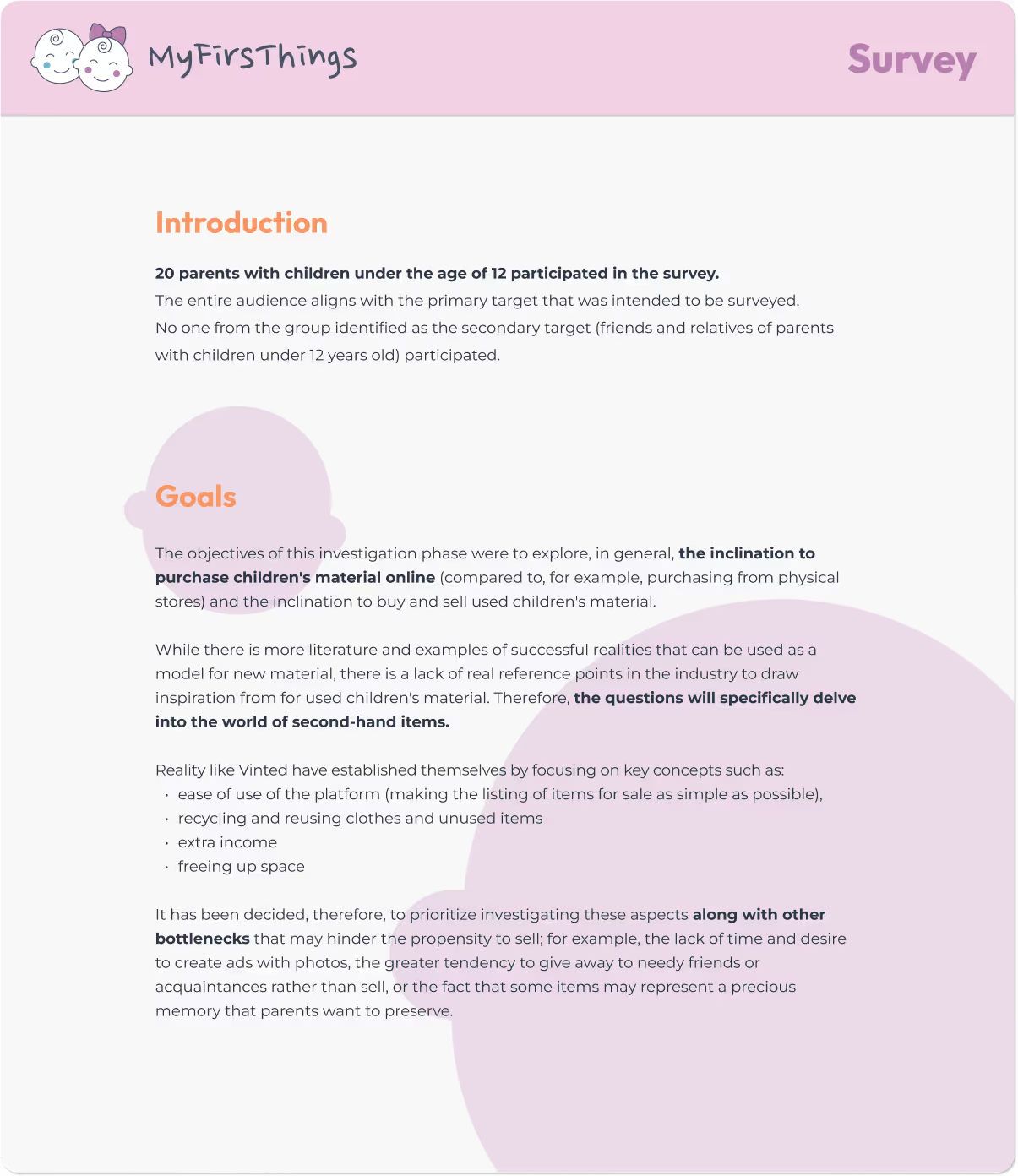
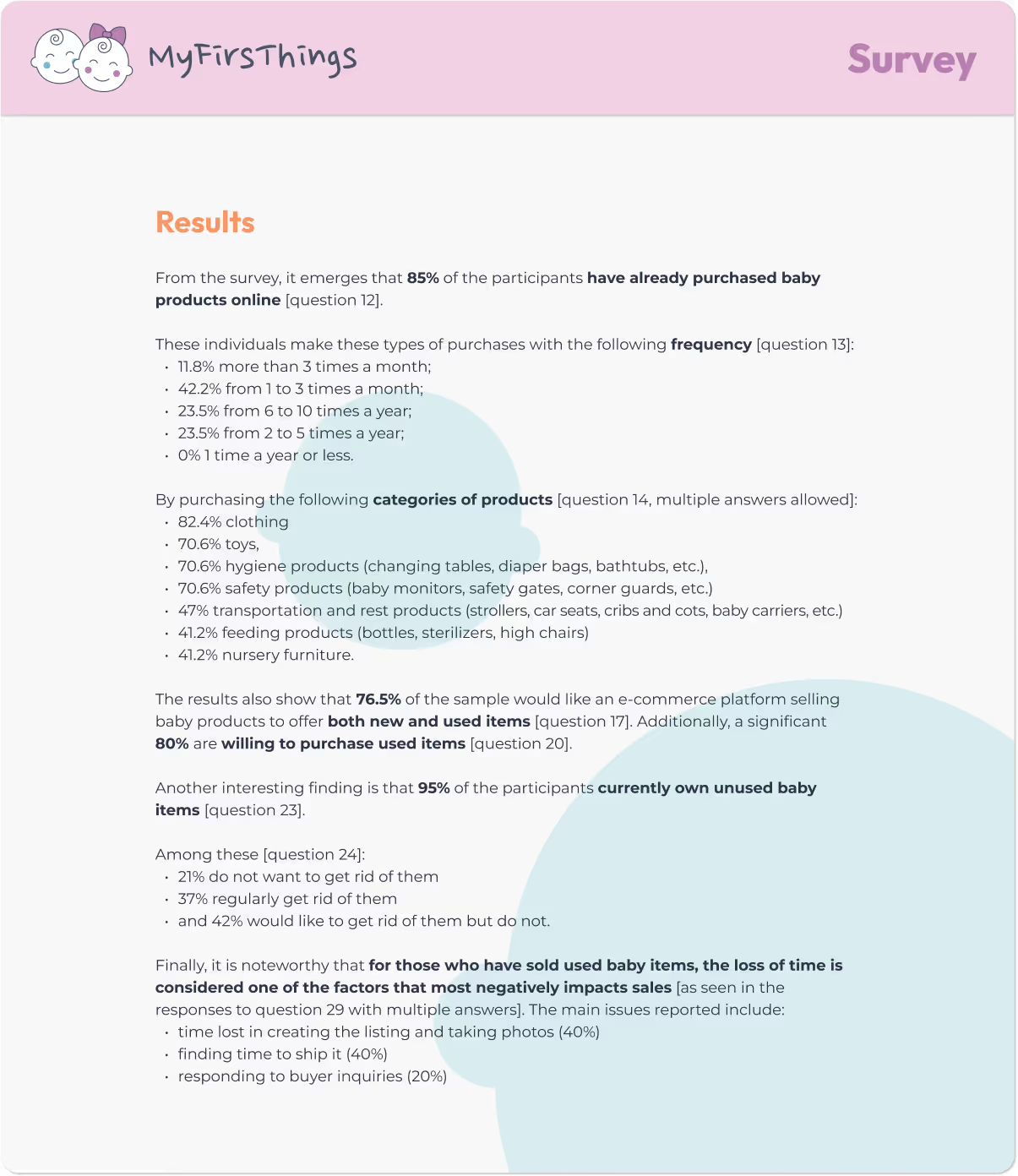
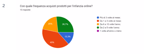
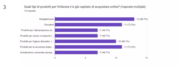
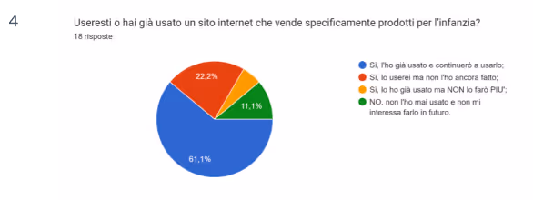
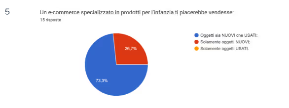
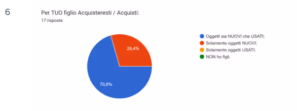
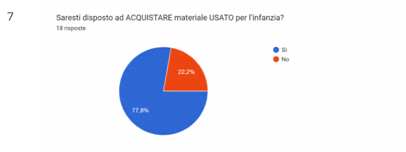
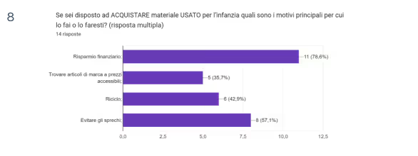
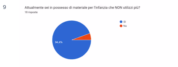
Designing without listening is like guessing with a blindfold. That’s why, before shaping MyFirsThings, I turned to the real experts: parents.
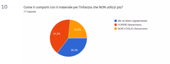
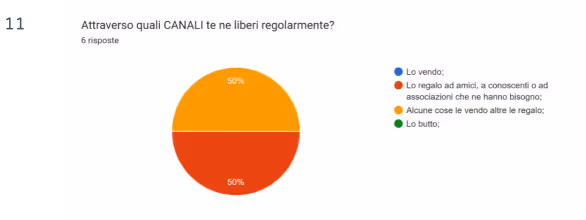
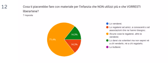
Through a carefully structured survey, I gathered insights from 20 participants—all with children under 12—about their shopping habits, their approach to second-hand products, and what would truly make their lives easier.
While market research tells you what’s happening, a direct survey reveals why.
I wanted to explore:
But
The biggest blocker?
The most exciting insight?
Parents are:
This validated the core value proposition of MyFirsThings and inspired a UX focused on simplicity, speed, and trust-building features.

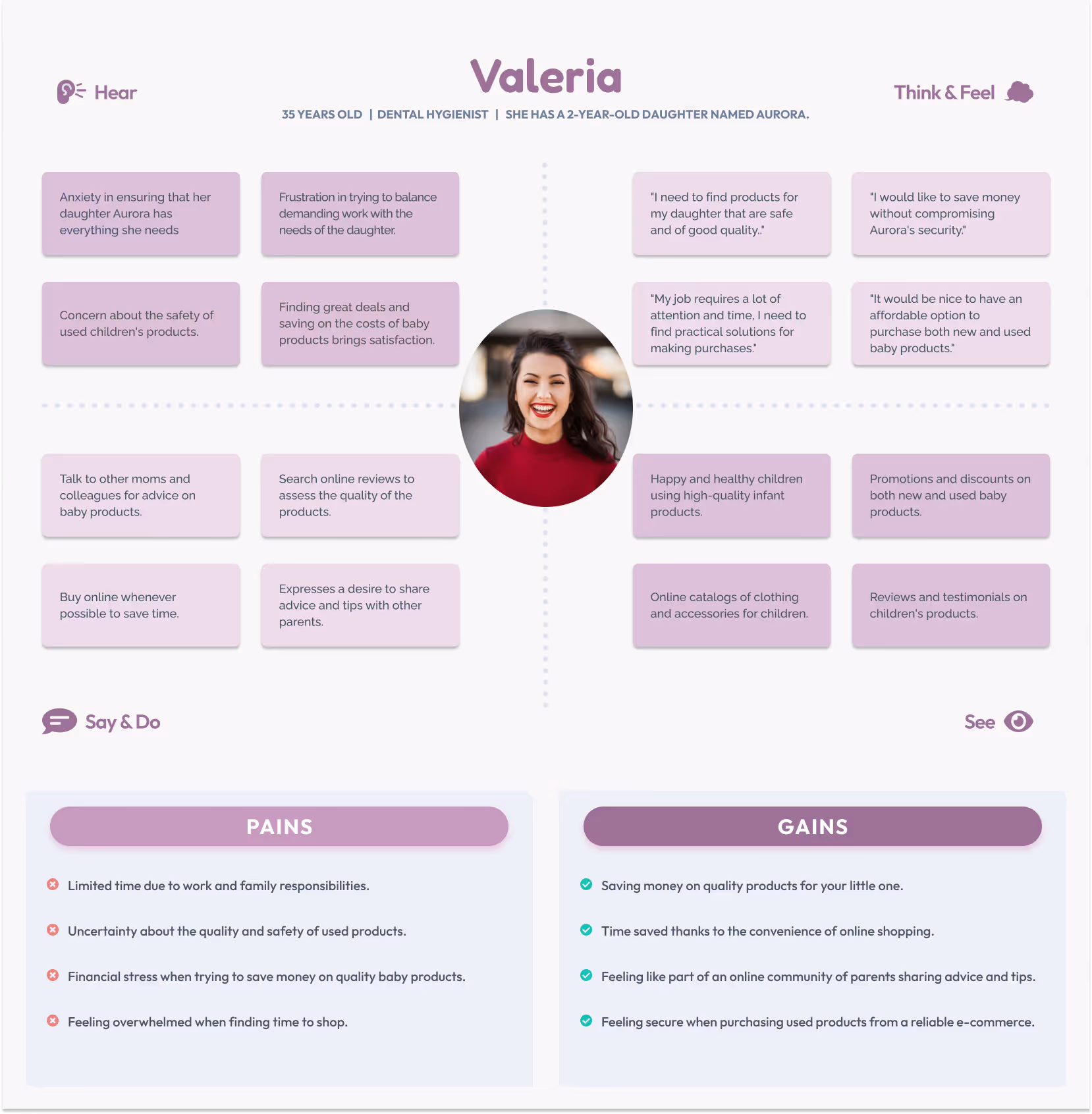
To create truly human-centered solutions, the first step is to step into the users’ shoes. These Empathy Maps helped me dive into the lives of two real parents—with different routines but the same goal: giving the best to their children without compromising time, quality, or peace of mind.
A dedicated professional and caring mother juggling a busy schedule and a mind full of responsibilities.
Pain Points:
Gains:
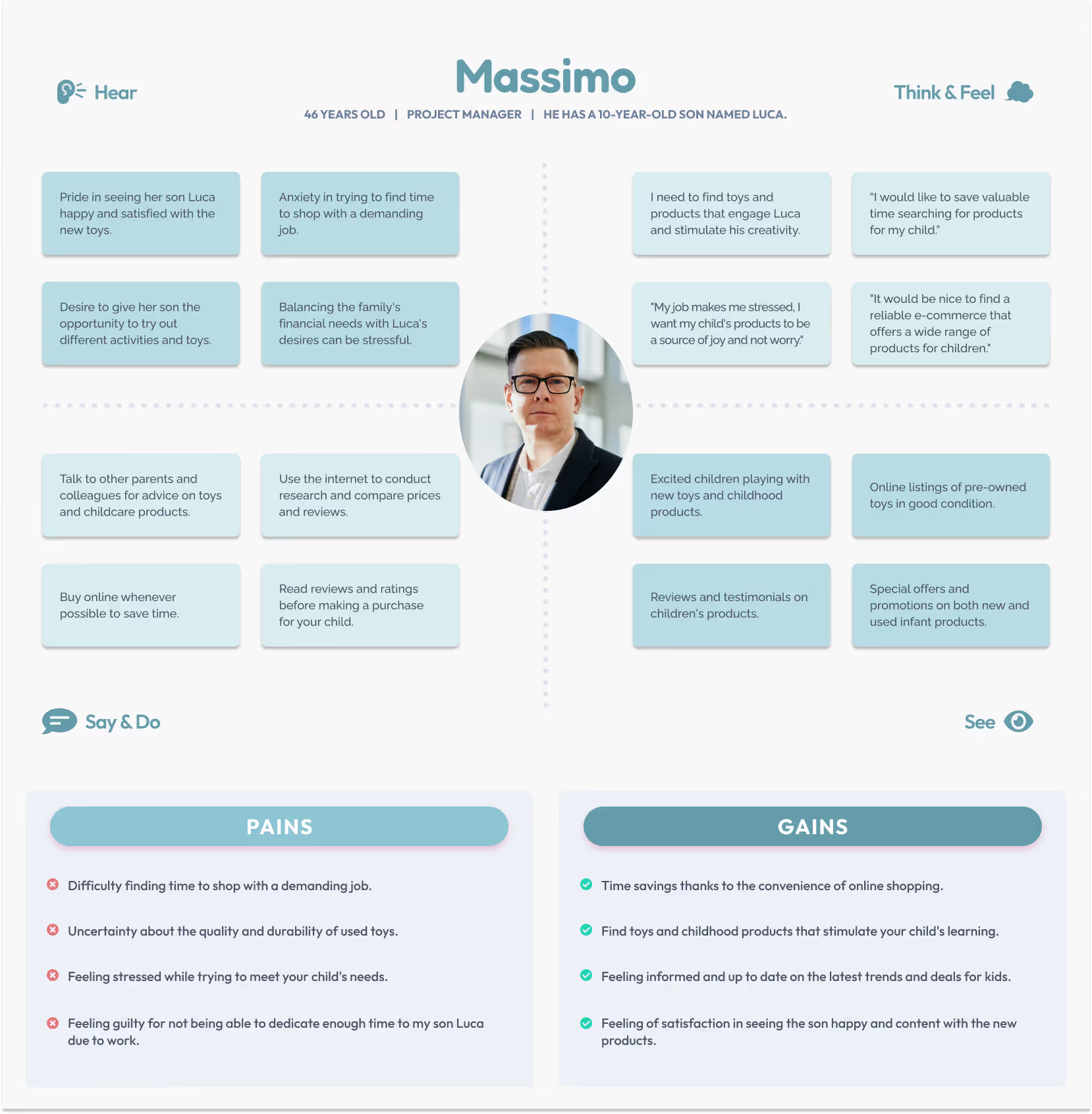
A busy project manager who wants to make the most of the time he spends with his child.
Pain Points:
Gains:
These empathy maps helped me to:

Understanding our users isn't just a step in the process — it's the foundation of meaningful design.
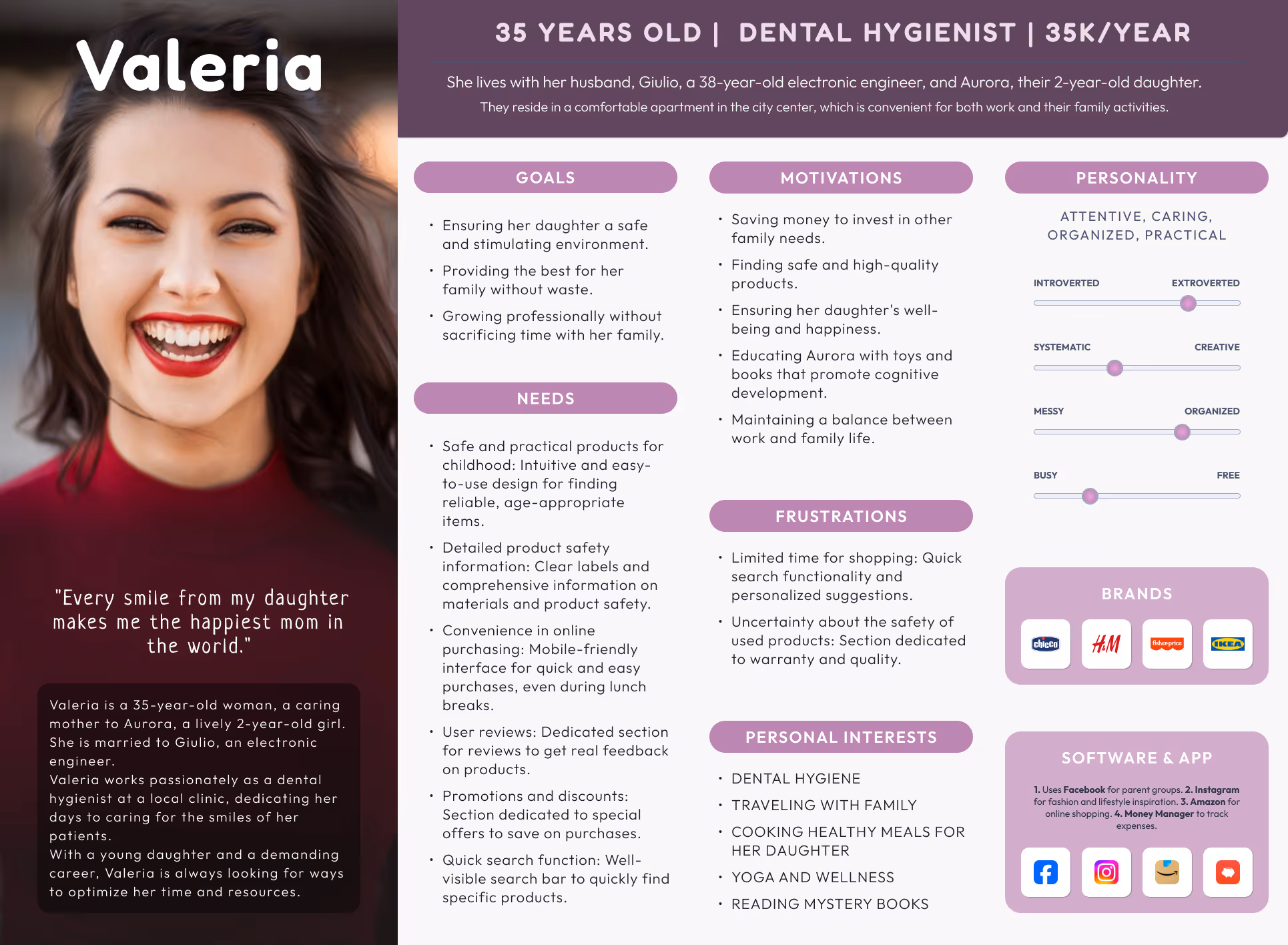
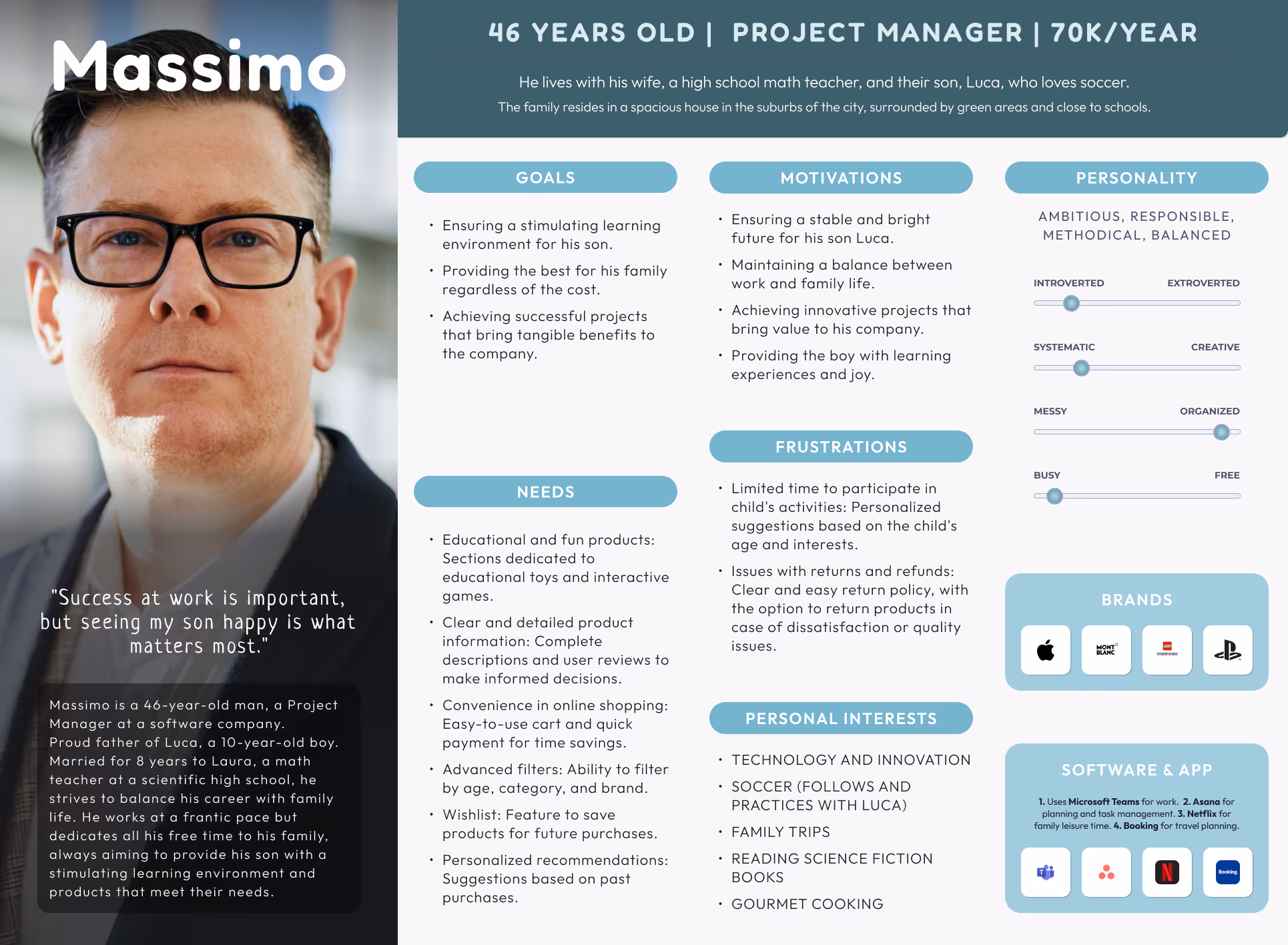
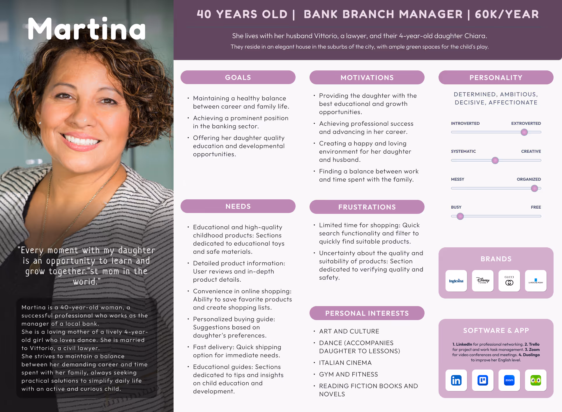
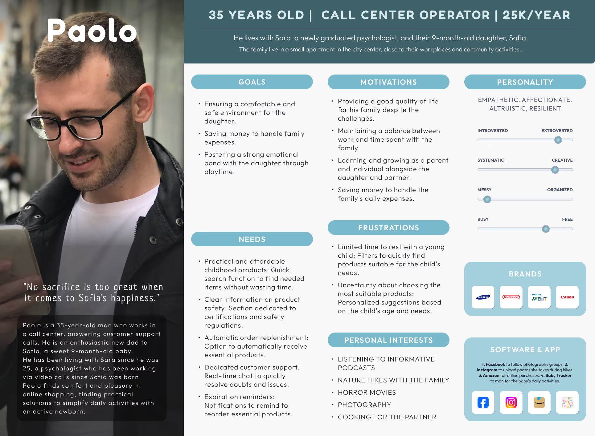
That’s why I created four detailed User Personas, each representing a unique profile of our core audience: modern parents juggling work, life, and the wellbeing of their children.
By giving a face and a voice to our data, these personas helped me uncover:
Pain Points:
Gains:
Designing with empathy is a game-changer.
Each persona pushed me to look beyond demographics and focus on behavioral insights that guide actual purchase decisions. Through this process, I gained a deeper understanding of:
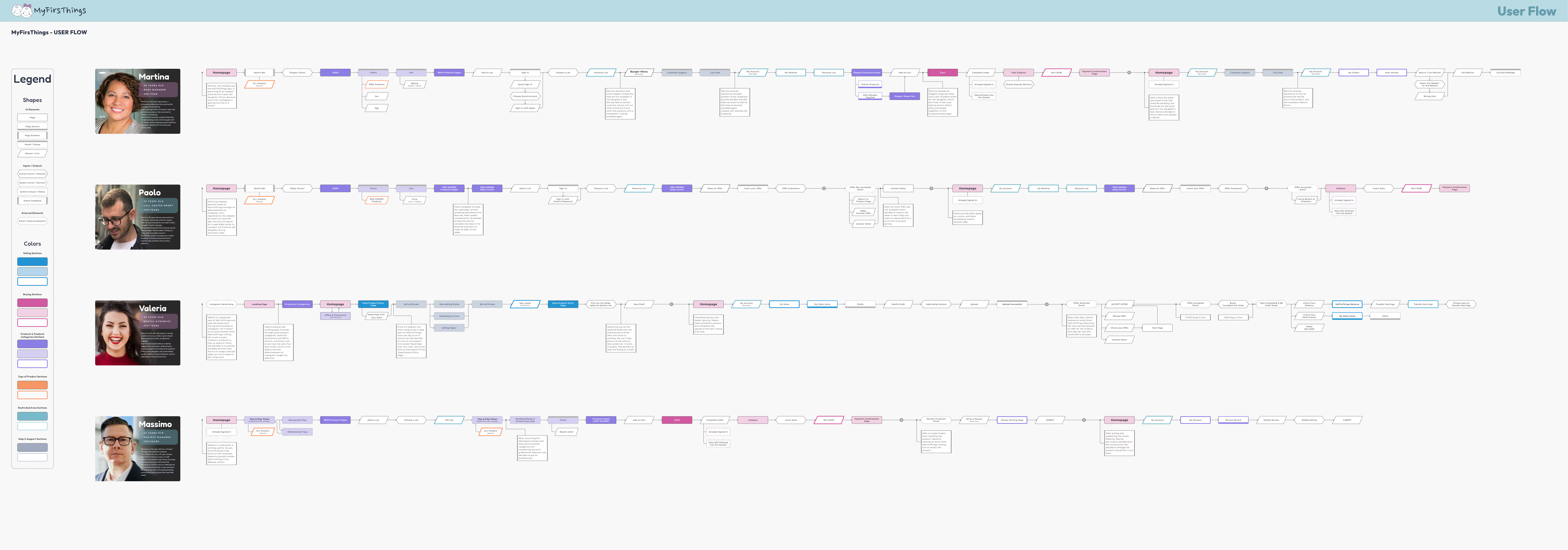
From Valeria’s quest for safe, time-saving purchases, to Massimo’s love for quality and innovation, Paolo’s dedication to his newborn daughter’s well-being, and Martina’s drive to offer her daughter the best — these stories shaped every design decision that followed.

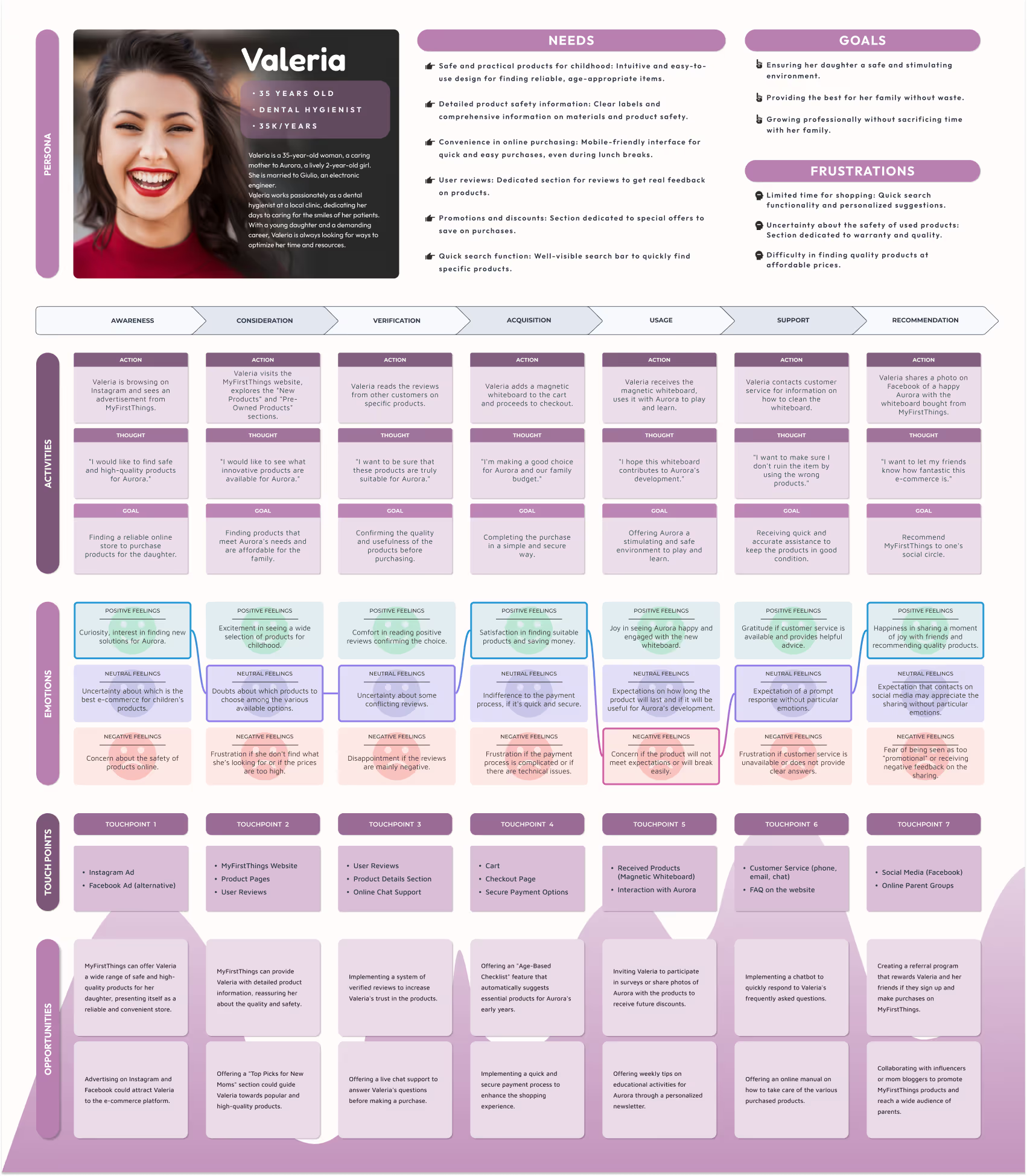
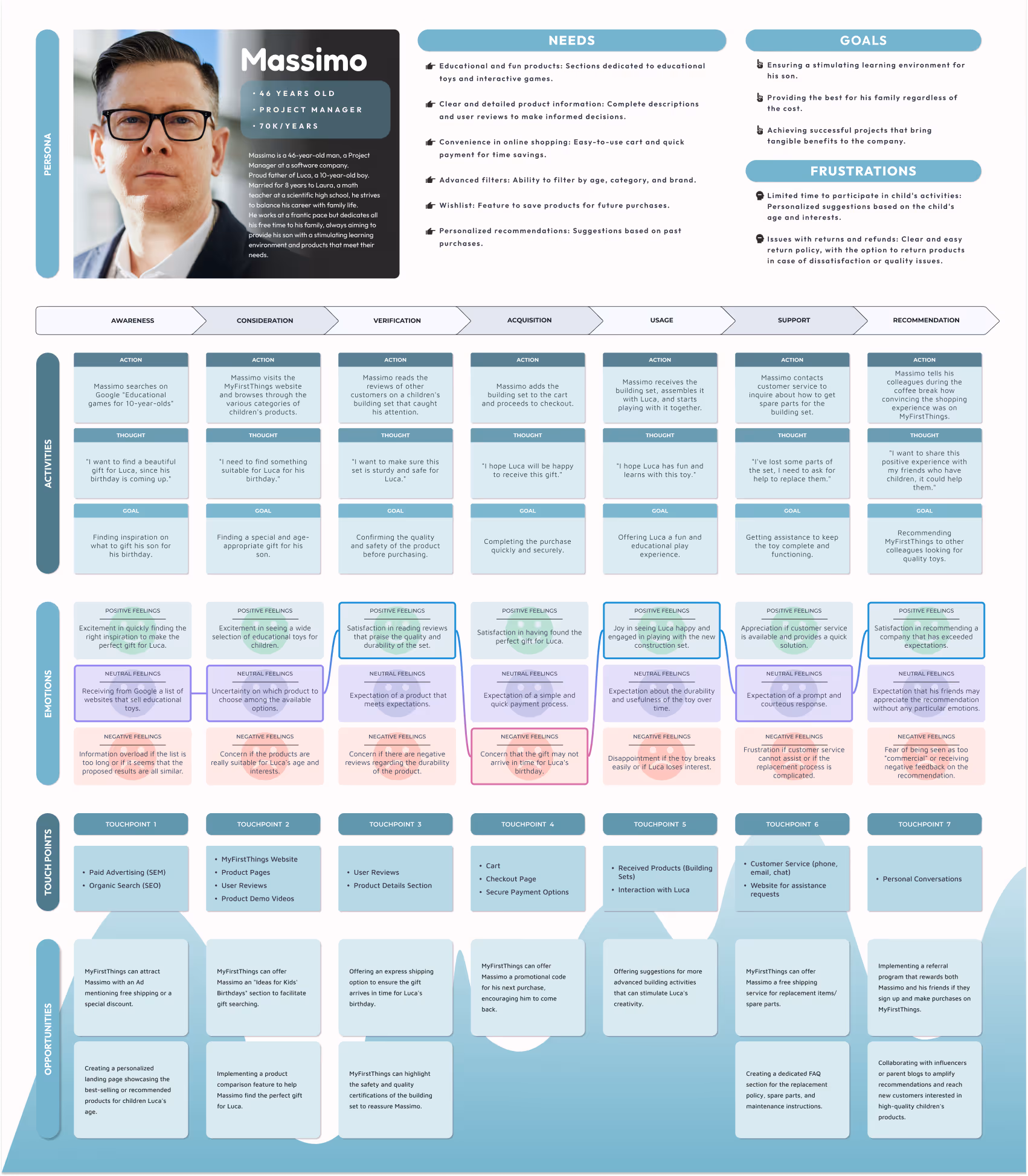
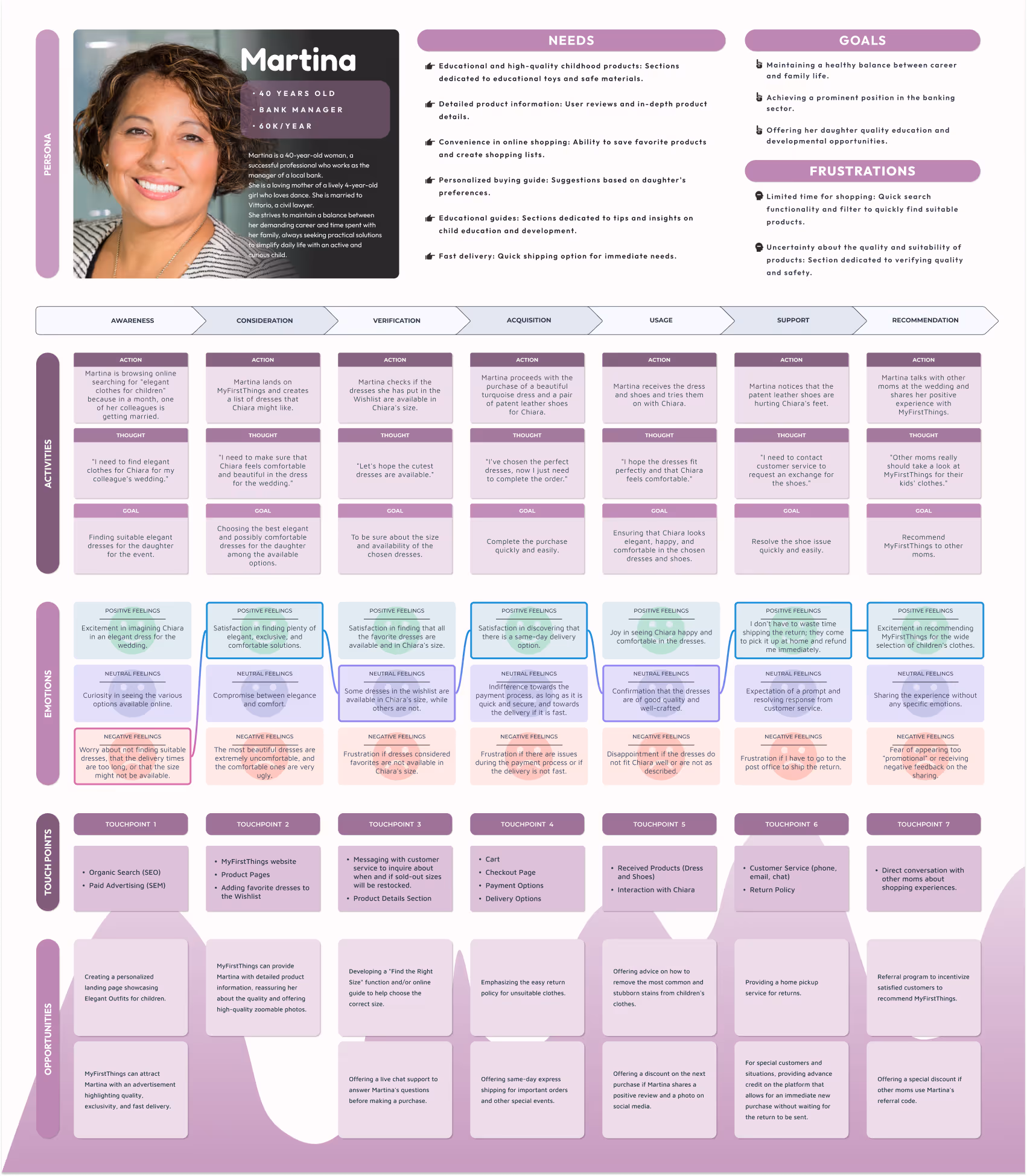
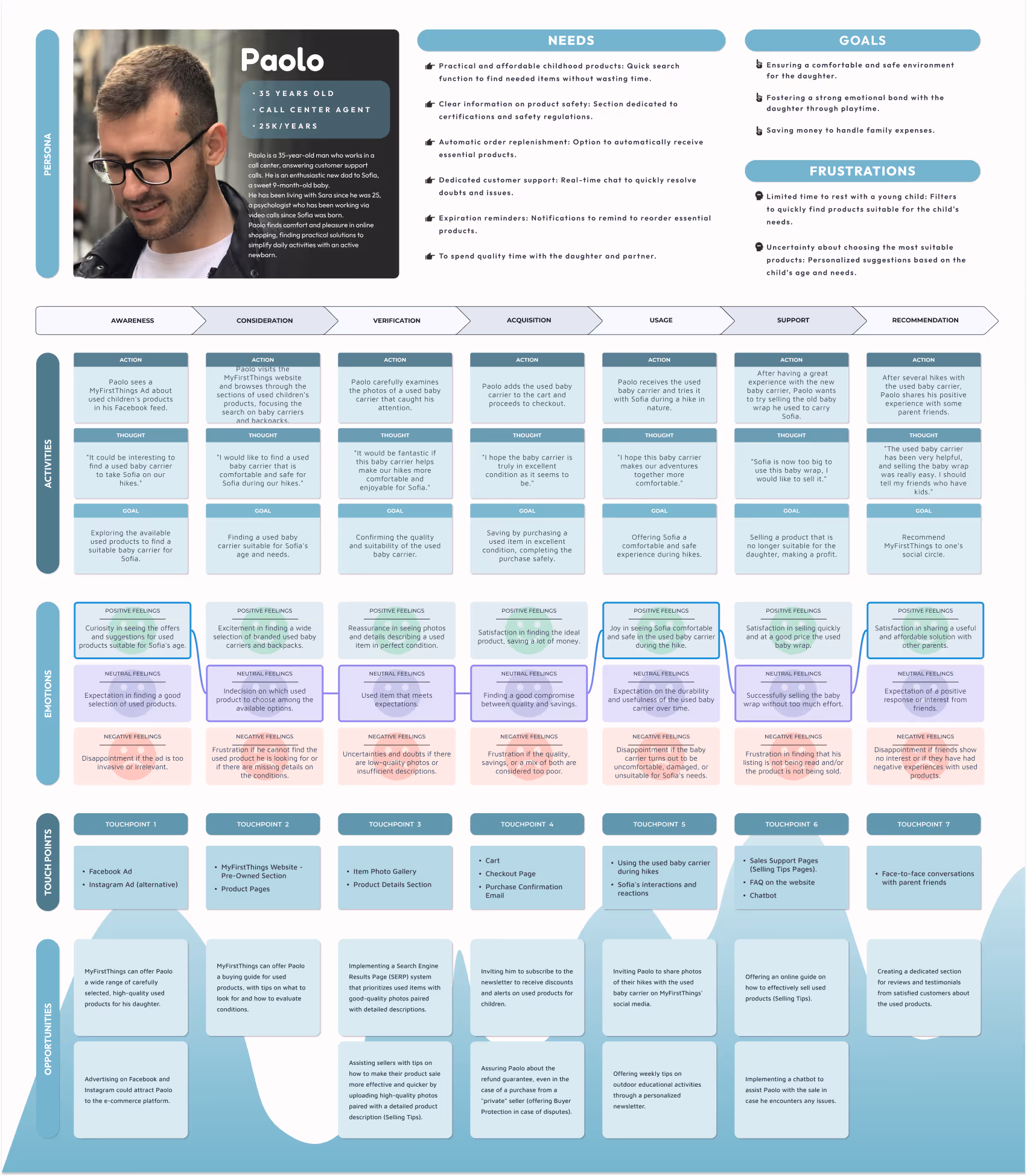
Creating the Customer Journey Maps for MyFirsThings was a key step to truly understand how people discover, evaluate, and experience shopping — and what happens beyond the purchase. Four parents, four journeys, one shared mission: finding the best for their children.
CJM helped me:
Pain Points:
Gains:
Four journeys, four personalities, four perspectives
Pain Points:
Gains:
What these stories taught me along the way:

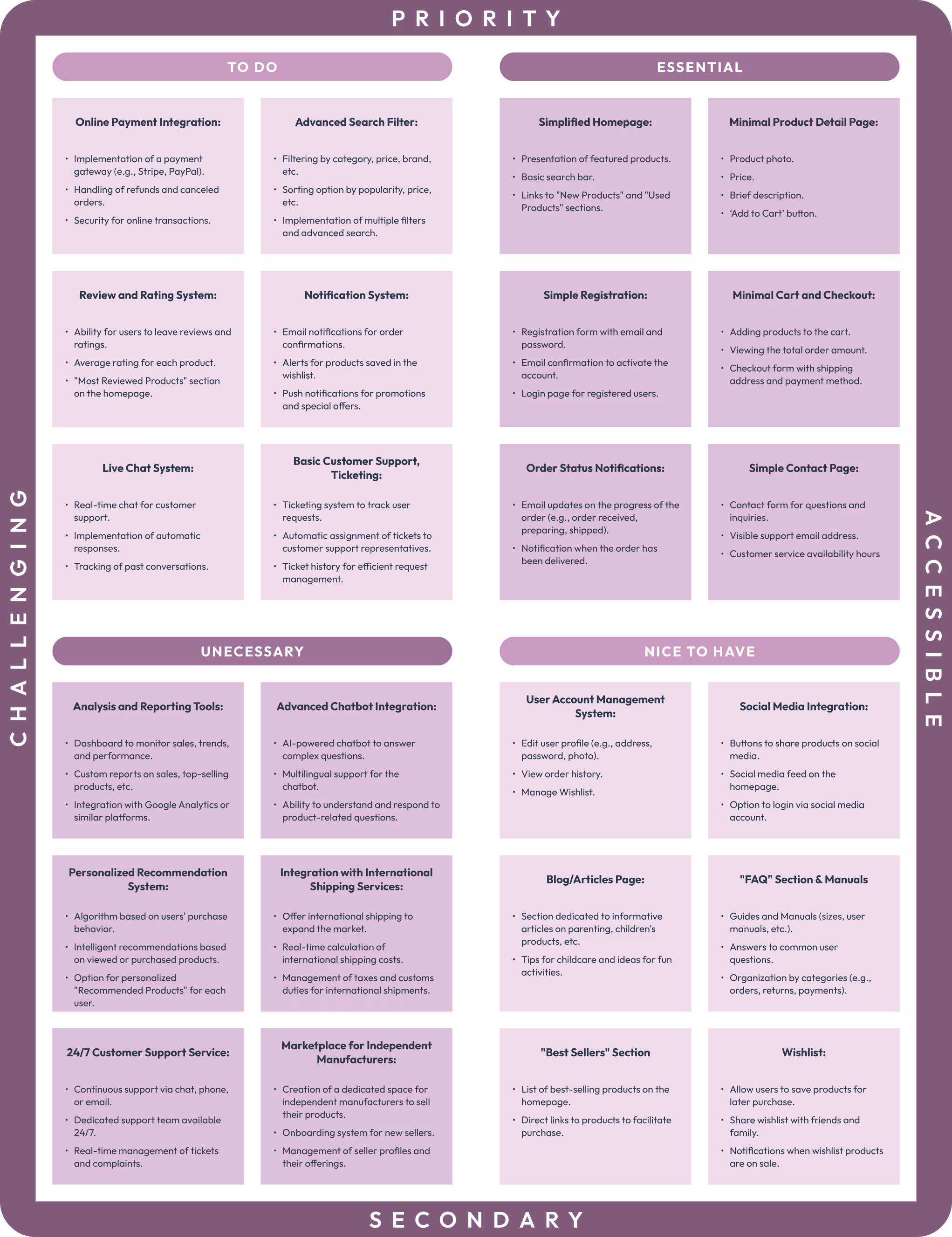
Building an MVP wasn’t just about launching a prototype — it was about validating assumptions, prioritizing what truly matters to users, and keeping things lean, smart, and meaningful.
In a market filled with parental needs, emotional decisions, and secondhand gems, our goal was clear: connect buyers and sellers through a safe, simple, and helpful experience — whether they’re shopping new or selling used.
The core features were designed to cover the essentials:
Pain Points:
Gains:
Creating an MVP helped me:
Pain Points:
Gains:
This project highlighted a few key lessons:
Pain Points:
Gains:


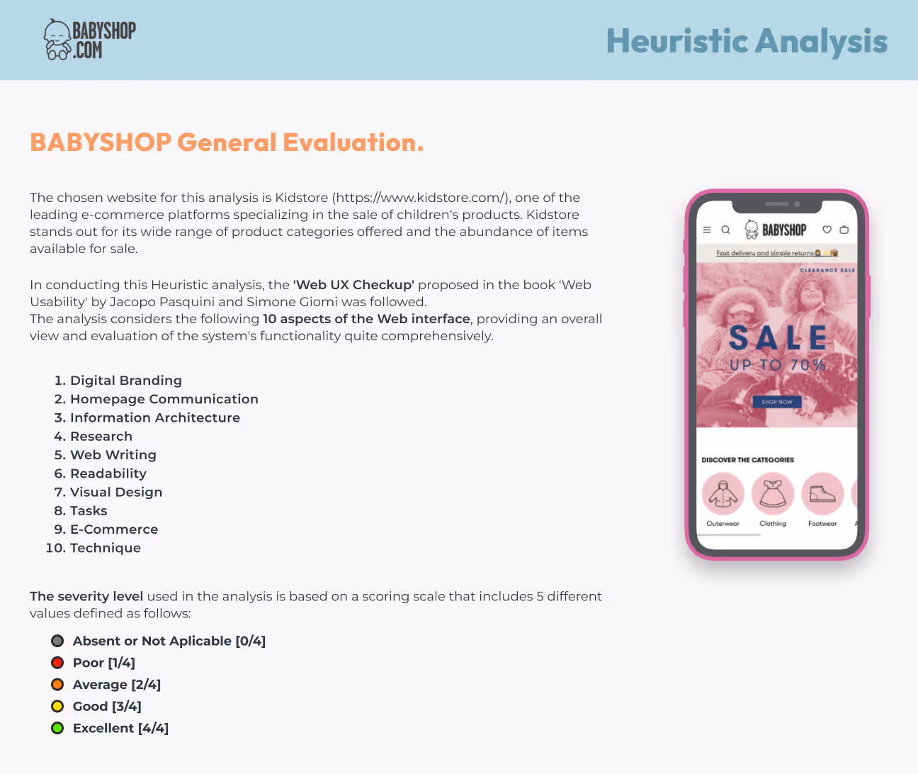
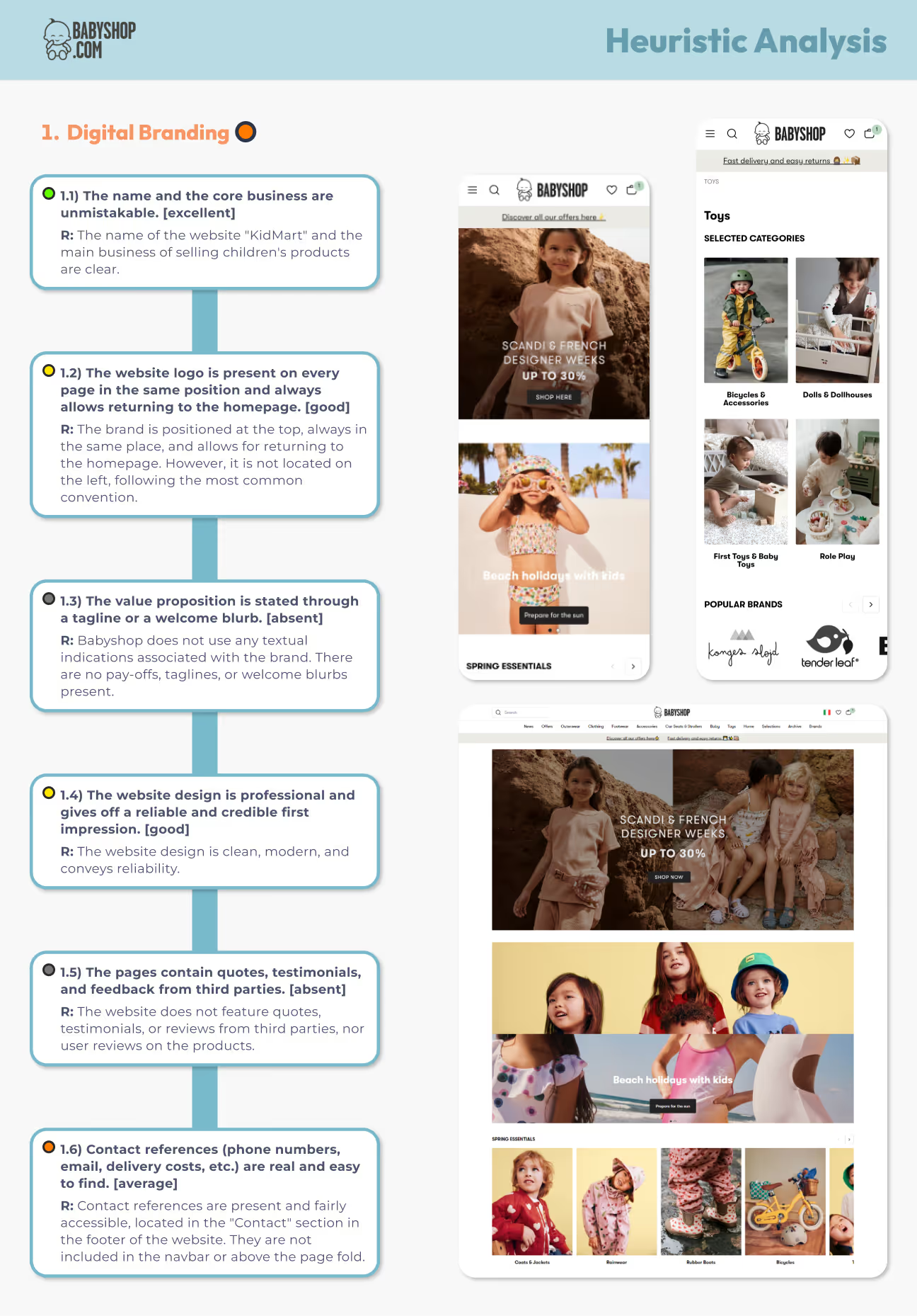
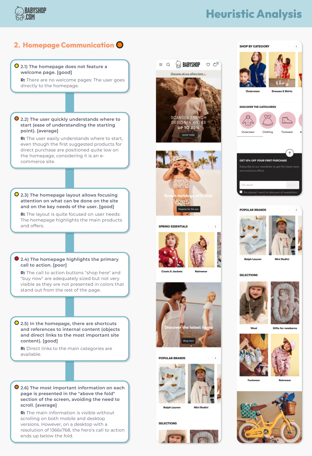
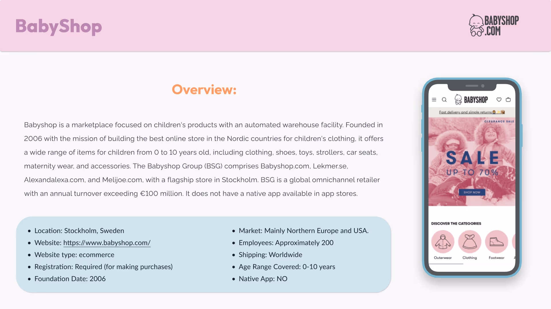
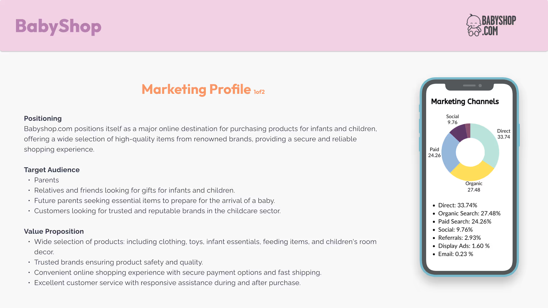
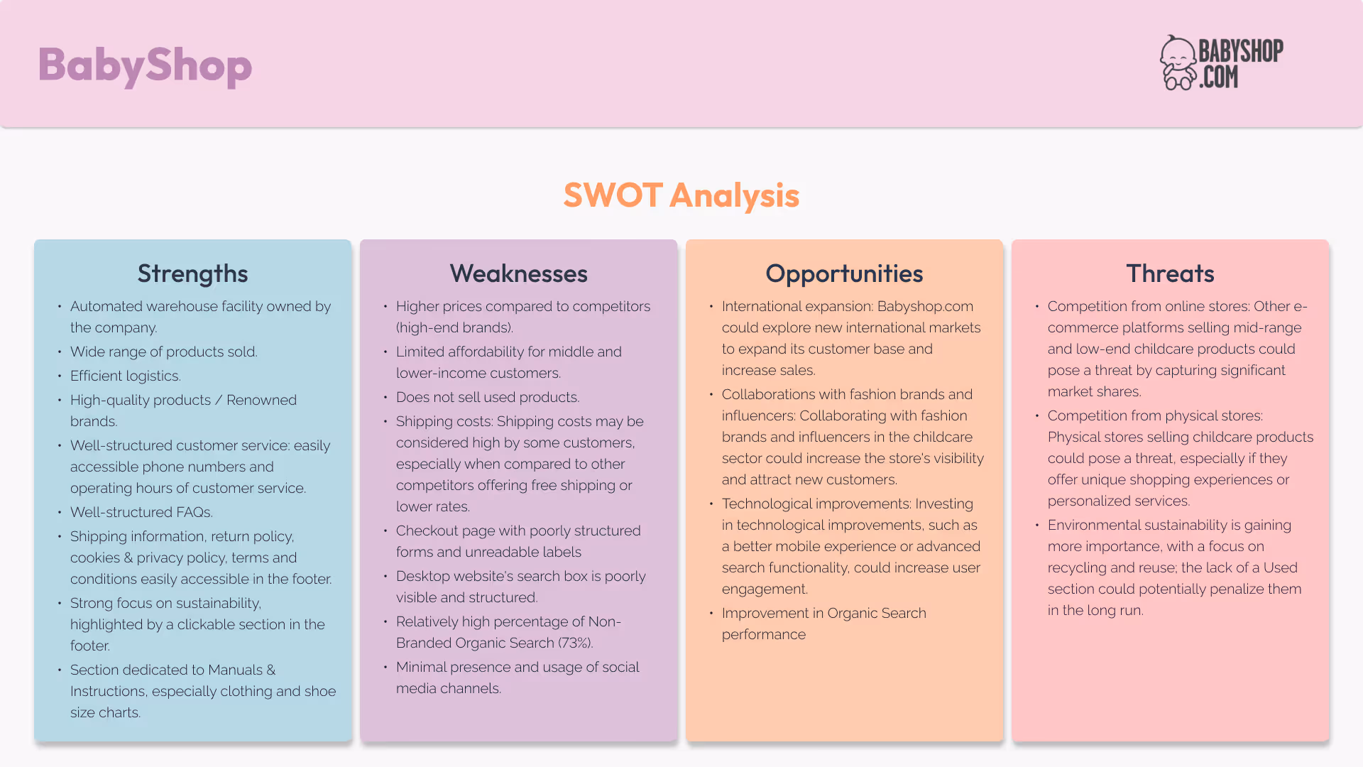
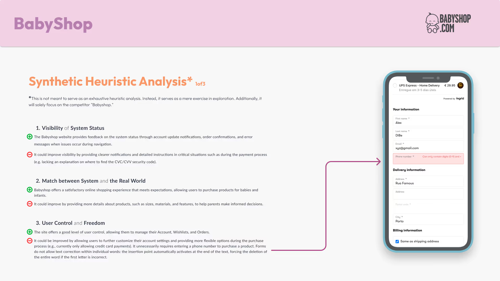
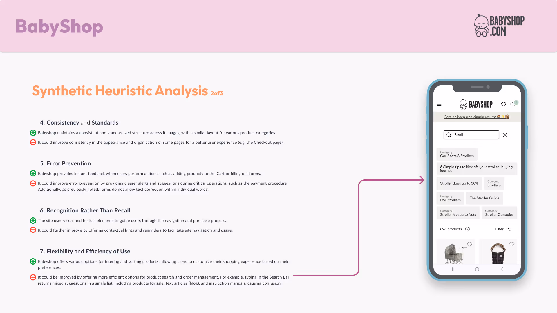
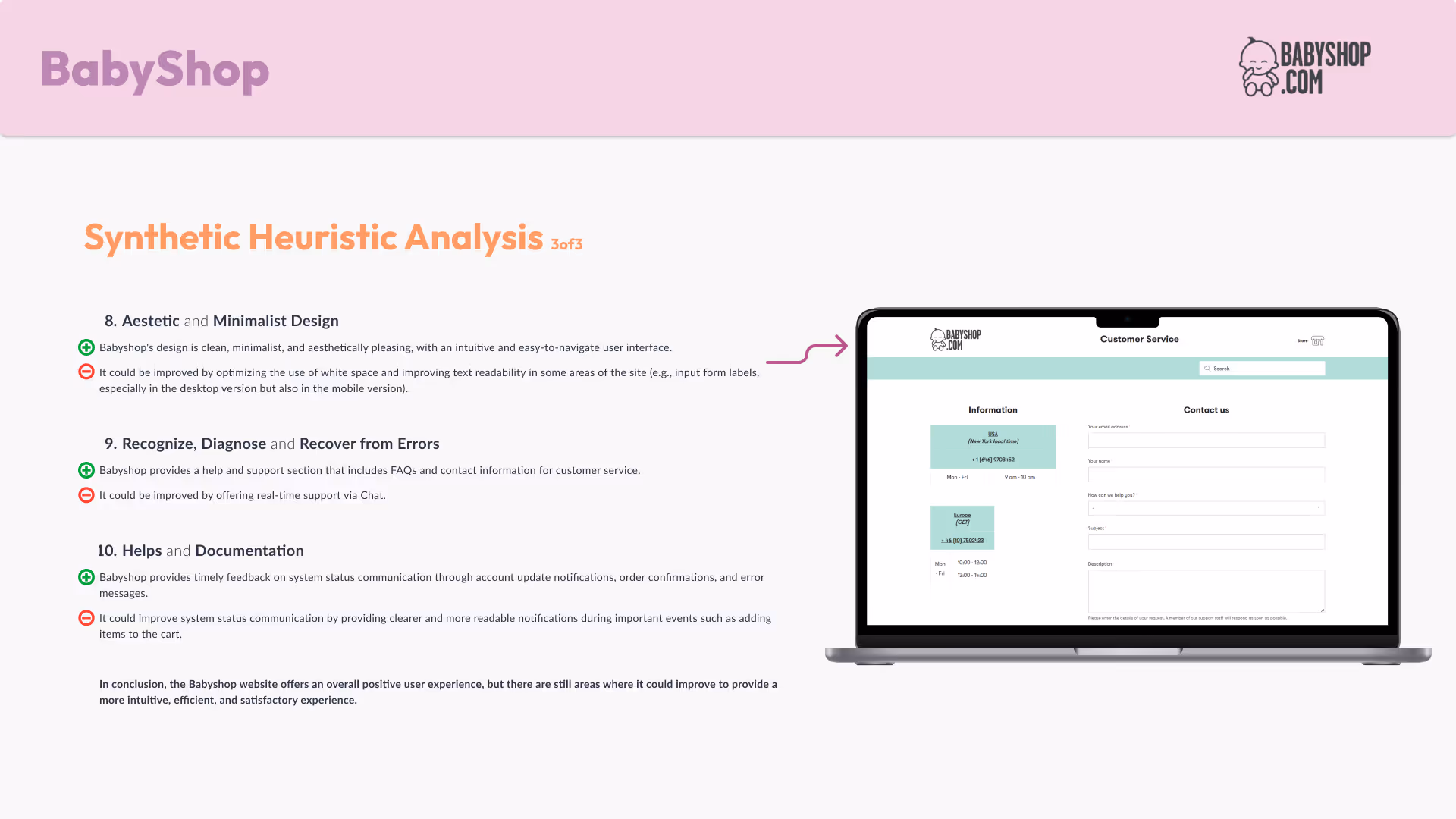
Babyshop.com under the UX Lens
Before designing a truly effective experience, you need a compass. The Heuristic Analysis is exactly that: a strategic checklist to evaluate what works (and what doesn’t) in a competitor’s interface—based on well-established usability principles. It’s where smart design starts.
Analyzing Babyshop — a leading player in the children’s e-commerce space — allowed me to:
This wasn’t just about critique — it was about learning from the best to build something even better
I followed the Web UX Checkup checklist from Web Usability by Pasquini and Giomi, examining 10 key areas of the user experience:
Each area helped me uncover both strengths and blind spots in the user journey.
Here’s what stood out during the process 👇
This step marked a turning point in my Interaction Design process. It gave me actionable insights to craft a more accessible, user-centered, and market-differentiated experience.

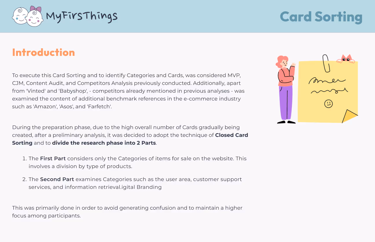
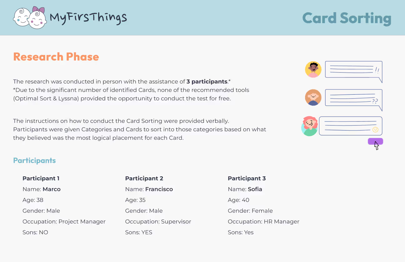
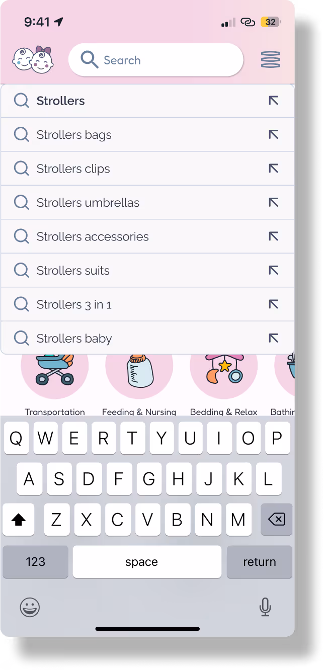
When designing a seamless shopping experience, it’s not just what you offer — it’s how users find it. That’s where Card Sorting comes in: a powerful method to uncover the most intuitive way to structure content based on real user logic.
Clear navigation isn’t just a nice-to-have — it’s the difference between scrolling and shopping. This work helped me:
To build a solid foundation, I drew insights from:
I split the sorting into two distinct phases to keep things clear and manageable:
Key insights that shaped the outcome 👇

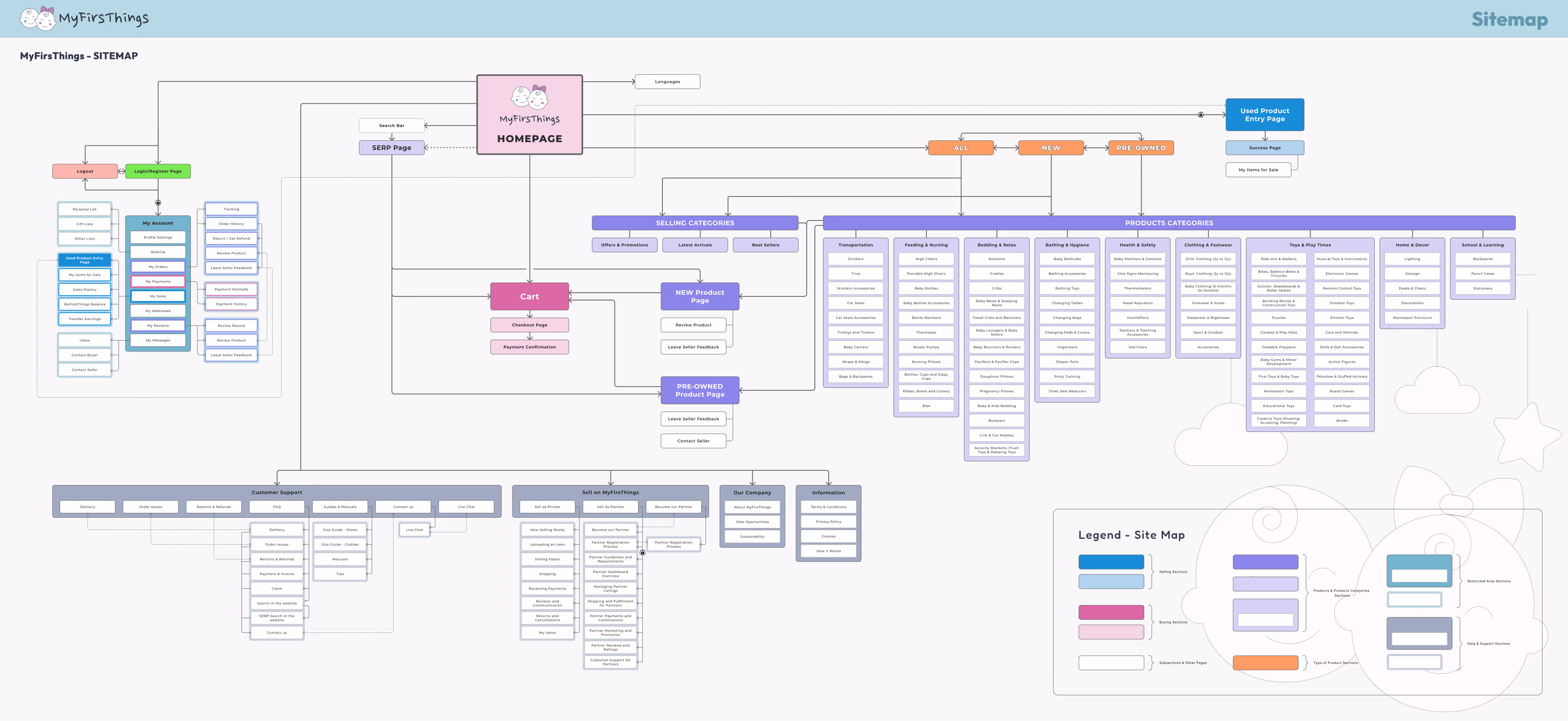
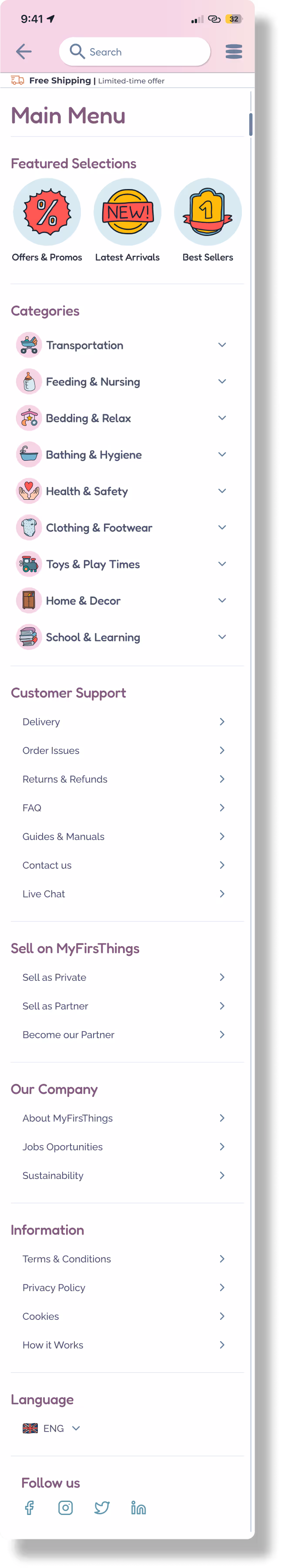
A well-structured Site Map is like a GPS for design: it provides a clear, organized framework of the entire platform, helping to define how users will navigate, explore, and interact with content.
It’s also a critical step to:
Based on the insights gathered from:
I translated complexity into structure. The result is a logical, scalable hierarchy that reflects user mental models and supports both sections of the platform: New Products & Pre-Owned Products.
Navigation starts here
Less is more
UX is iterative

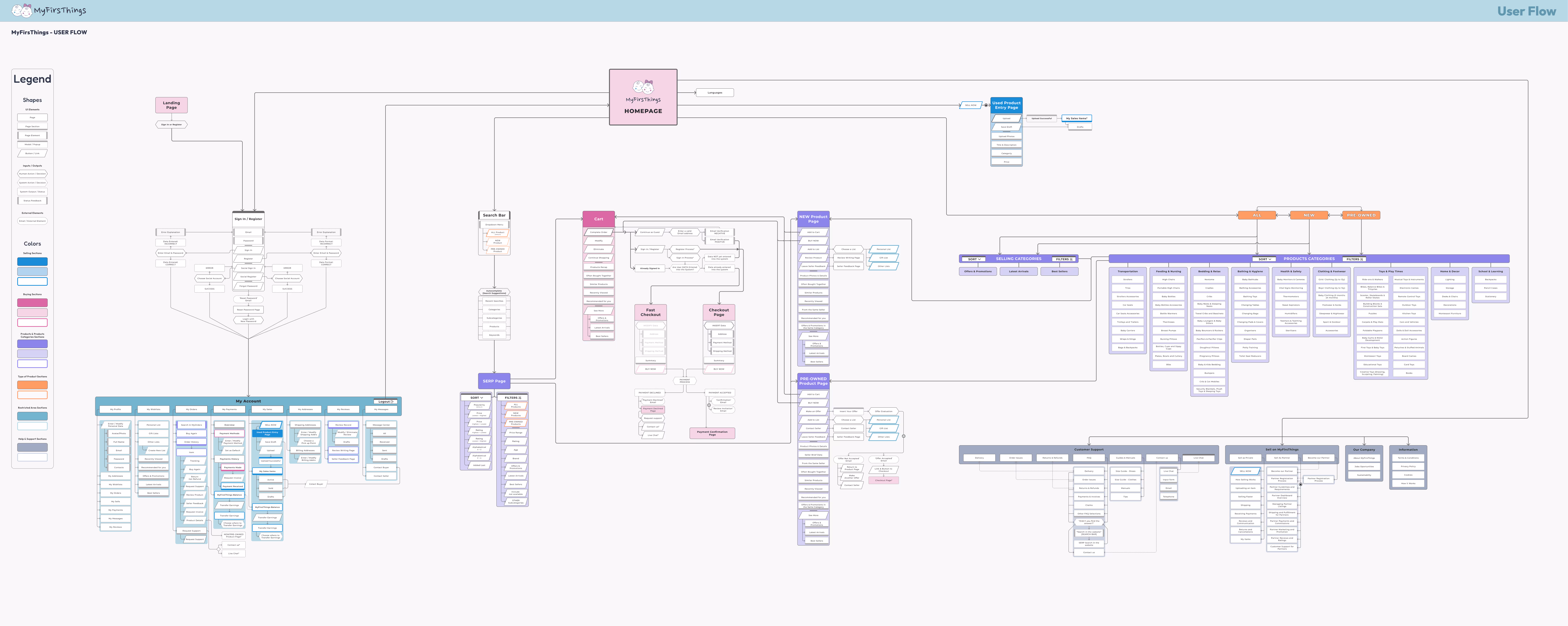
User Flows are more than diagrams—they're experience blueprints. They help visualize the steps users take to complete a task, uncovering pain points and ensuring each journey is:
They bridge the gap between intention and interaction, giving structure to every tap, click, and scroll.
I created:
This approach allowed me to zoom out for strategy, and zoom in for empathy.
Empathy = Efficiency
Complexity needs clarity
Friction is feedback

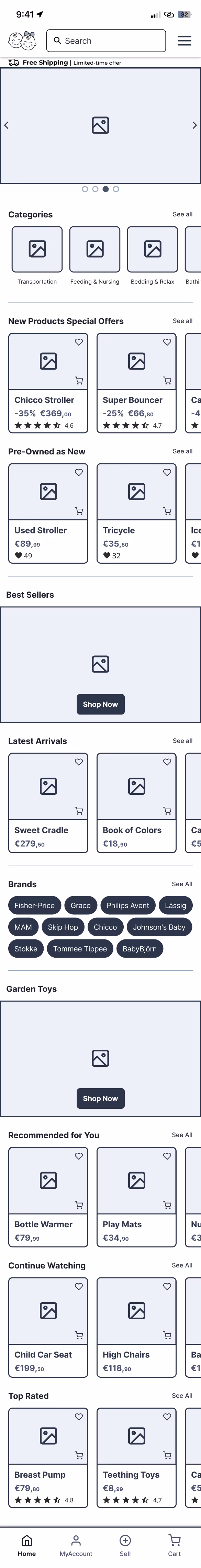
Wireframes are the backbone of UX design. They allow us to translate ideas into structure, giving form to flow and clarity to complexity.
Before colors and typography, they answer the most important question: “Does this make sense for the user?”
They help:
I crafted over 75 wireframes, covering the full scope of the platform:
Every screen was shaped by previous work on the Sitemap and User Flows, creating a seamless translation from strategy to structure.
Every pixel has a purpose
Structure reveals gaps
Navigation is design


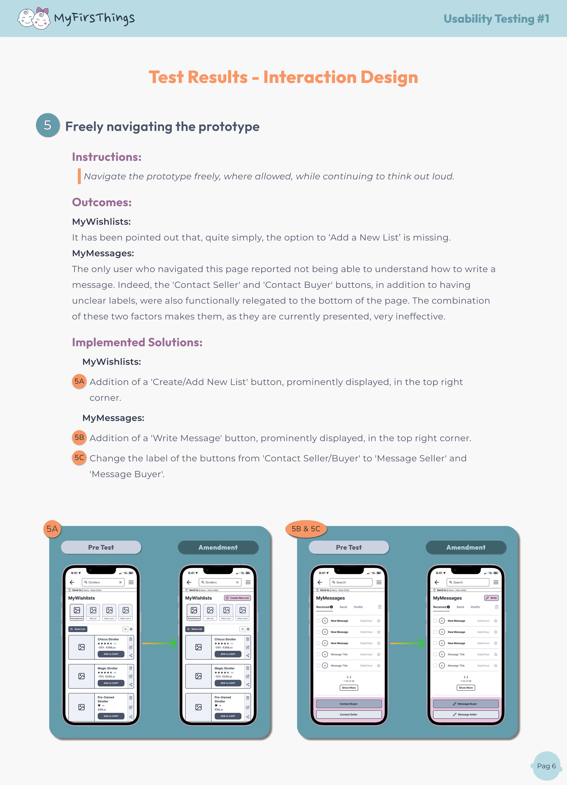
To validate the structure and usability of my wireframes, I conducted a mobile-based usability test using the interactive Figma prototype with 3 participants — all e-commerce users, with varied family needs and shopping habits
Because what seems clear to the designer may not be clear at all to the user. This test allowed me to uncover friction points, unexpected behaviors, and interface blind spots that I couldn’t have spotted on my own.
Each has its strengths:
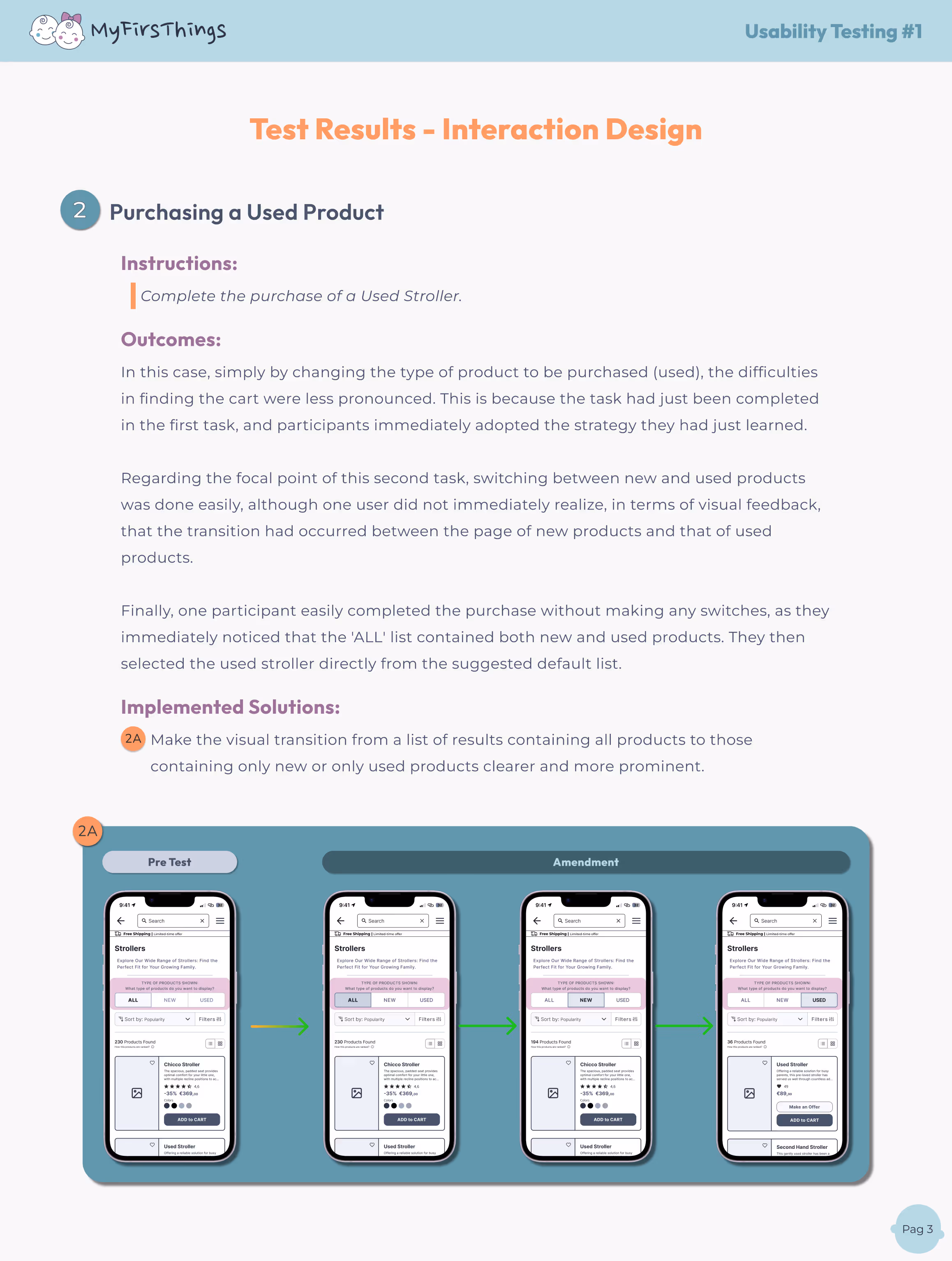
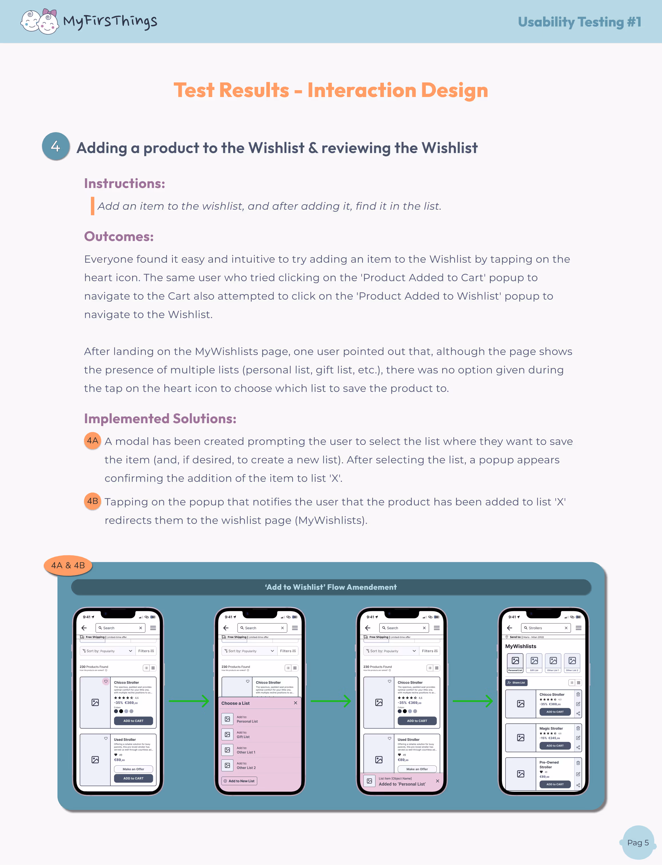
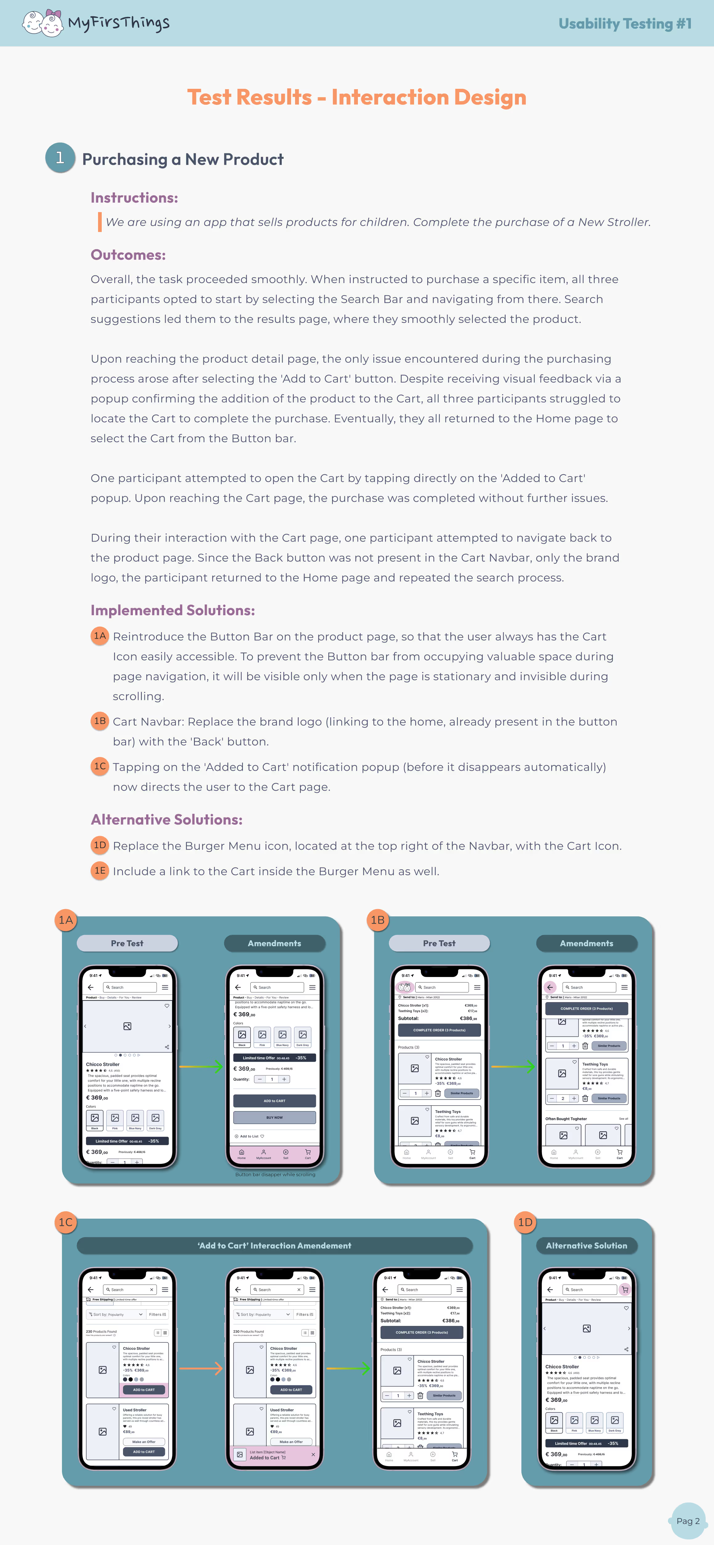
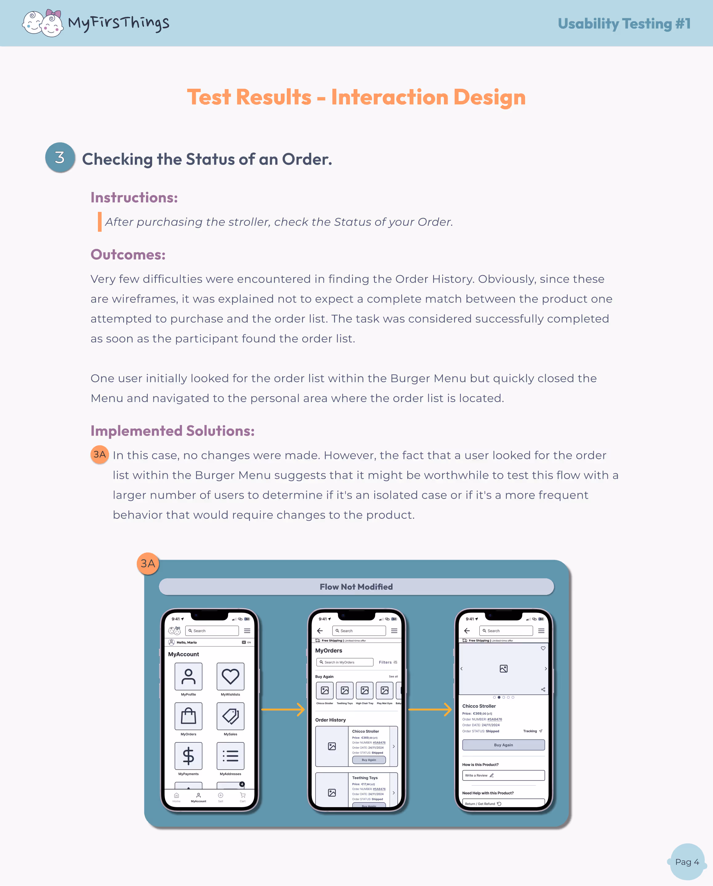
Here’s what testing revealed and how I addressed it 👇


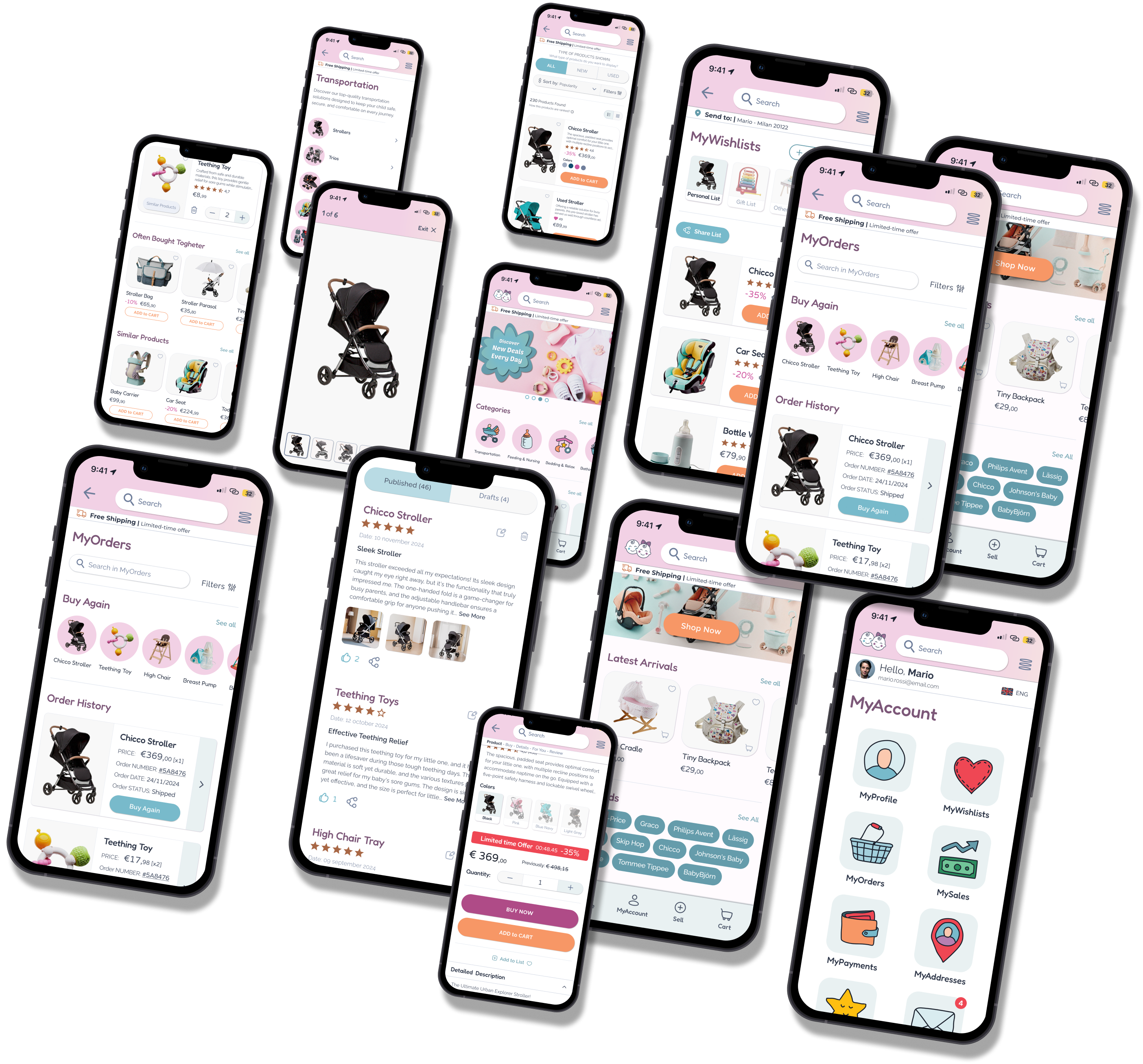
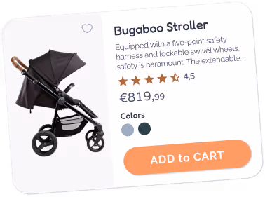
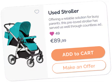
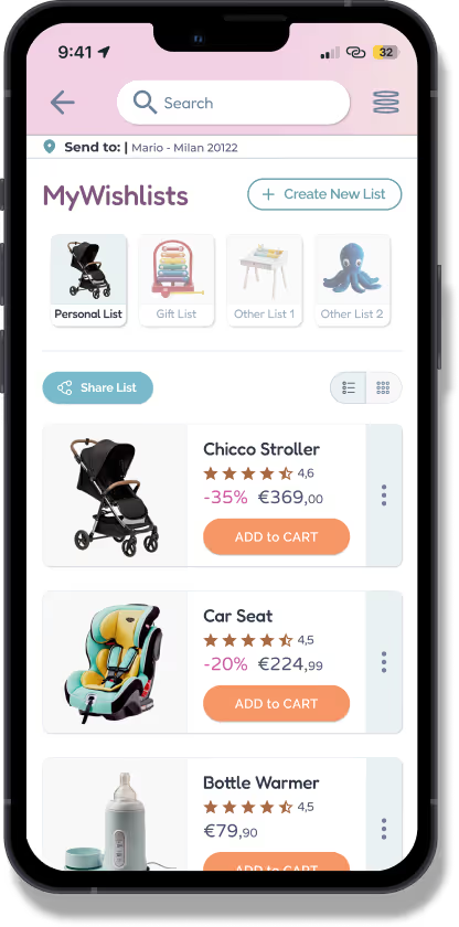
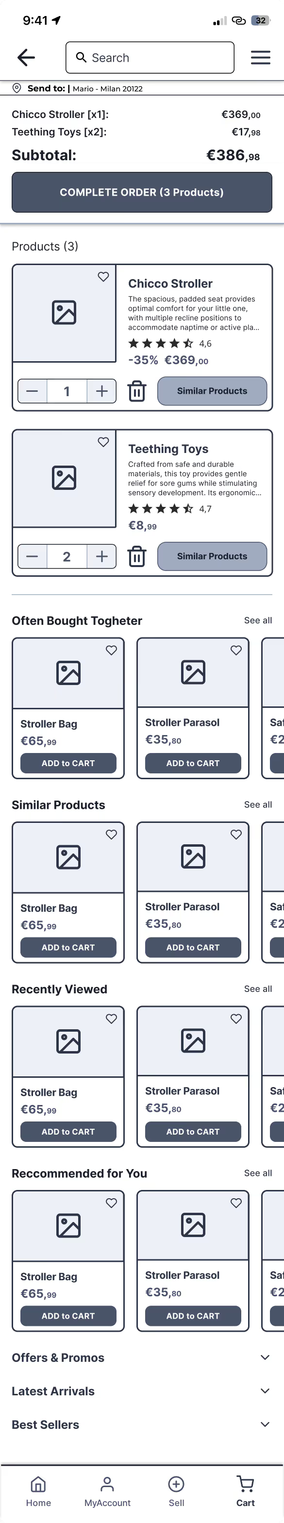
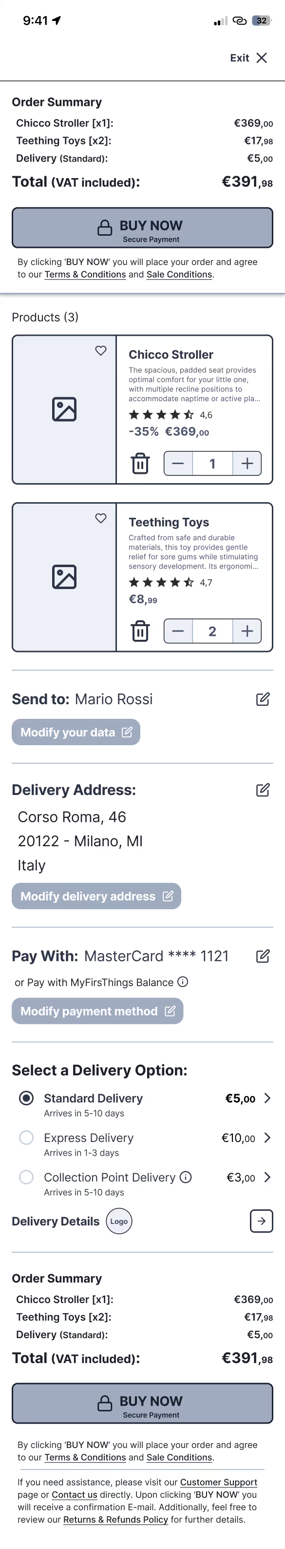
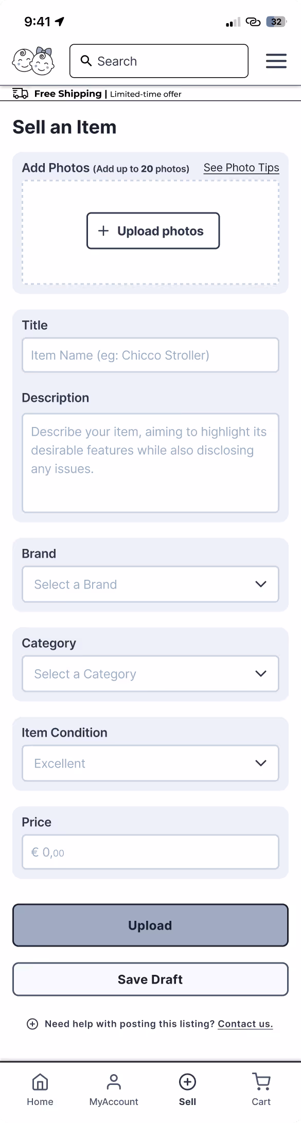
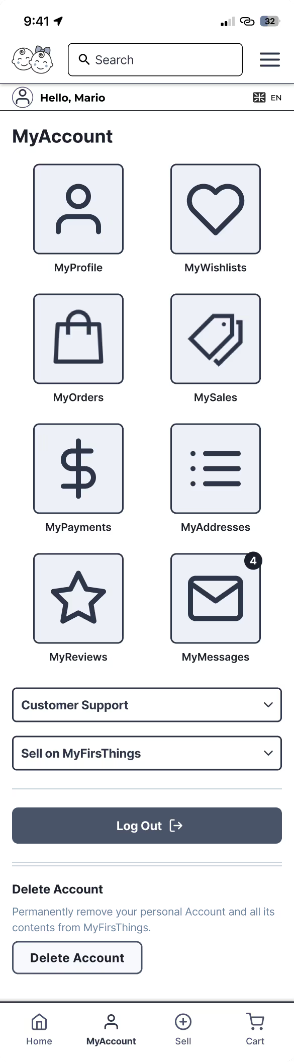
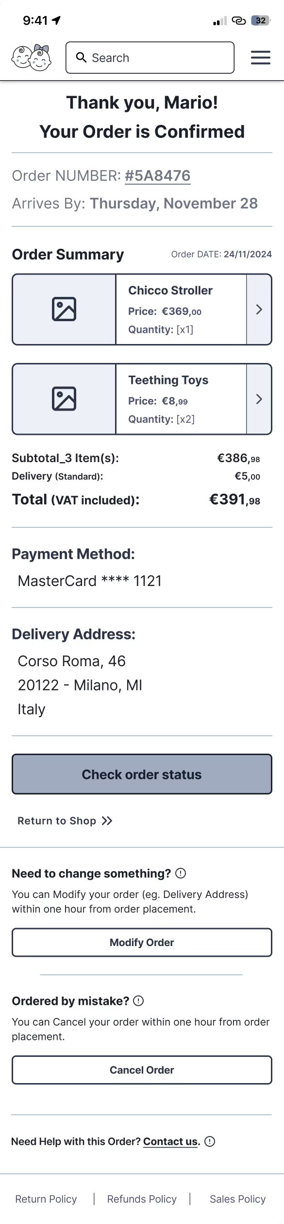
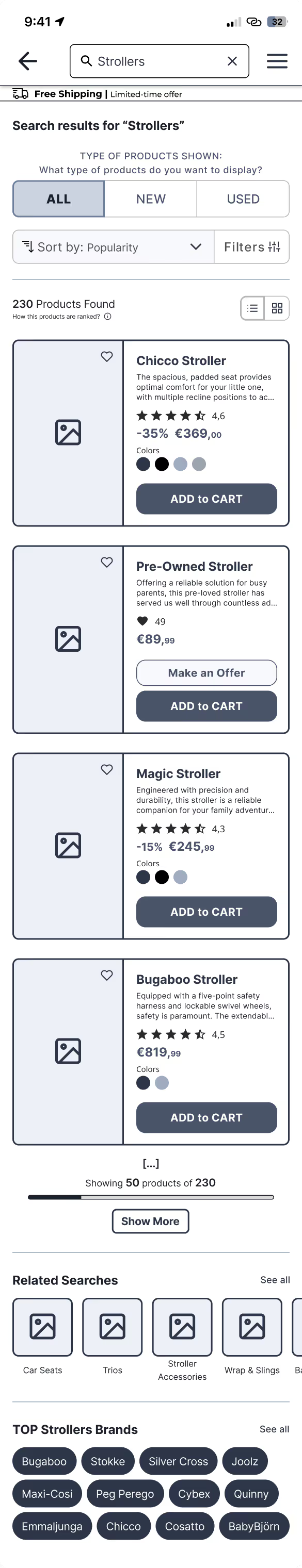
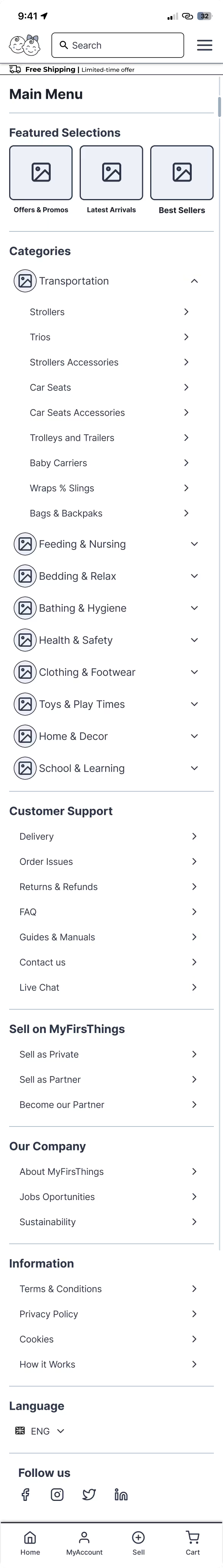
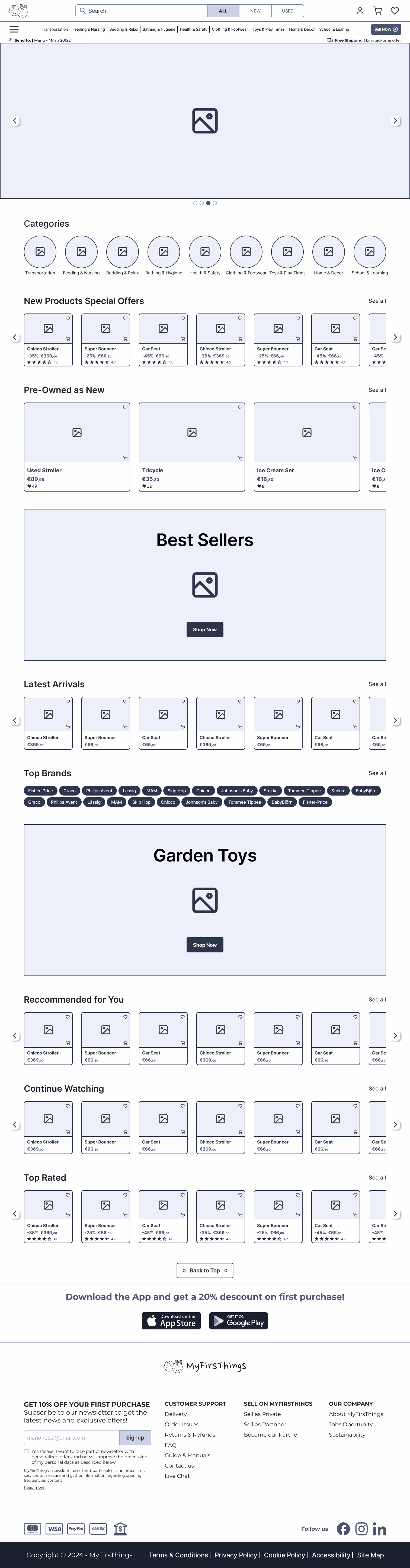
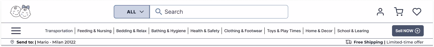
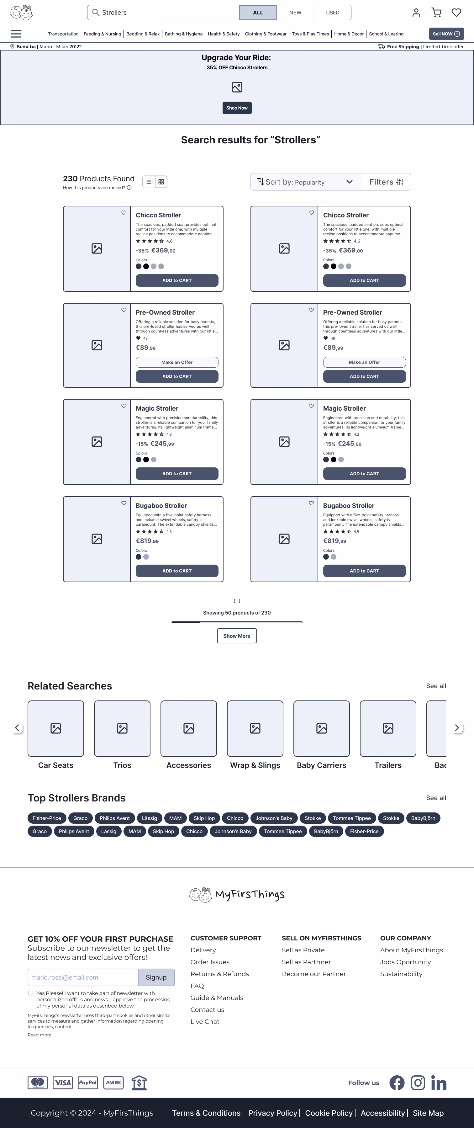
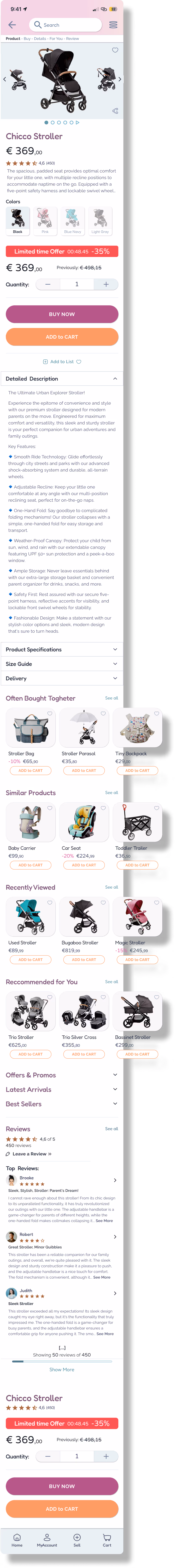
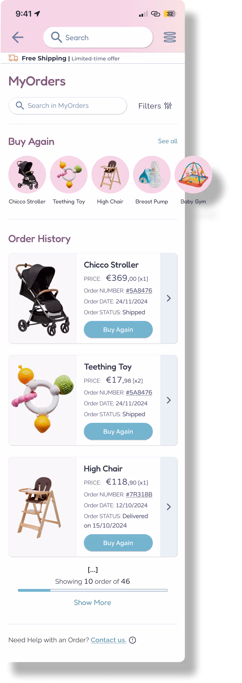
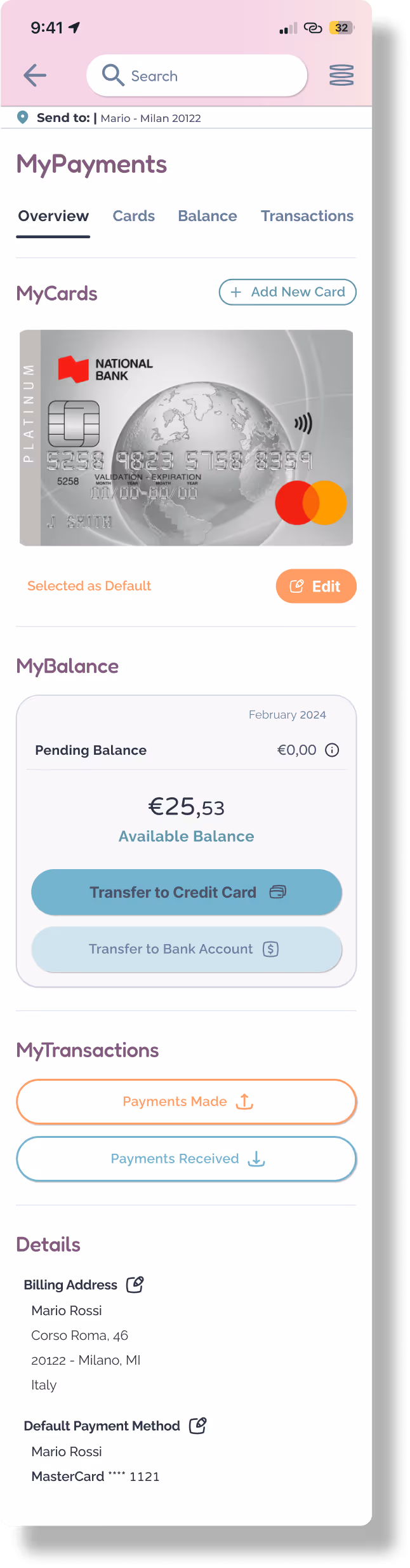
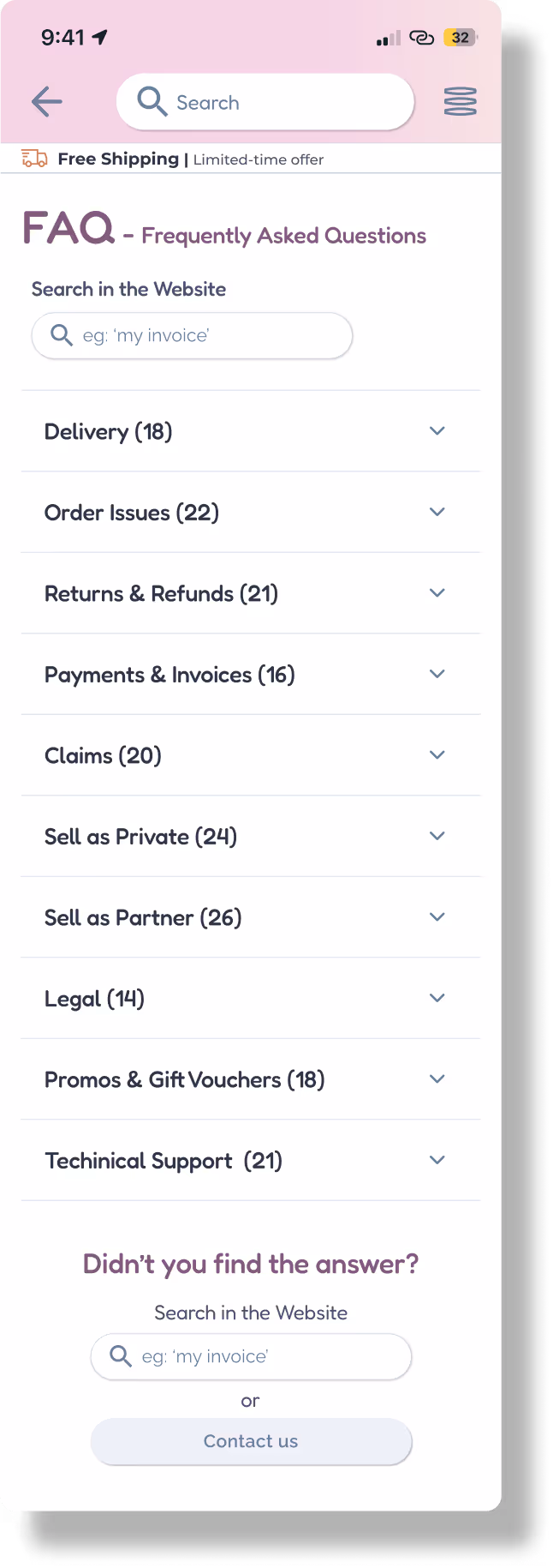
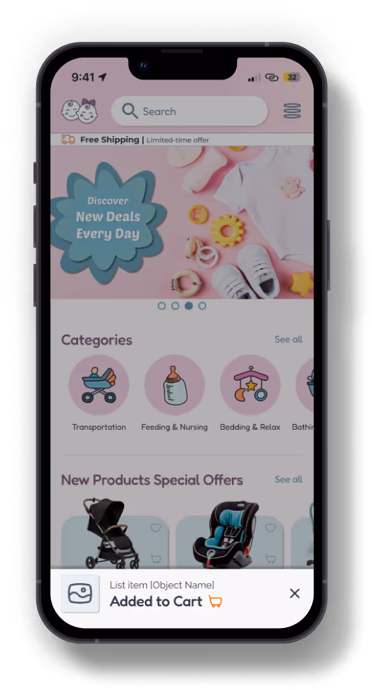
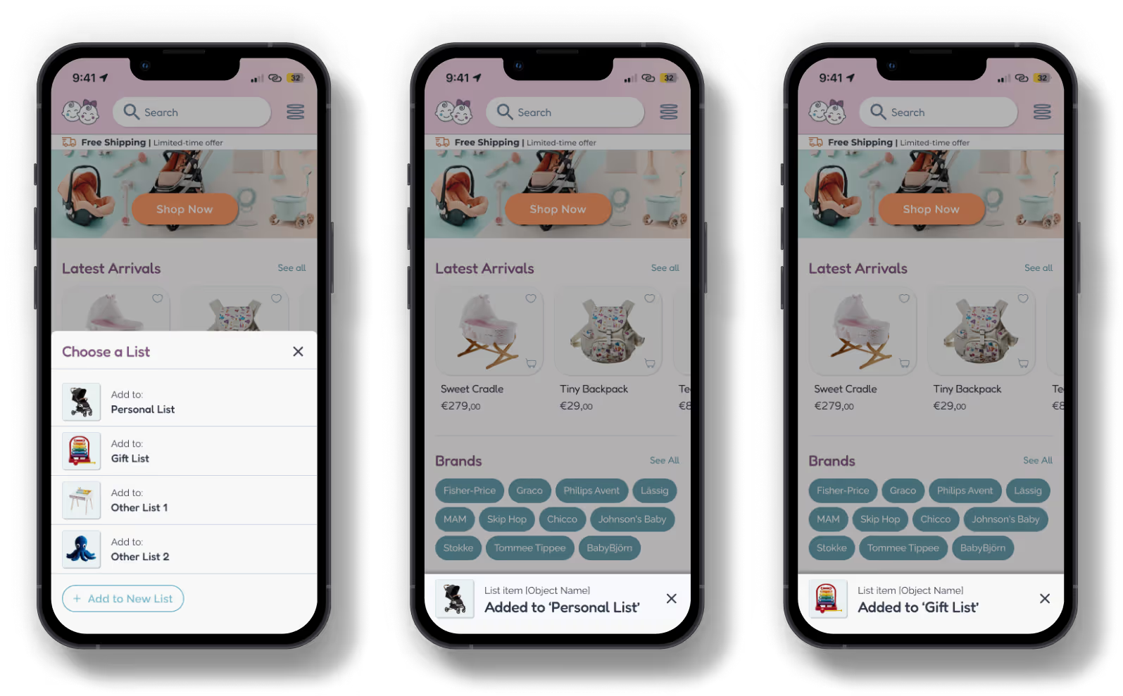
After designing over 75 detailed mockups, it was time to make them move, react, and guide the user journey. Using Figma, I built high-fidelity interactive prototypes to simulate real user flows — from product search to purchase, from selling an item to managing personal settings.
Turning static designs into experiences users can feel and test.
The first real taste of the product experience.


From the clean structure of wireframes to a vivid, engaging interface – mockups are where ideas turn into reality!
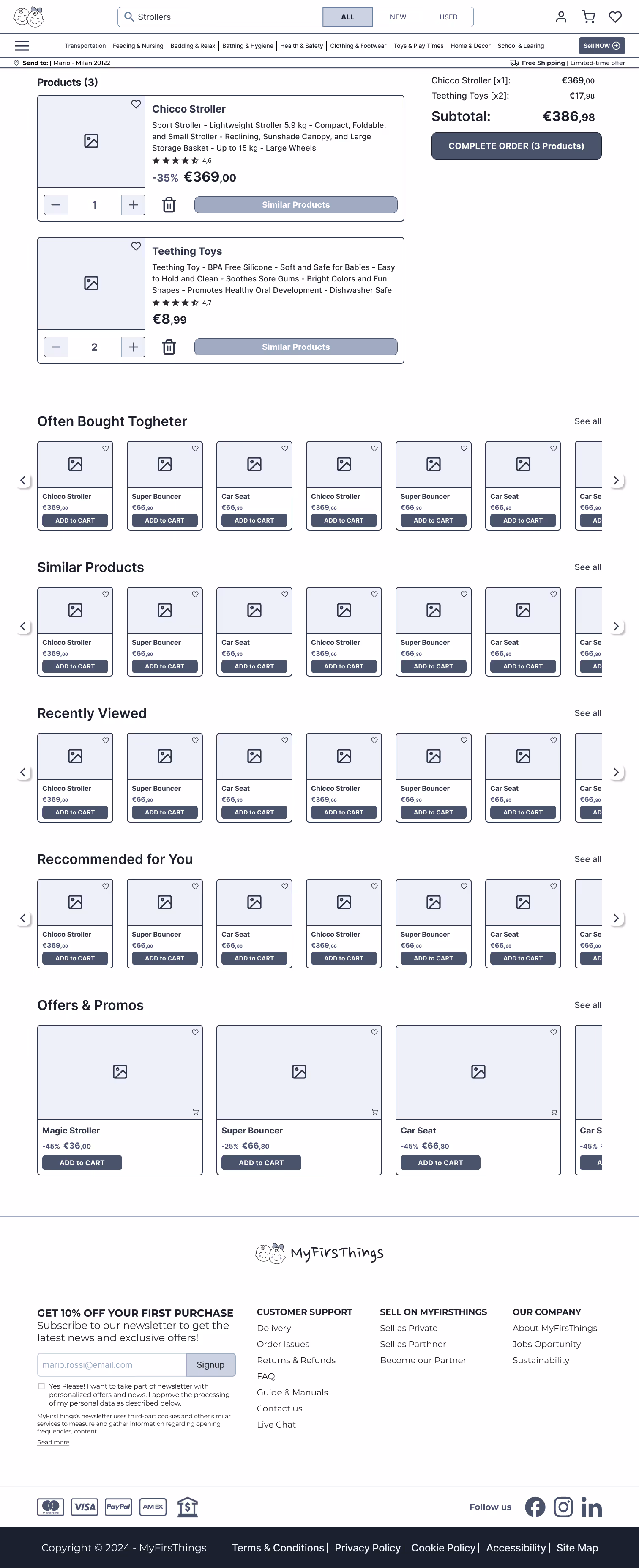
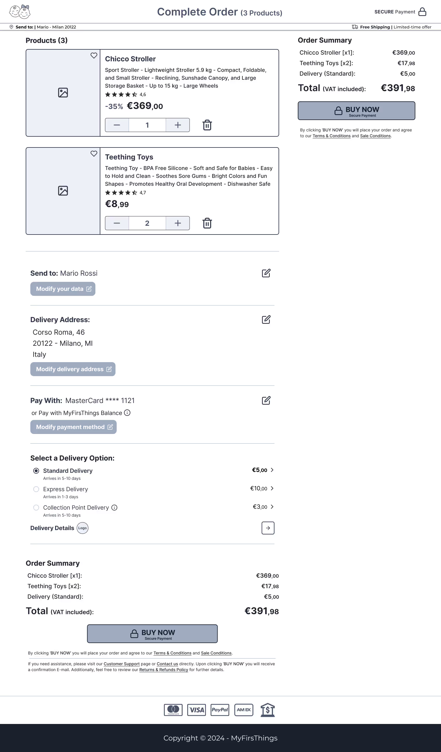
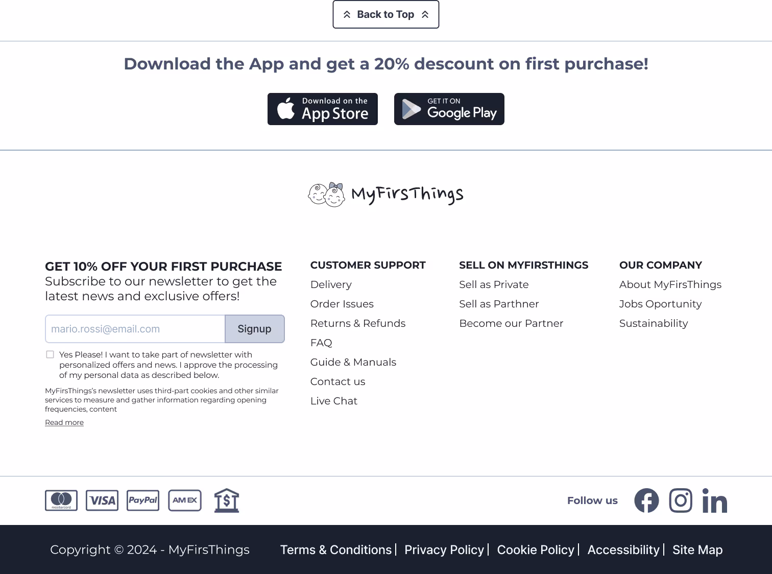
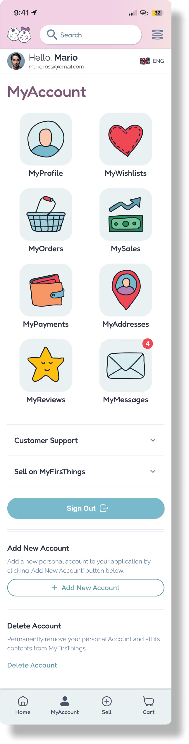
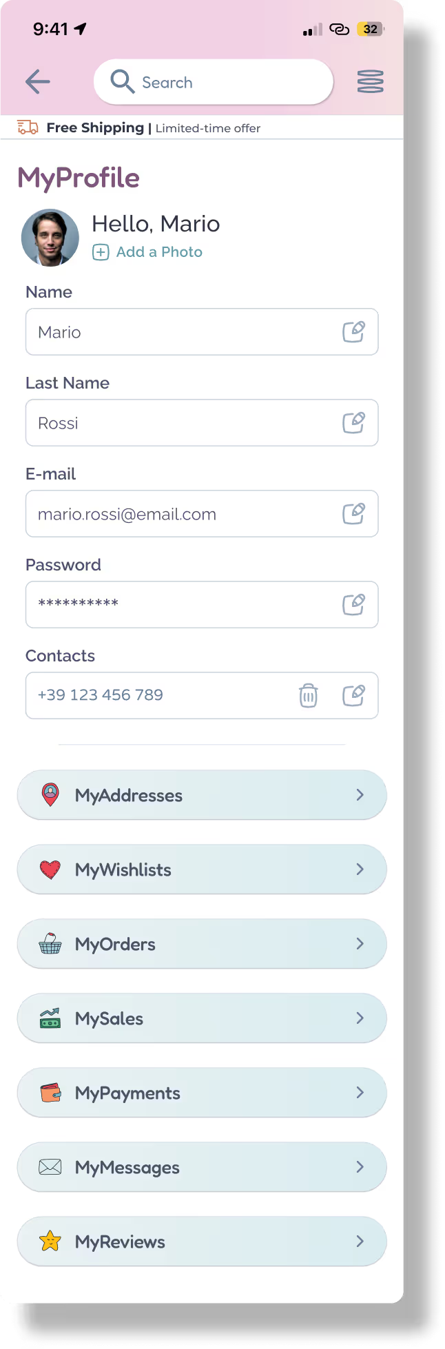
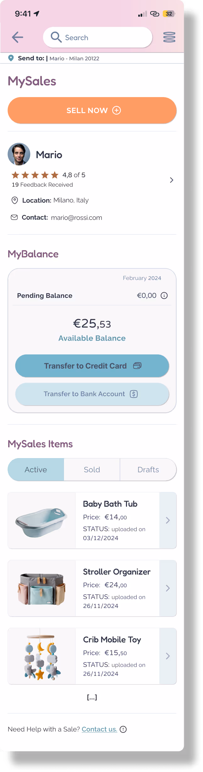
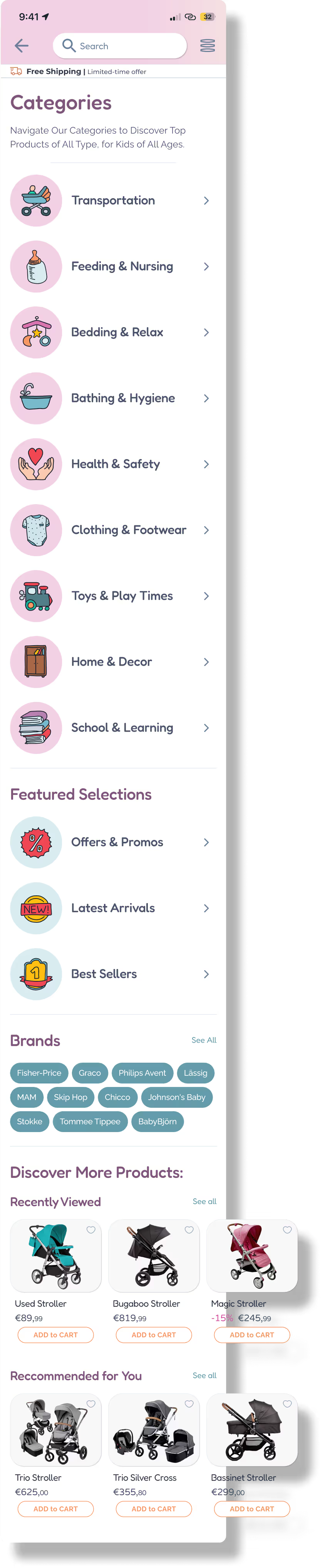
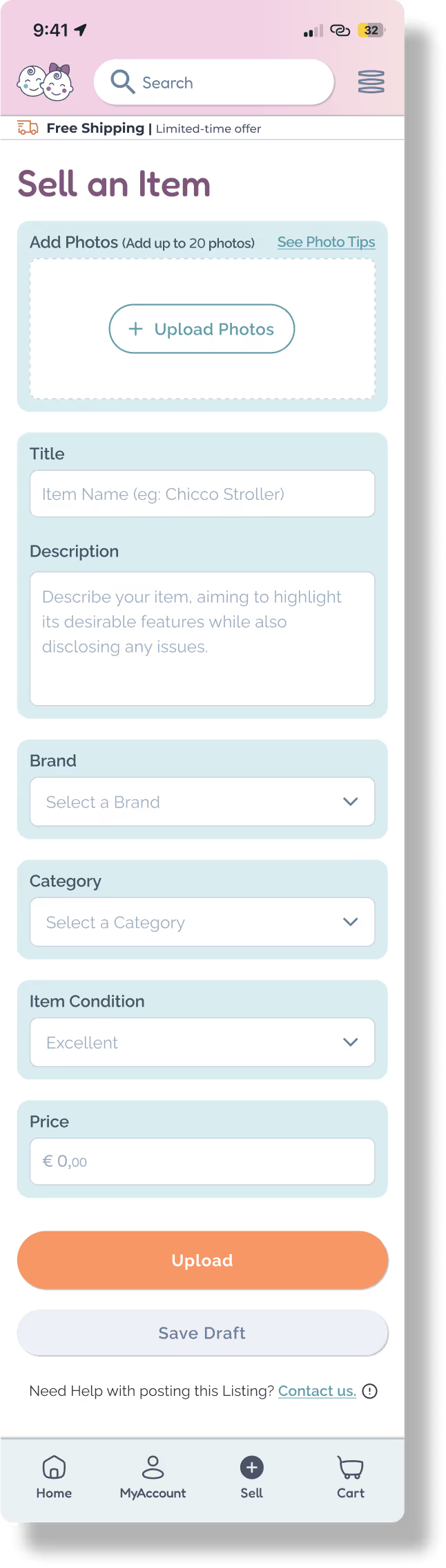
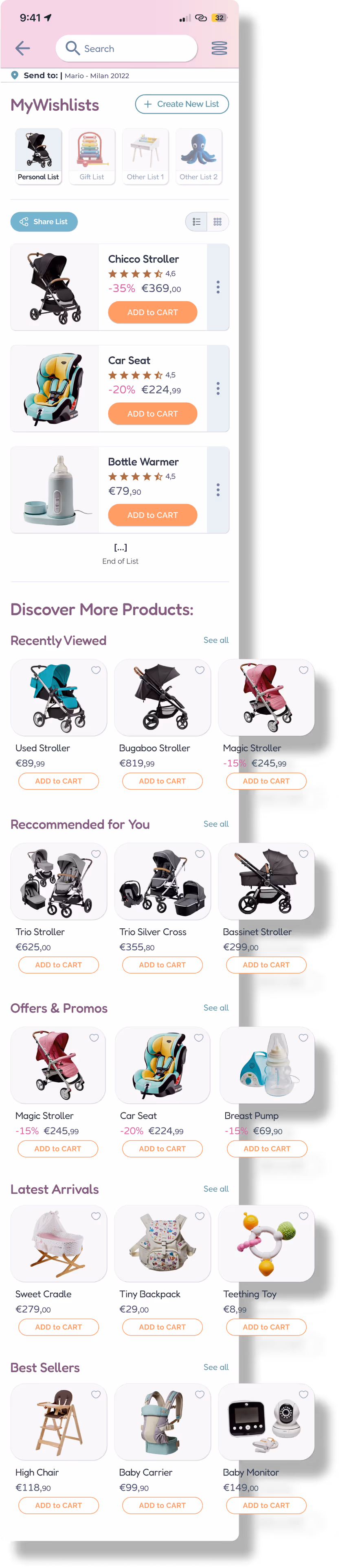
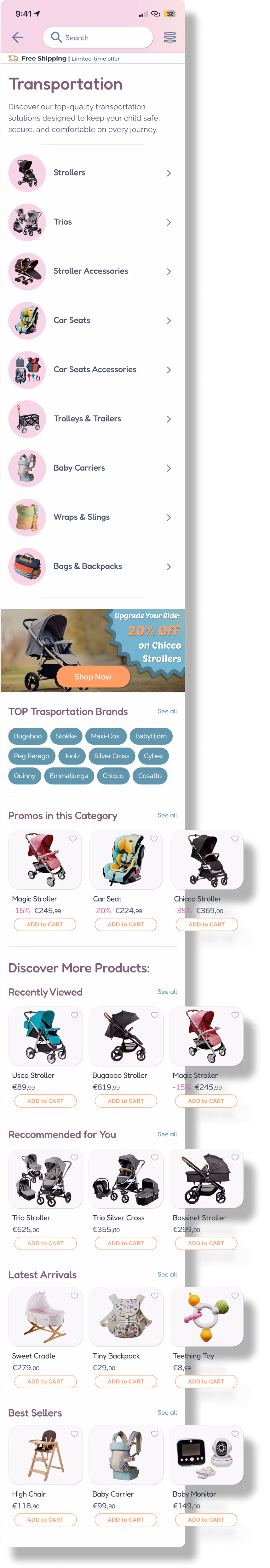
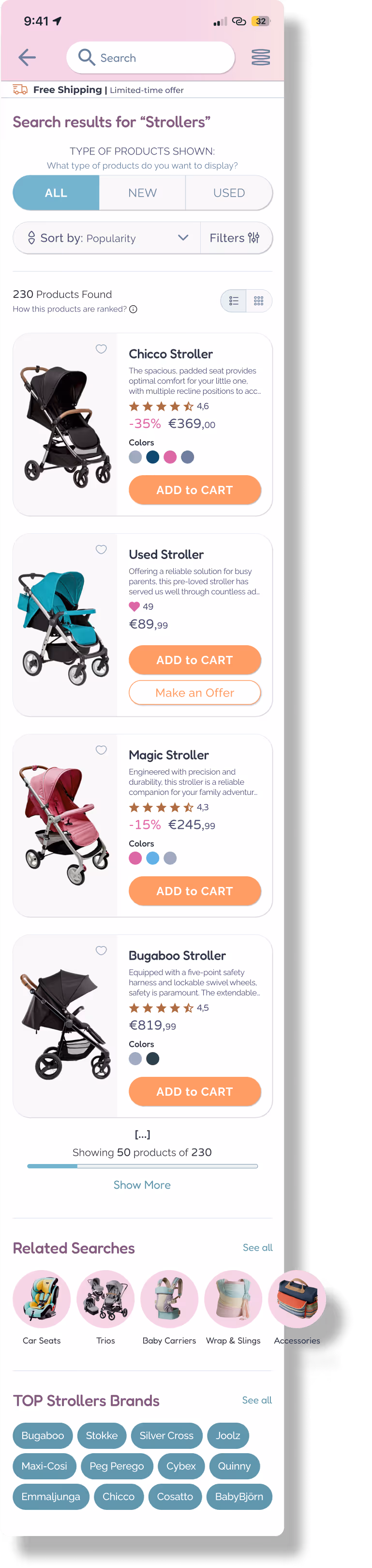
For MyFirsThings, I designed over 75 screens, covering every page and user flow across the platform:
Bridging visuals, functionality, and real-world feedback.
Every screen contributes to a seamless, branded user journey.


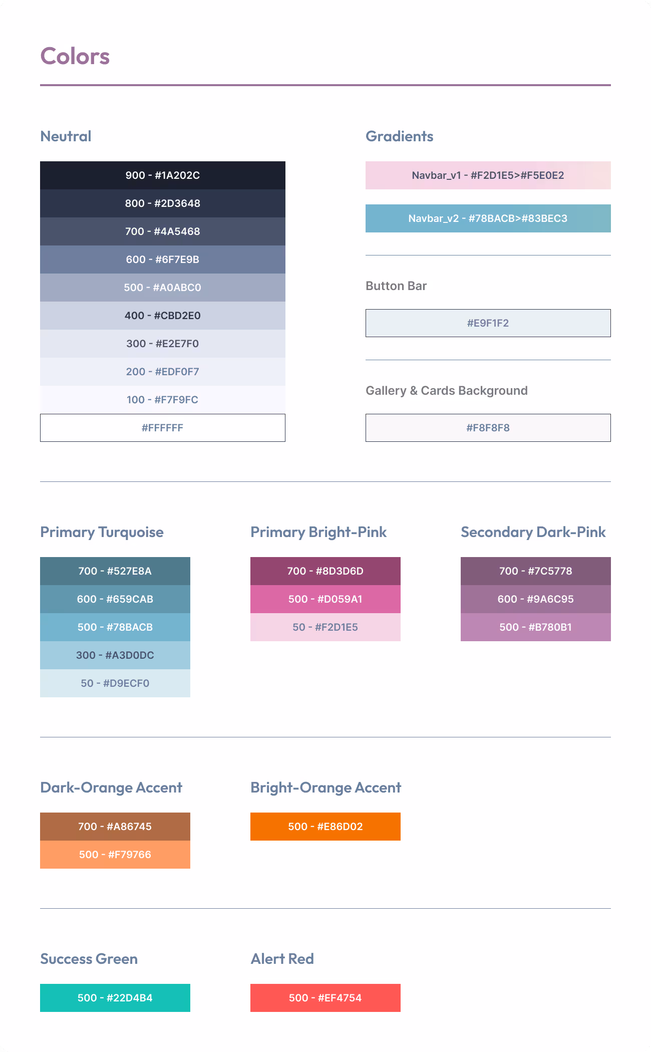
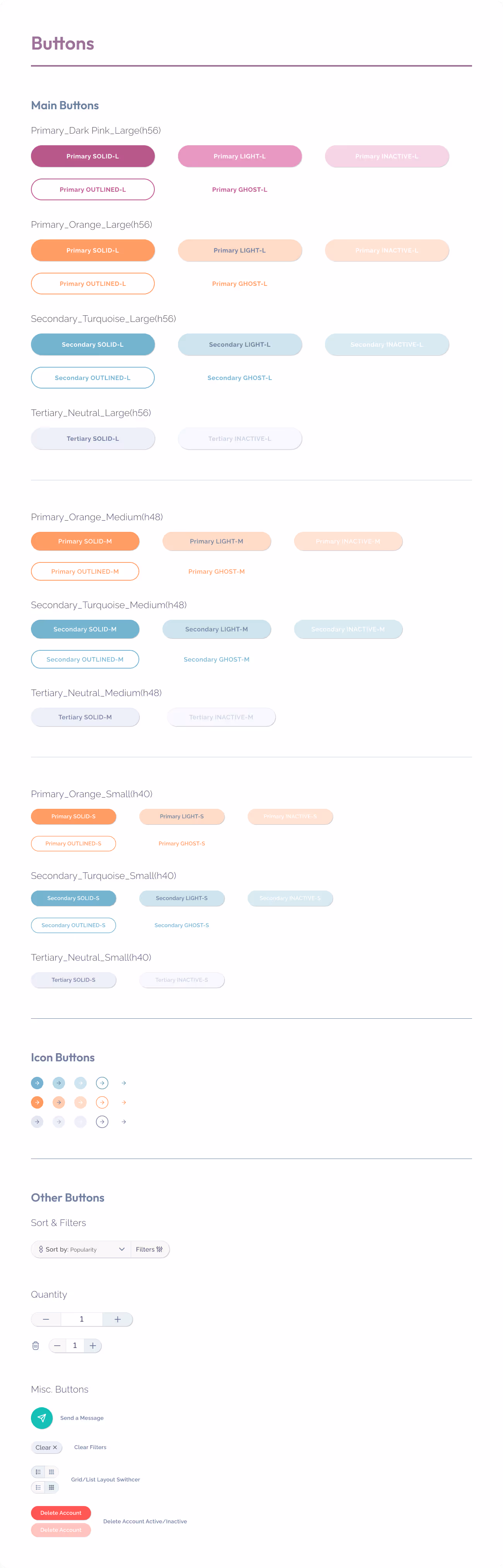
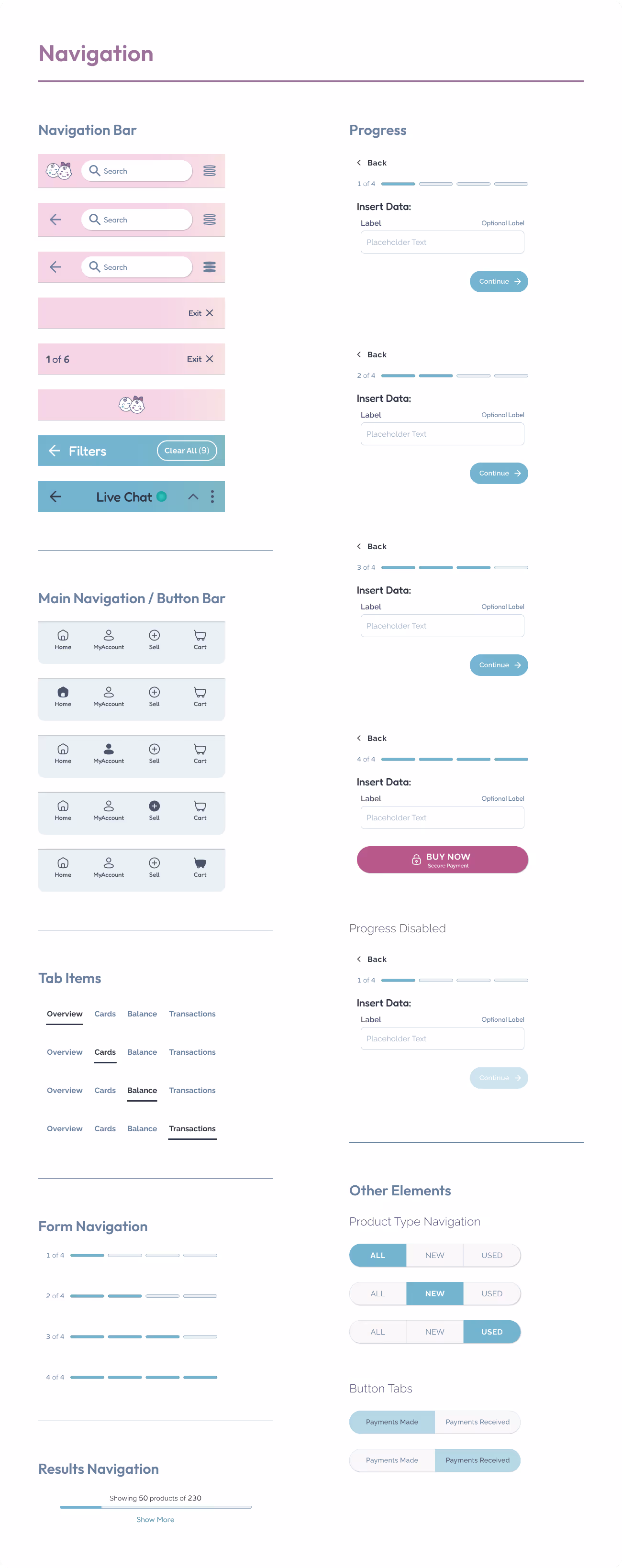
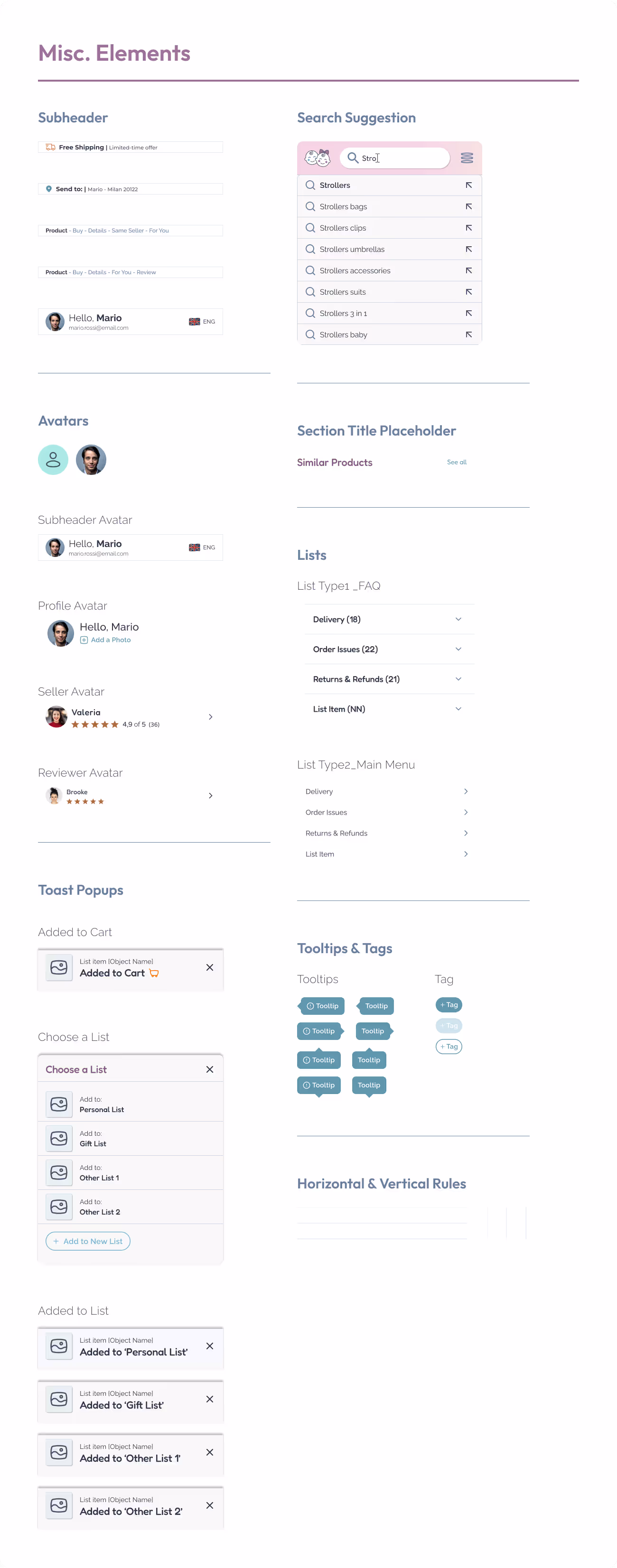
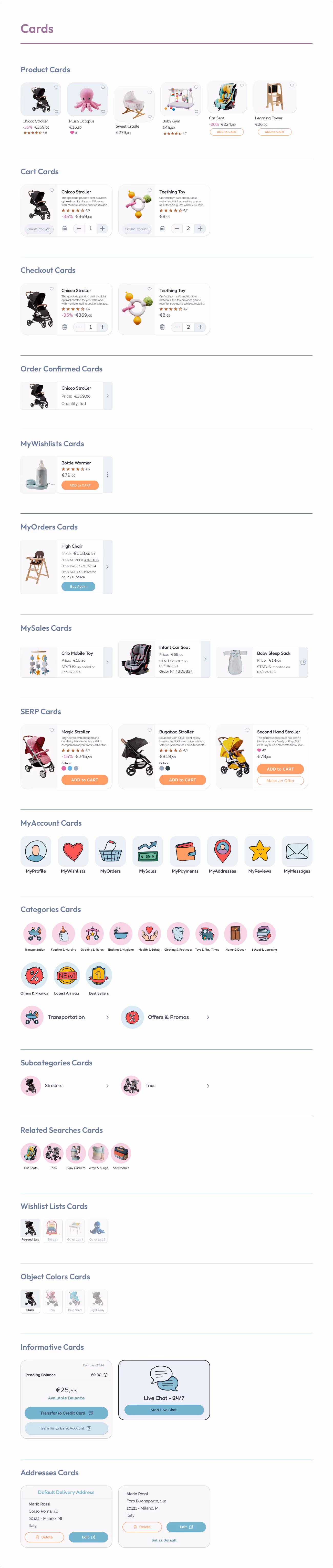
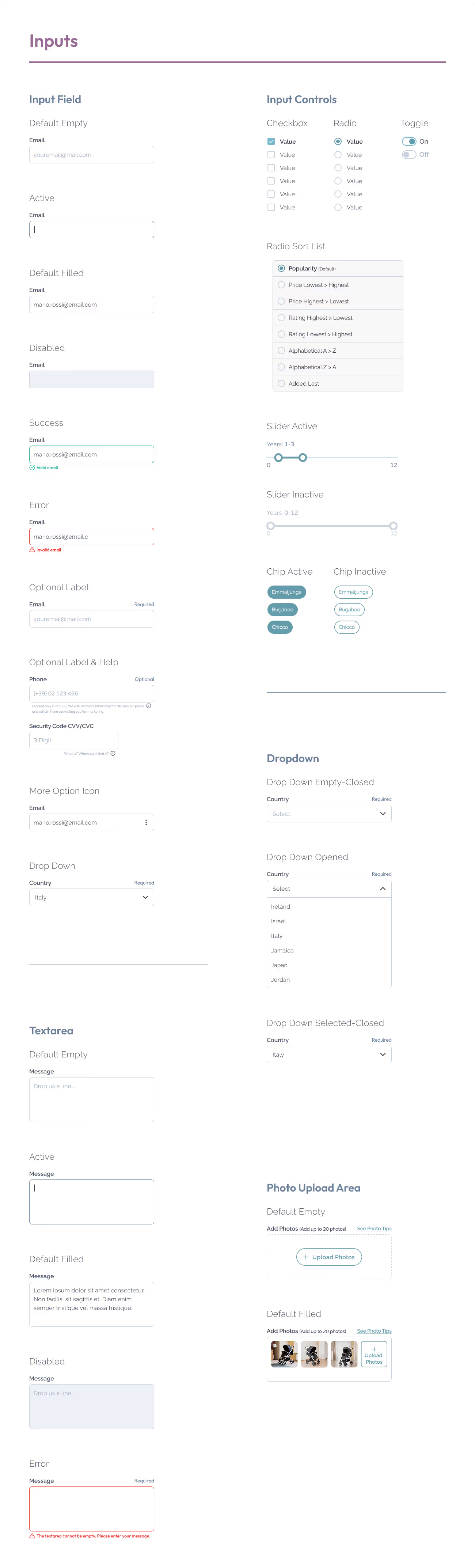
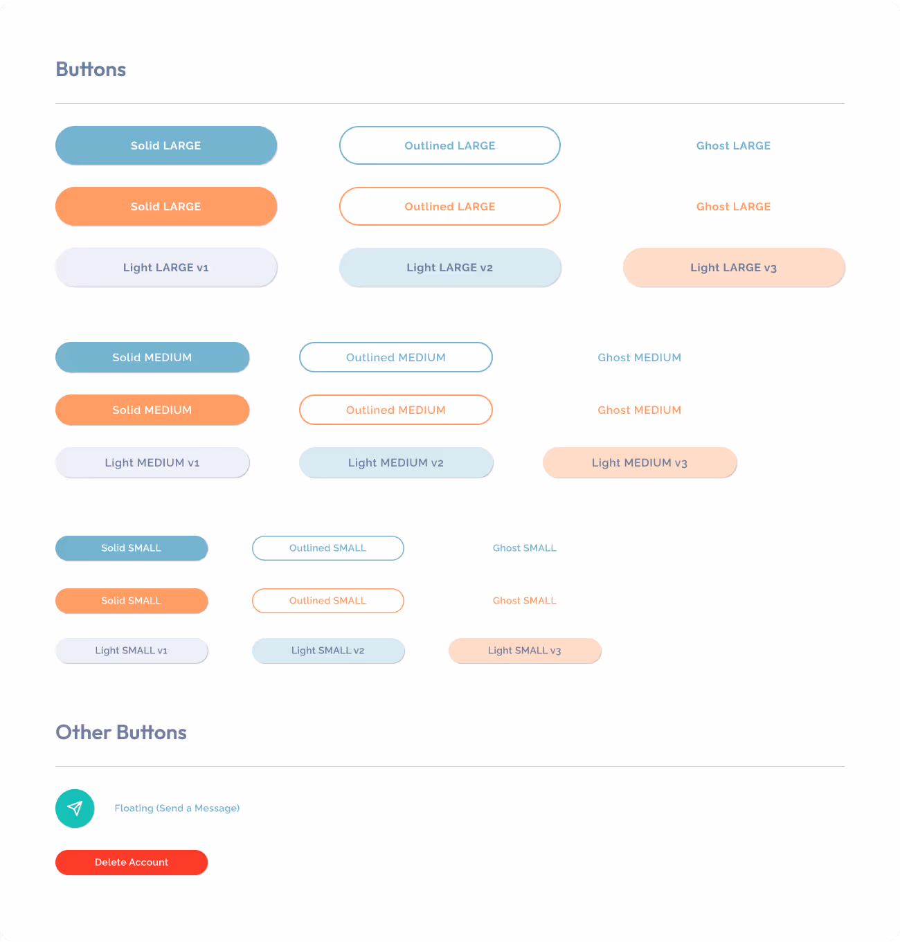
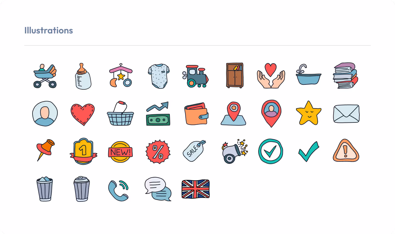
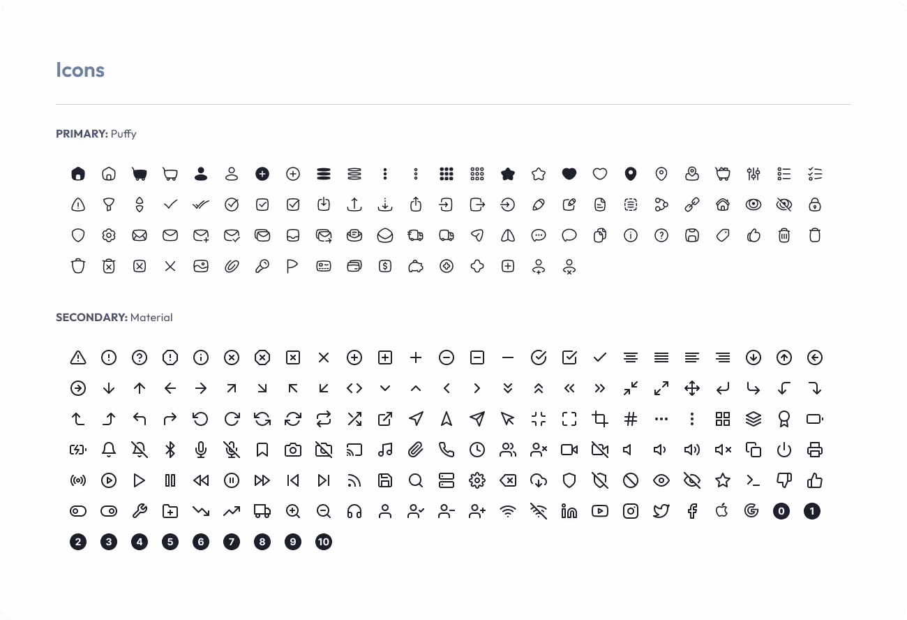
A great interface needs more than good looks — it needs structure, consistency, and clarity. That’s where the Design System comes in! It’s the visual toolbox that keeps every screen aligned, every interaction intuitive, and every pixel on-brand
A well-organized set of reusable components, including:
Making design faster, clearer, and easier to scale.
Designing with systems, scalability, and accessibility in mind.


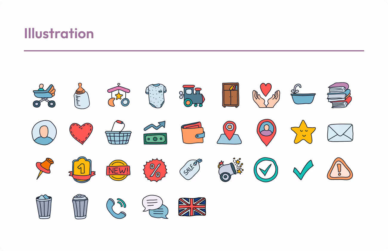

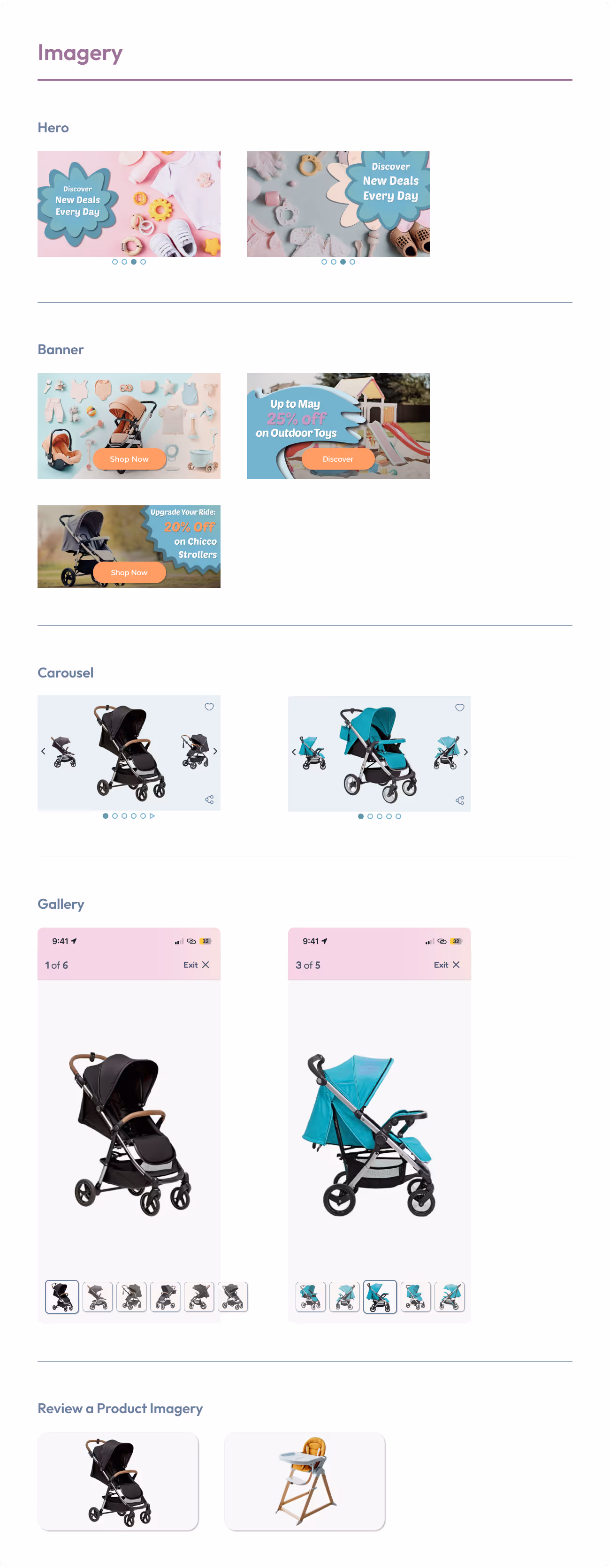
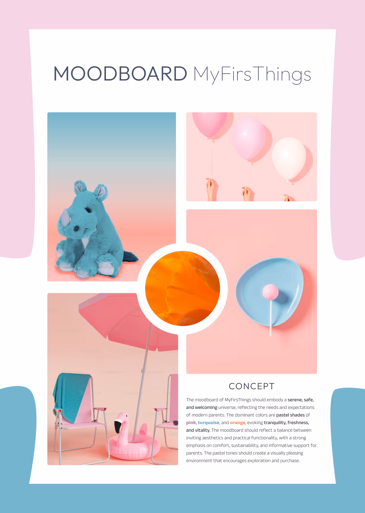
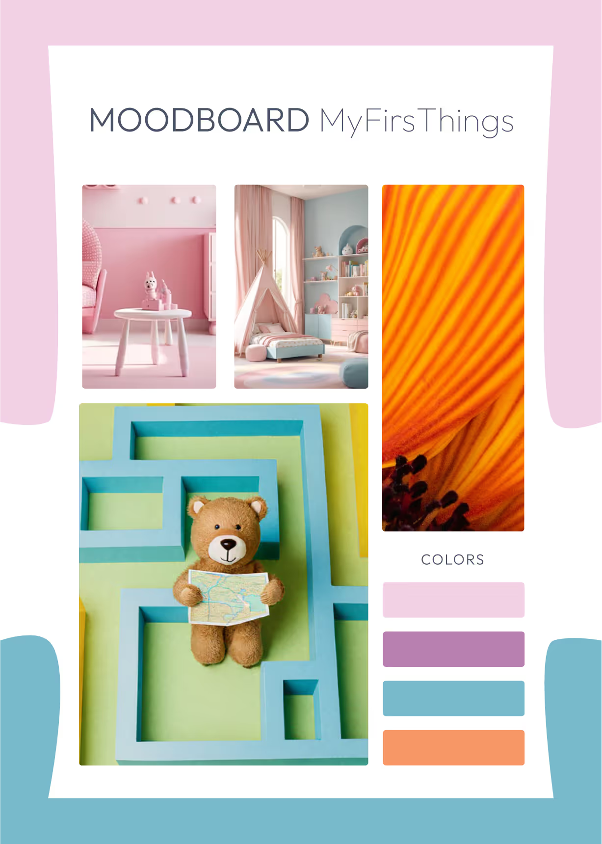
Before diving into colors and components, I crafted a Moodboard to define the emotional atmosphere of MyFirsThings.
A Moodboard isn’t just about aesthetics — it’s a strategic foundation that helps align visuals with the brand’s tone, target users, and product values.
The visual universe I created blends serenity, trust, and joy — the core feelings for a platform dedicated to children and parents.
The result? A visual guide that feels safe and soothing for little ones, and reliable and modern for their parents.

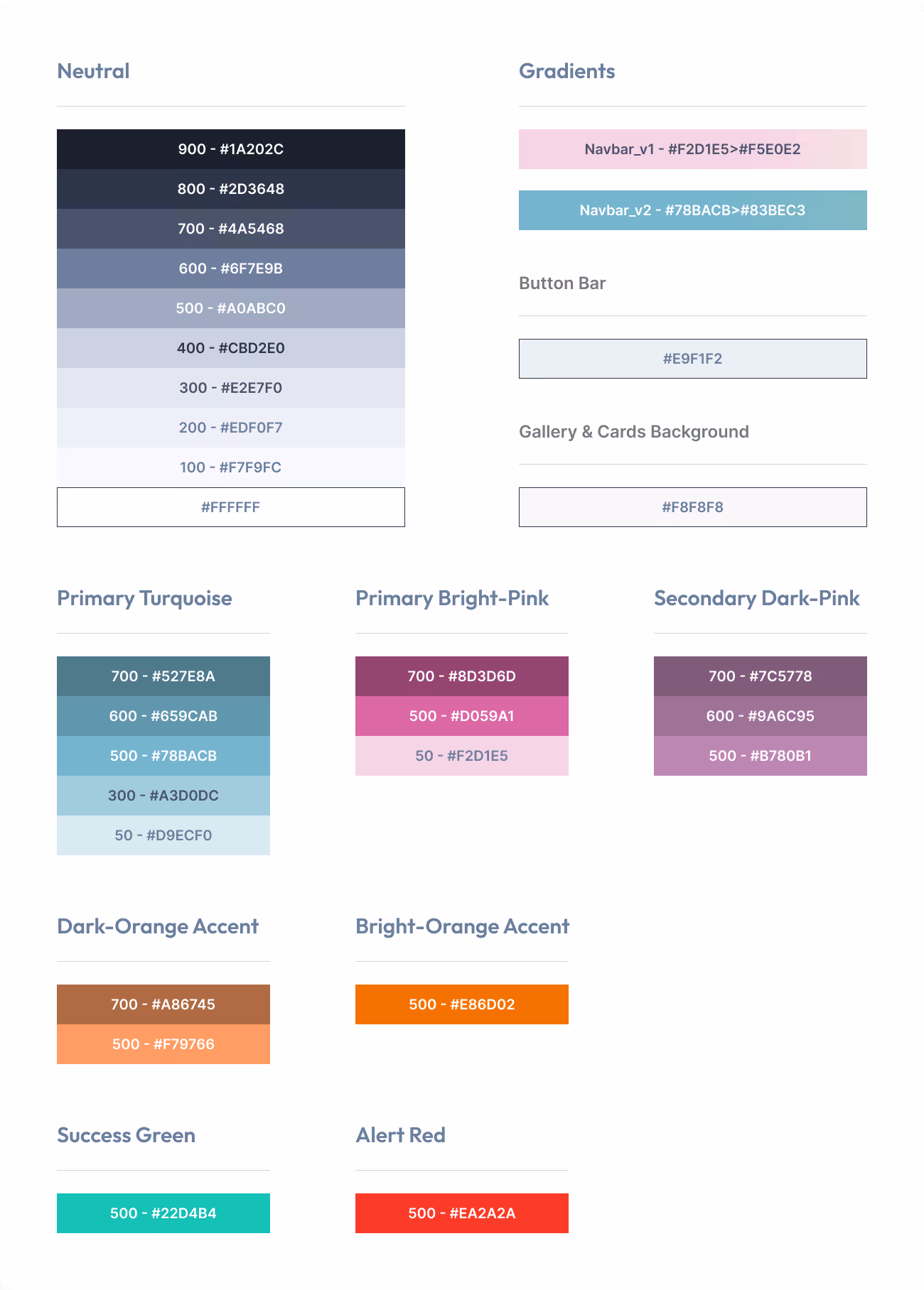
Design without consistency is just decoration. That’s why I created a Style Guide — a visual compass that ensures every element of MyFirsThings speaks the same language, across screens and situations
A solid Style Guide is essential to:
Turning brand values into clear, consistent, and usable design elements.


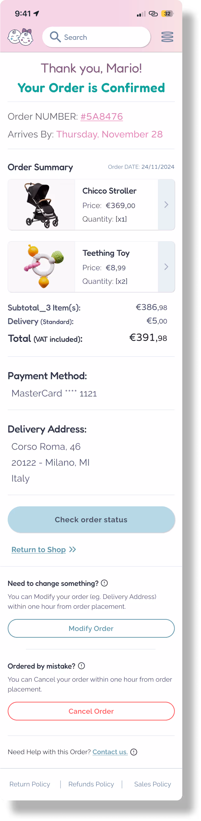
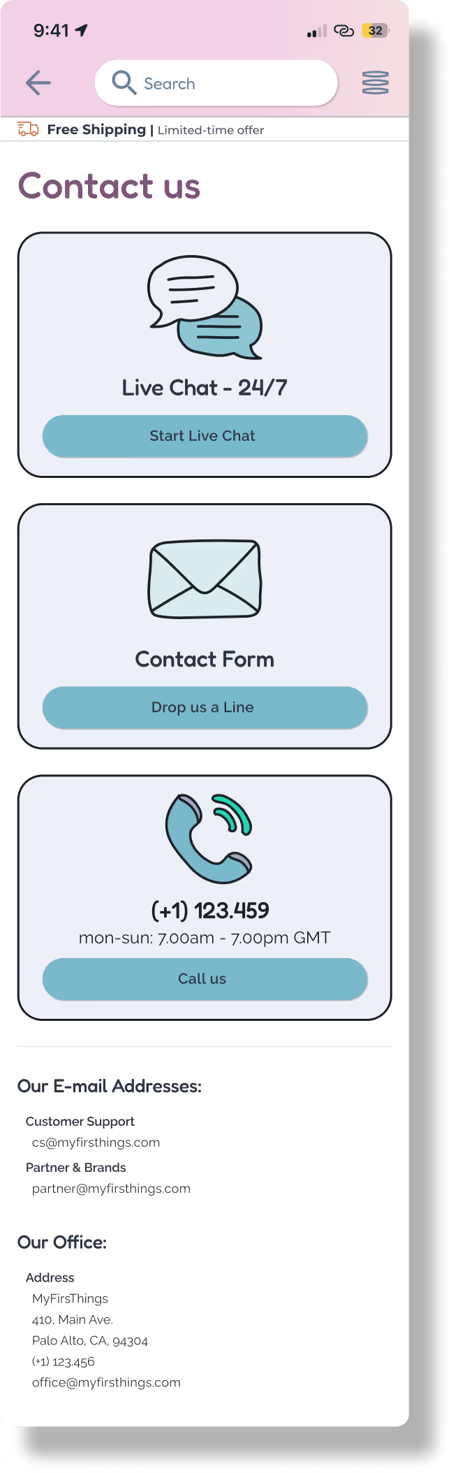
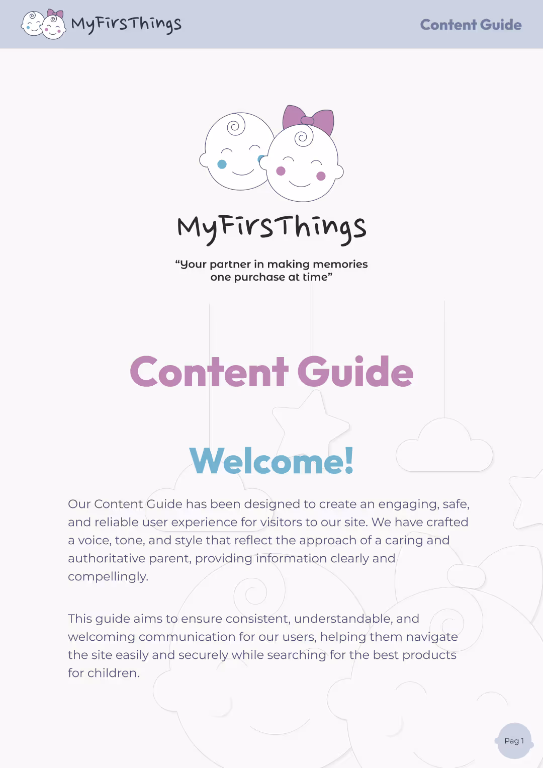
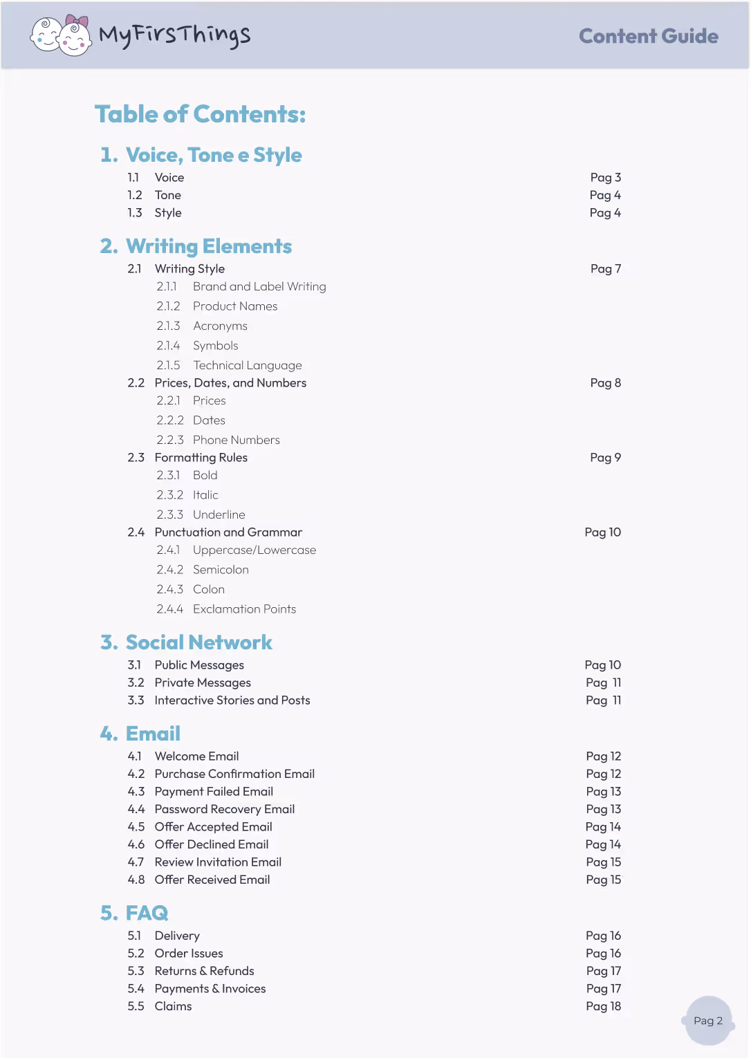
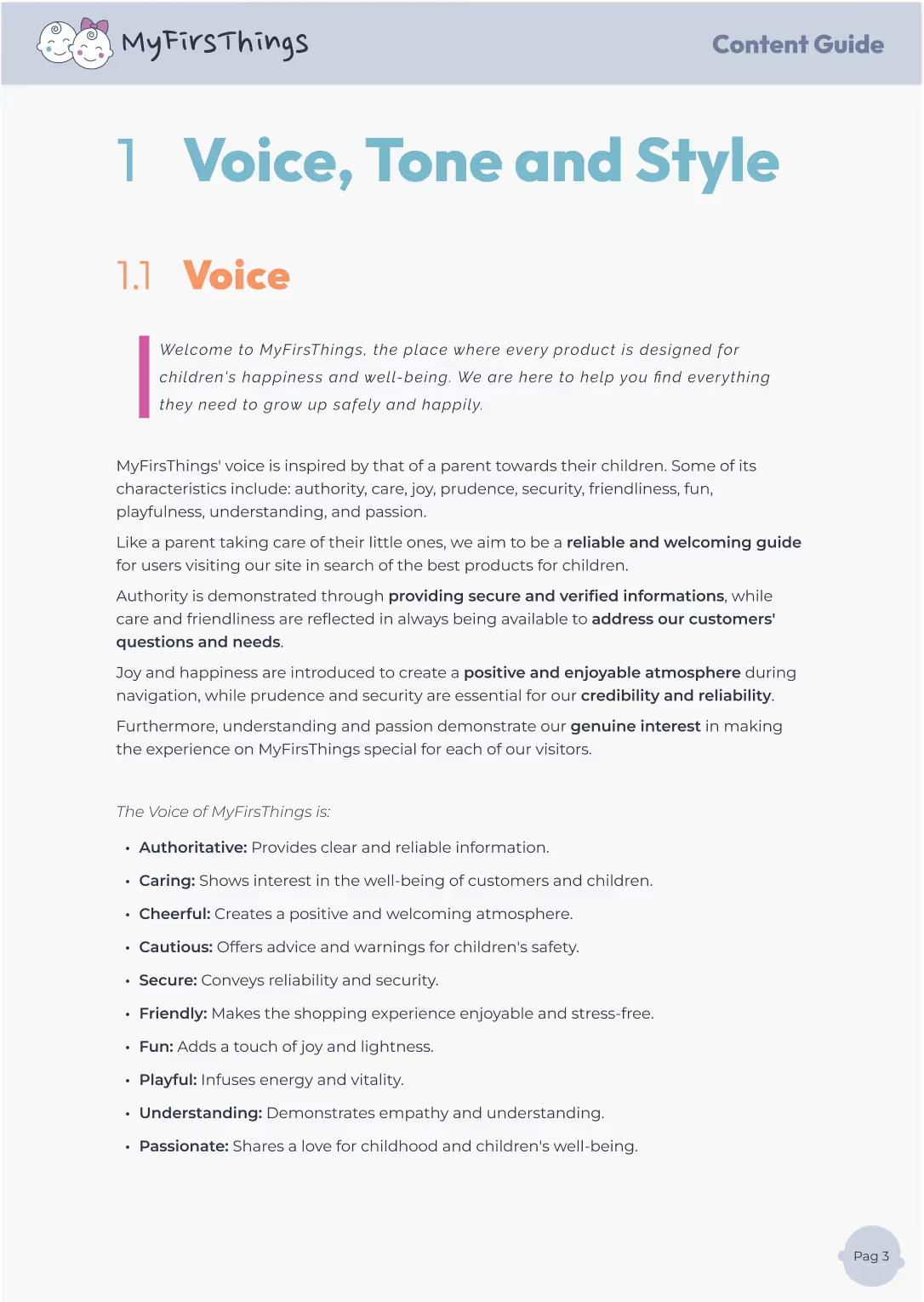
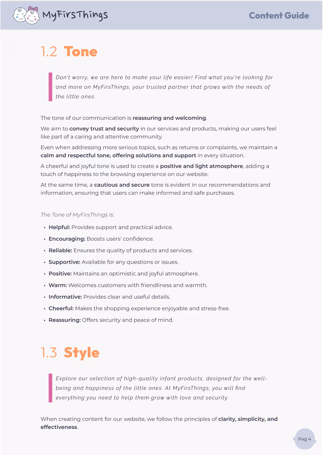
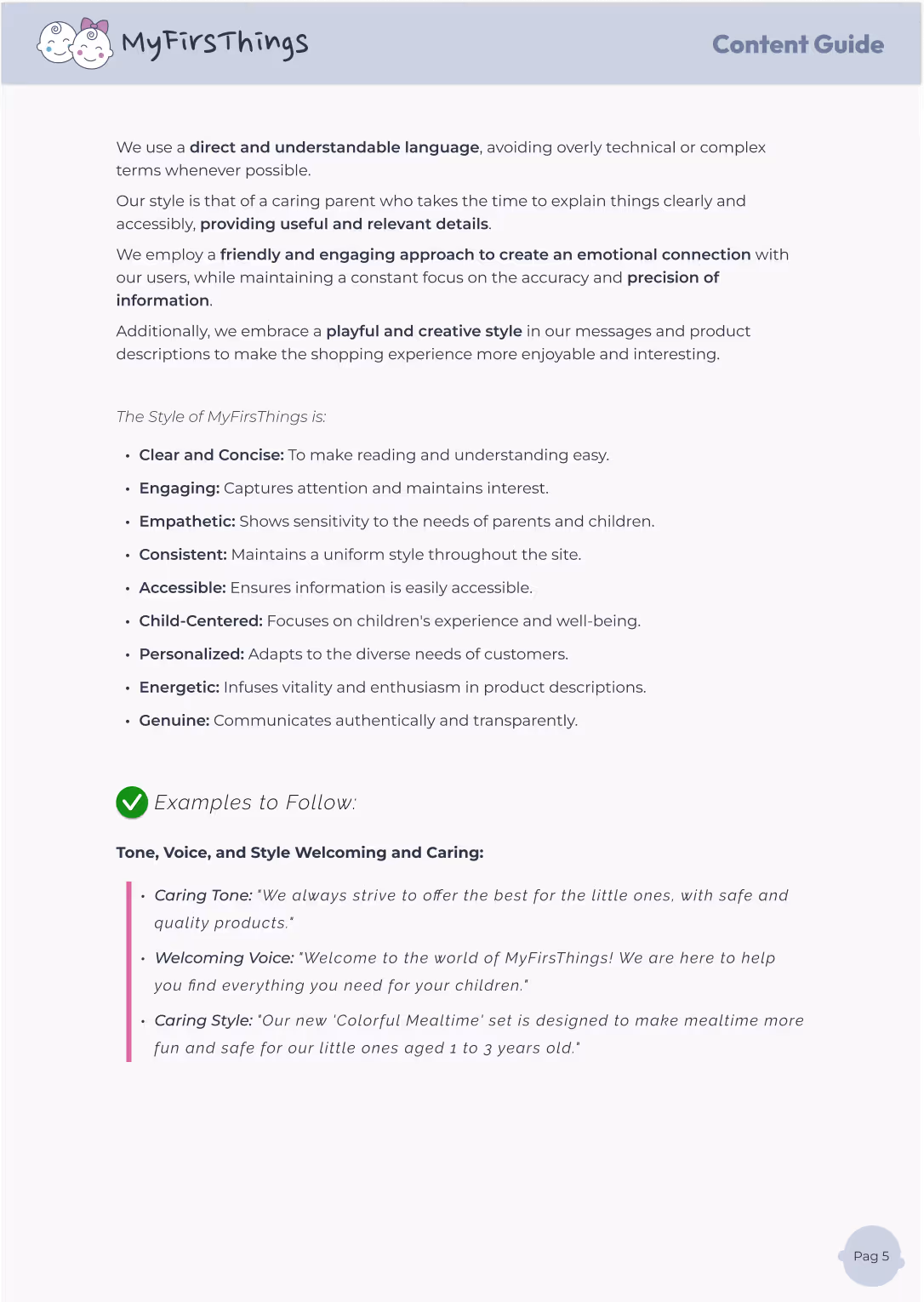
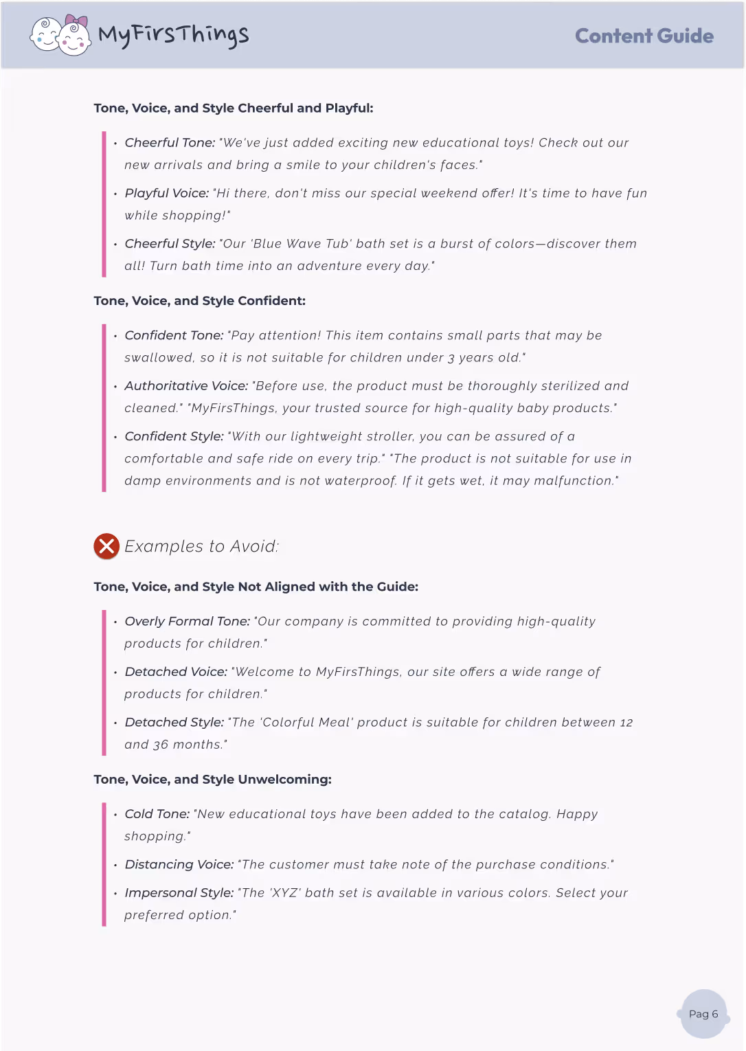
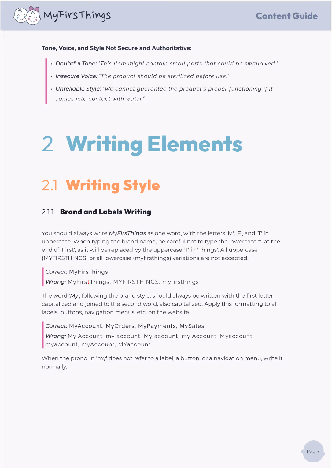
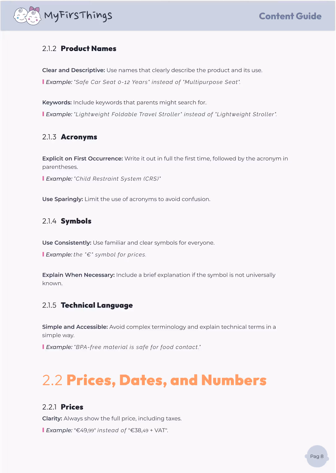
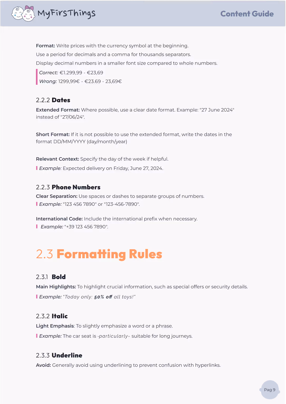
Words matter — especially when you're speaking to parents making decisions for their children. That’s why I created a Content Guide that helps MyFirsThings communicate in a voice that’s clear, helpful, and human.
This guide sets the tone for all types of content, from product names to social media captions, ensuring everything we write reflects the brand’s personality: trustworthy, friendly, and easy to understand.
Simple language, clear product names, thoughtful use of symbols and acronyms
Ensuring clarity, coherence, and a unified voice across every screen and interaction.
Ensuring UX speaks clearly, consistently, and on-brand.


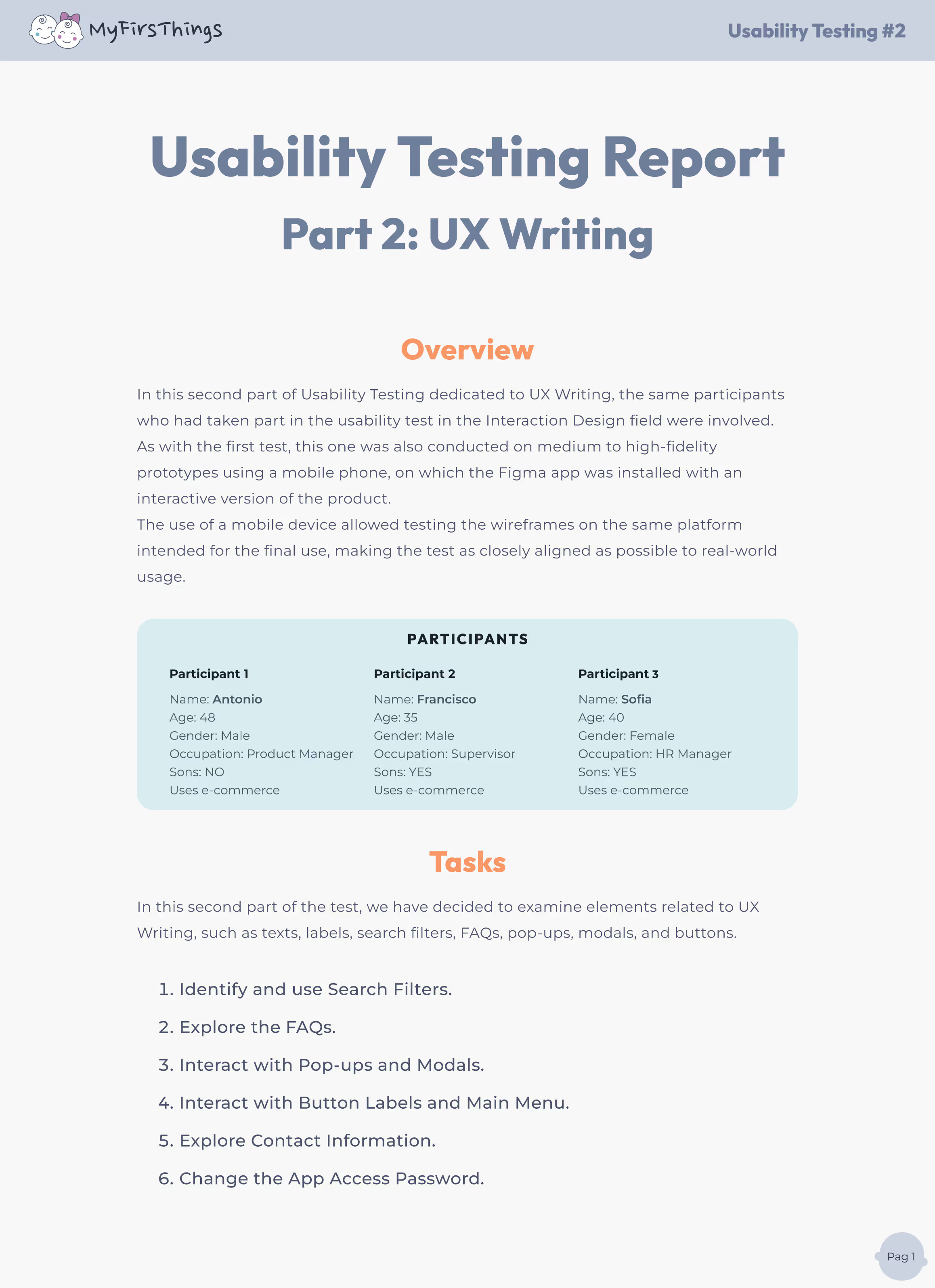
After testing the flow and interactions of MyFirsThings, it was time to dive into the details that guide, support, and reassure users: the words.
This second phase of usability testing is focused on UX Writing — from filter labels to FAQs, button text, pop-ups, and contact information. We wanted to assess whether the copy was clear, helpful, and aligned with users’ expectations
Because great design needs great communication. Even the smoothest interaction can fail if the message isn’t clear or shows up at the wrong time
Using the same mid-to-high fidelity prototype on a mobile device, we ran task-based testing with users already familiar with the platform, ensuring insights were contextual and accurate.
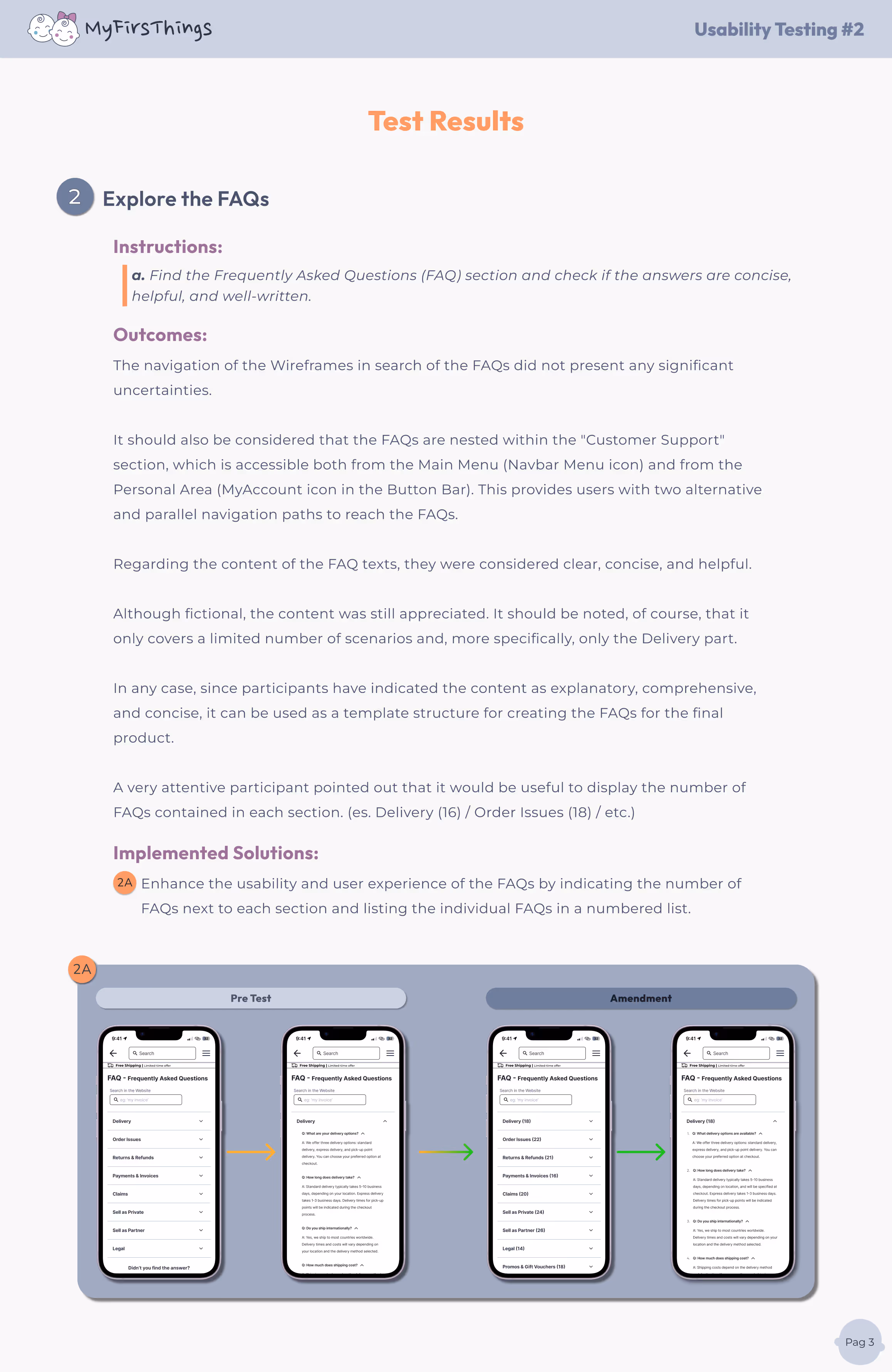
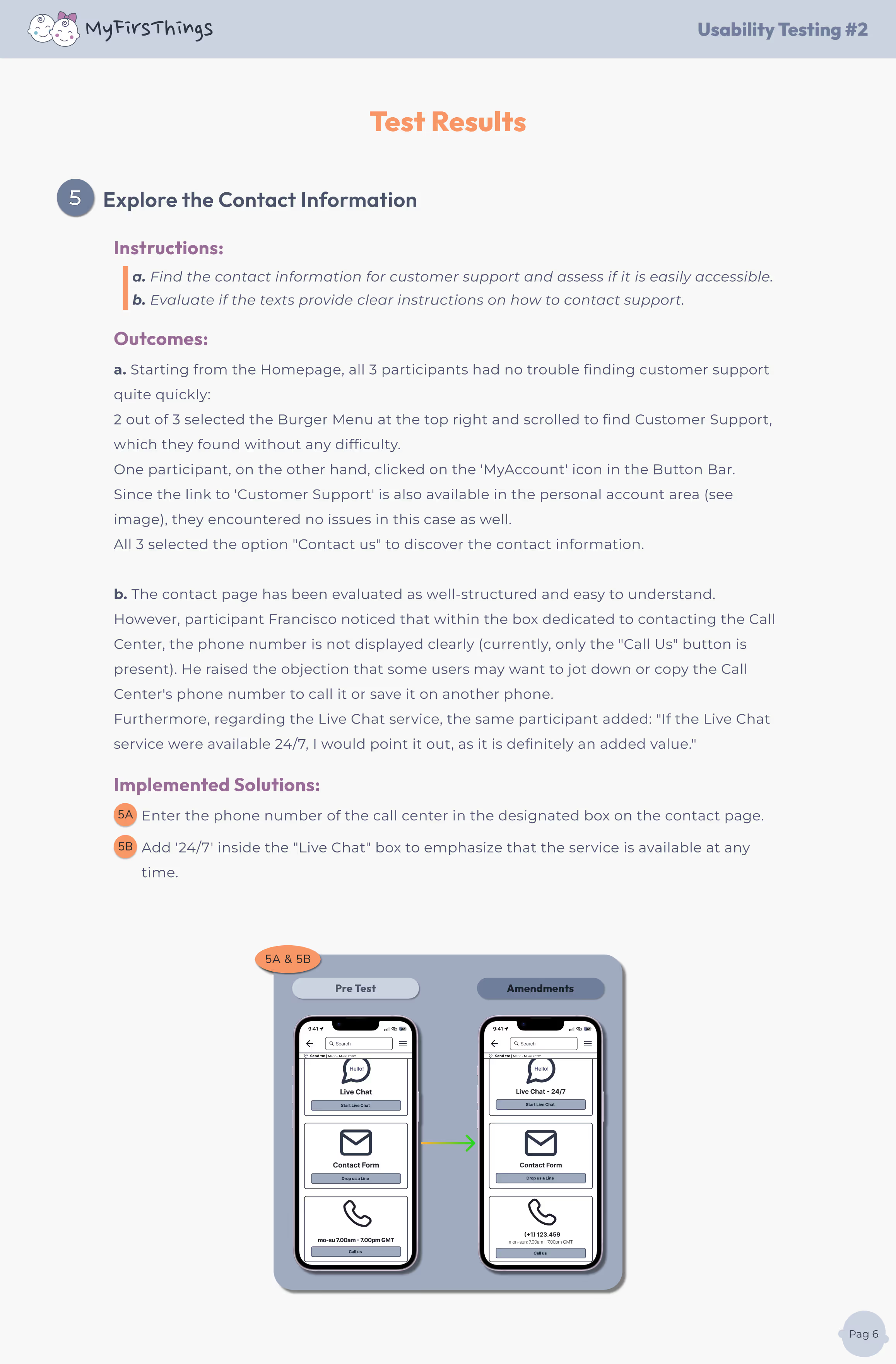
Small changes in words can have a big impact on usability and clarity.
I saw firsthand how the right words improve understanding, reduce friction, and support user confidence. Writing for UX is not about being clever — it’s about being clear, helpful, and human.

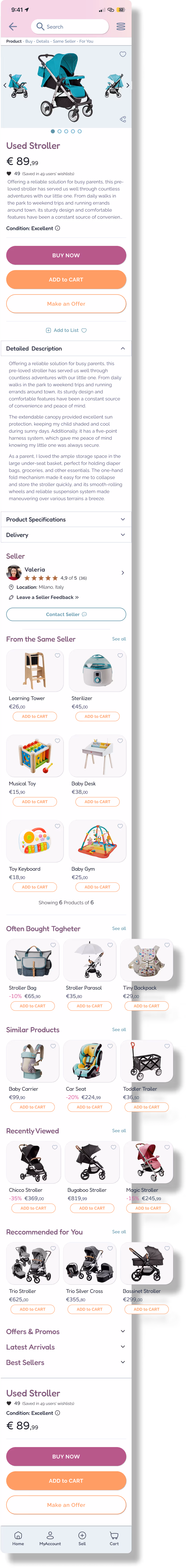
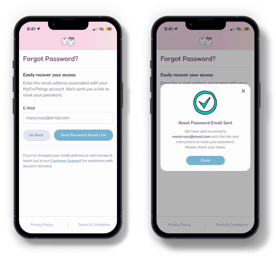
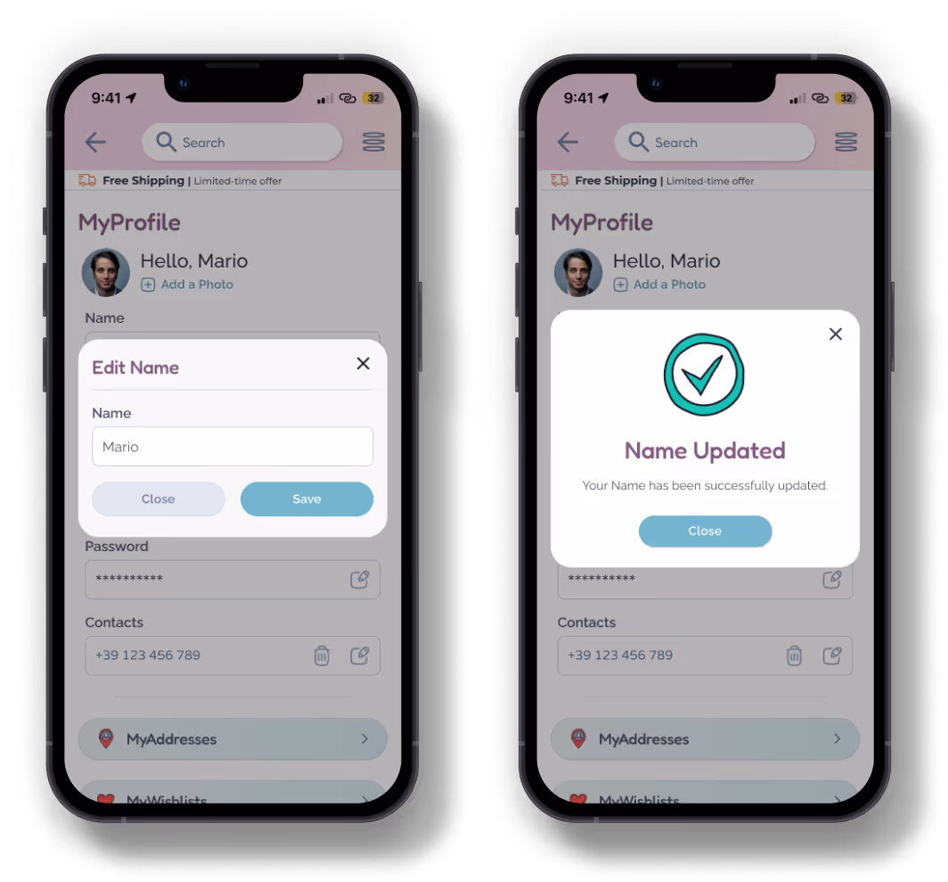
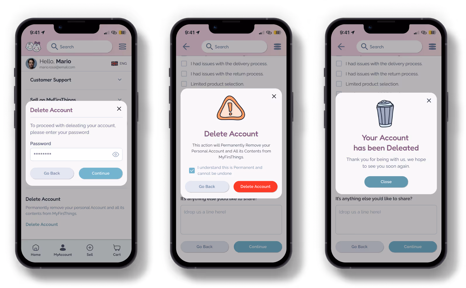
In the digital world, even the tiniest words make a big impact. Microcopy is the short text—buttons, error messages, tooltips, labels—that guides users through an interface, offering clarity, building trust, and creating a smoother, more human experience.
Microcopy is the invisible layer of design that speaks directly to users, turning every click into a clear, confident step forward.
For MyFirsThings, I carefully crafted microcopy to:
You’ll find all microcopy examples in the mockups and prototypes, where every word is designed to make parents feel right at home—from the very first click!

