
Designing an accessible, inclusive eLearning platform for a government context, from research to interactive prototype.
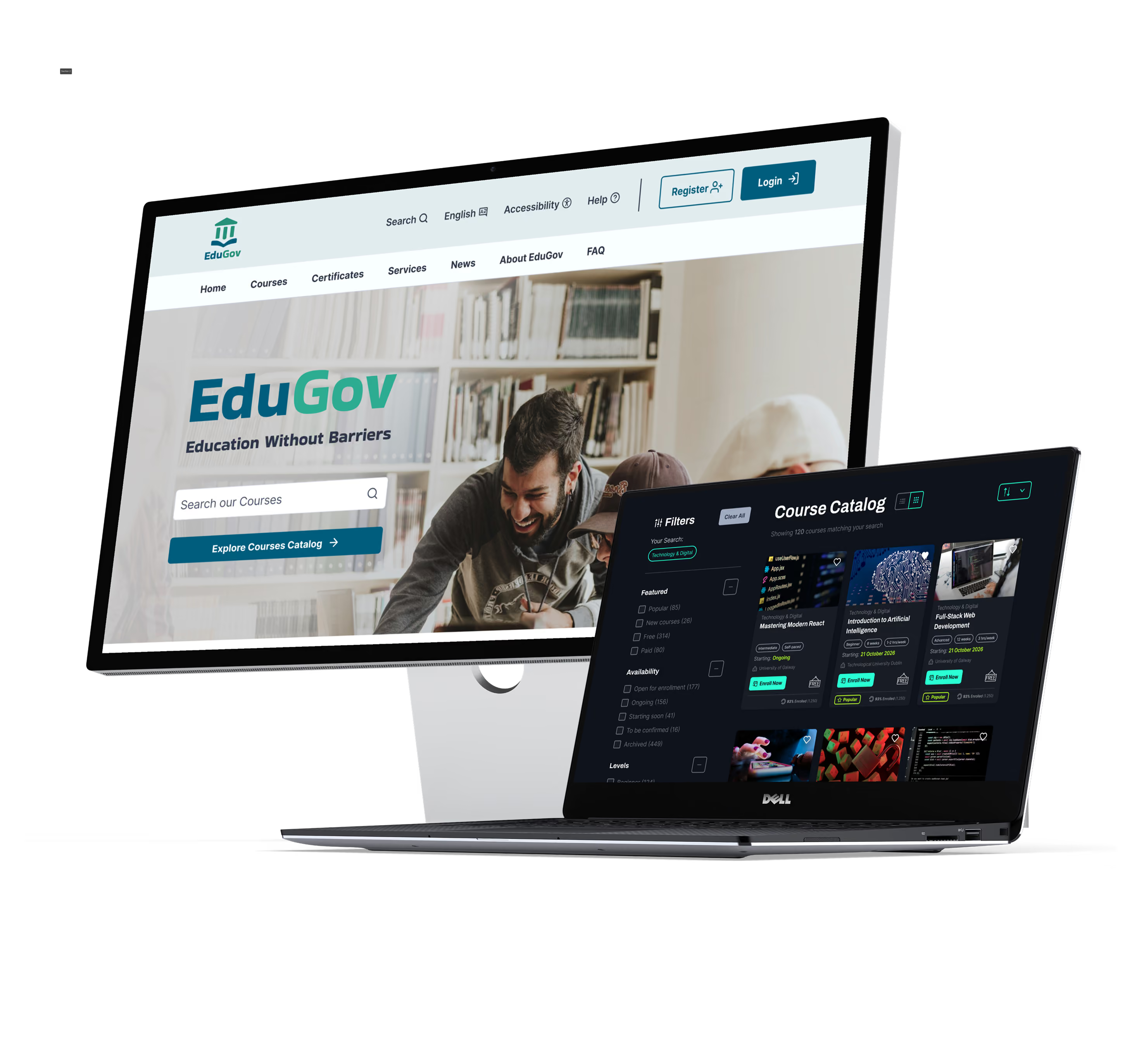
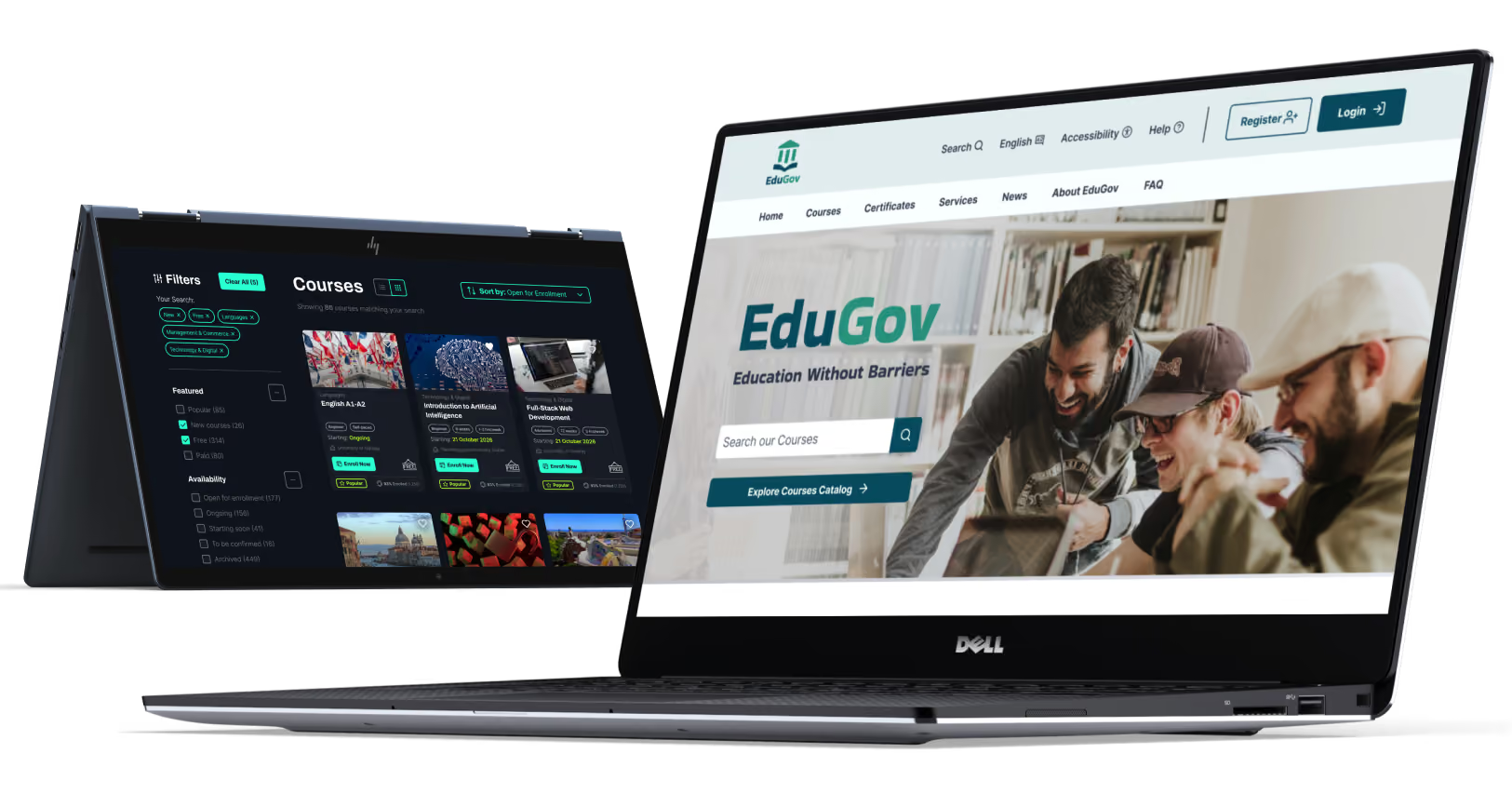
From digitally literate professionals to users accessing public services for the first time.
WCAG 2.1 AA compliance as a non-negotiable requirement, not an afterthought.
Balancing government authority with an inclusive, encouraging learning experience.
From registration to certification, every touchpoint carefully designed and considered.
Balancing government authority with an inclusive, encouraging learning experience.
From registration to certification — every touchpoint designed with care.
From digitally literate professionals to users accessing public services for the first time.
WCAG 2.1 AA compliance as a non-negotiable requirement, not an afterthought.

Personas, customer journey maps and service blueprints, built to understand the user base and map the end-to-end service.
IA, user flows, wireframes, key design decisions and usability testing, forming the full design process from structure to validation.
Course cards, error handling, registration and login forms, navigation and sidebars, key components designed and documented in detail.
Full WCAG 2.1 AA compliance across all components
Screens designed and annotated across 8 key flows
Documented design decision rationale documents

Wants to manage government services online independently and stay connected with her grandchildren through video calls.
Struggles with small fonts, poor contrast, and cluttered interfaces. Relies on screen readers, so unlabeled content becomes inaccessible.
Uses high-contrast themes, screen readers, and keyboard navigation instead of a mouse.

Wants to improve her English skills and gain civic knowledge to settle into life in Ireland.
Long, dense paragraphs increase cognitive load. Inconsistent navigation and buried instructions cause confusion.
Uses dyslexia-friendly fonts, text-to-speech, and chunked, step-by-step content.

Wants to complete civic knowledge courses to prepare for Irish citizenship and strengthen his integration.
Audio-only content and sound-based alerts are inaccessible. Group discussions without visual cues leave him excluded.
Relies on synchronized captions, transcripts, and visual indicators over audio cues.

Wants to improve her digital literacy for online services and strengthen her English for work and integration.
Long unbroken lessons and timed tasks increase stress. Quizzes without progress indicators cause frustration.
Relies on chunked lessons, progress indicators, and untimed quizzes with immediate feedback.
Every persona in this project lives with a distinct accessibility need that directly affects platform usability. This shaped the decision to treat WCAG 2.1 AA as a primary constraint from day one.

Activates high-contrast mode and logs in via keyboard.
Explores the catalog using zoom and simplified layouts.
Reviews enlarged course details before starting.
Follows video and text lessons with adaptive controls.
Downloads a high-contrast, accessible certificate.
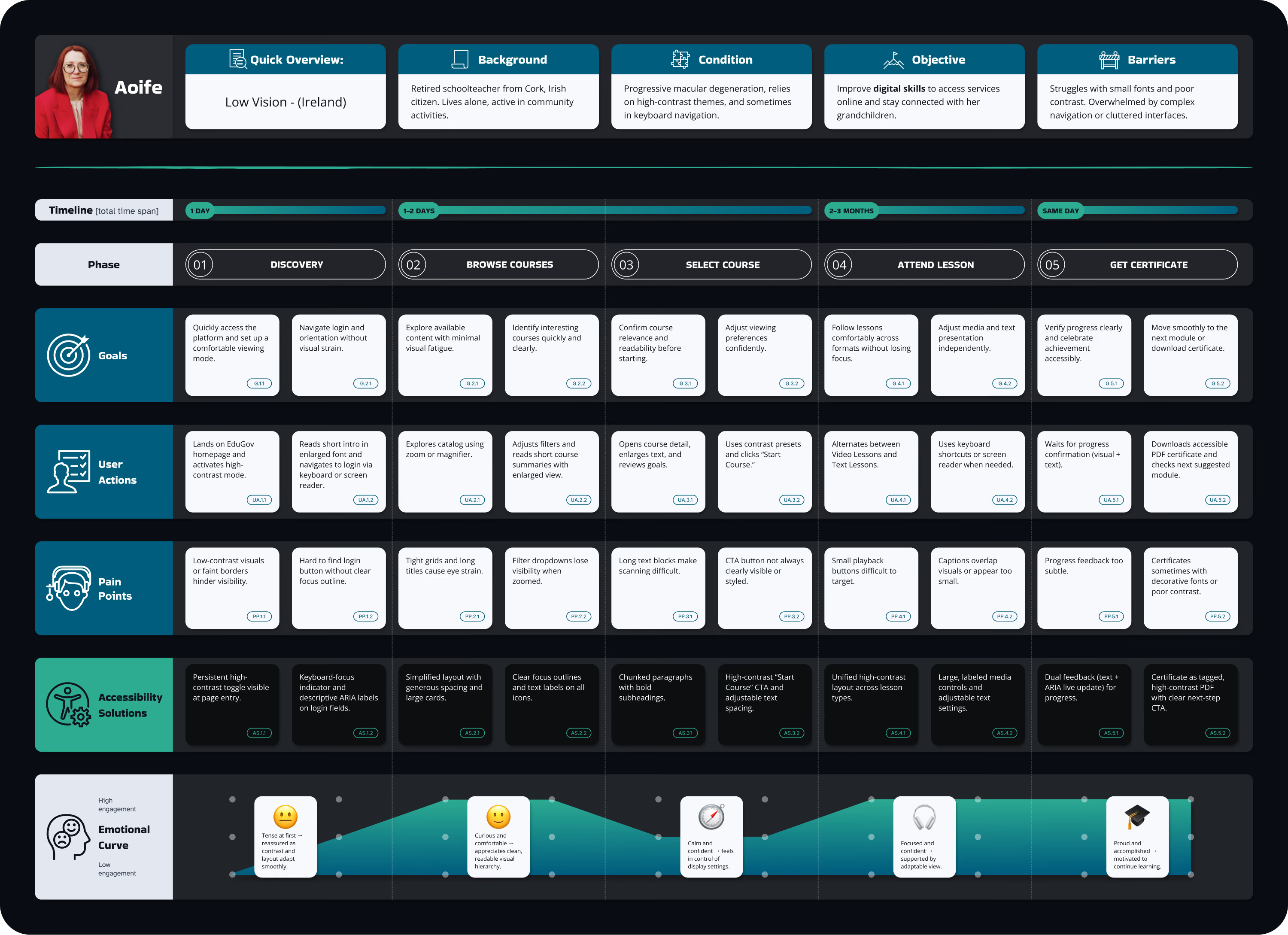
The discovery-phase pain points identified in Aoife's journey, faint visuals and a hard-to-find login button, directly informed the decision to add a dedicated High Contrast button alongside Light and Dark modes from the very first screen.

Reads short instructions or uses text-to-speech to begin confidently.
Works through each question using a clear, consistent layout.
Corrects mistakes quickly with plain-language guidance.
Reviews concise feedback and decides on next steps.
Downloads and verifies an accessible certificate.

The comprehension-phase pain points identified in Mariana's journey, an inconsistent question layout and cramped text, directly informed the decision to use a fixed, predictable layout paired with a dyslexia-friendly font and generous letter spacing throughout the quiz.
High-Contrast mode and ARIA-labelled fields support her first login.
Large cards, alt text, and keyboard-accessible filters support browsing.
Scalable typography and a clear CTA confirm her choice.
Captions, transcripts, and adjustable contrast support mixed lesson formats.
Dual feedback and a tagged PDF/UA certificate confirm completion.
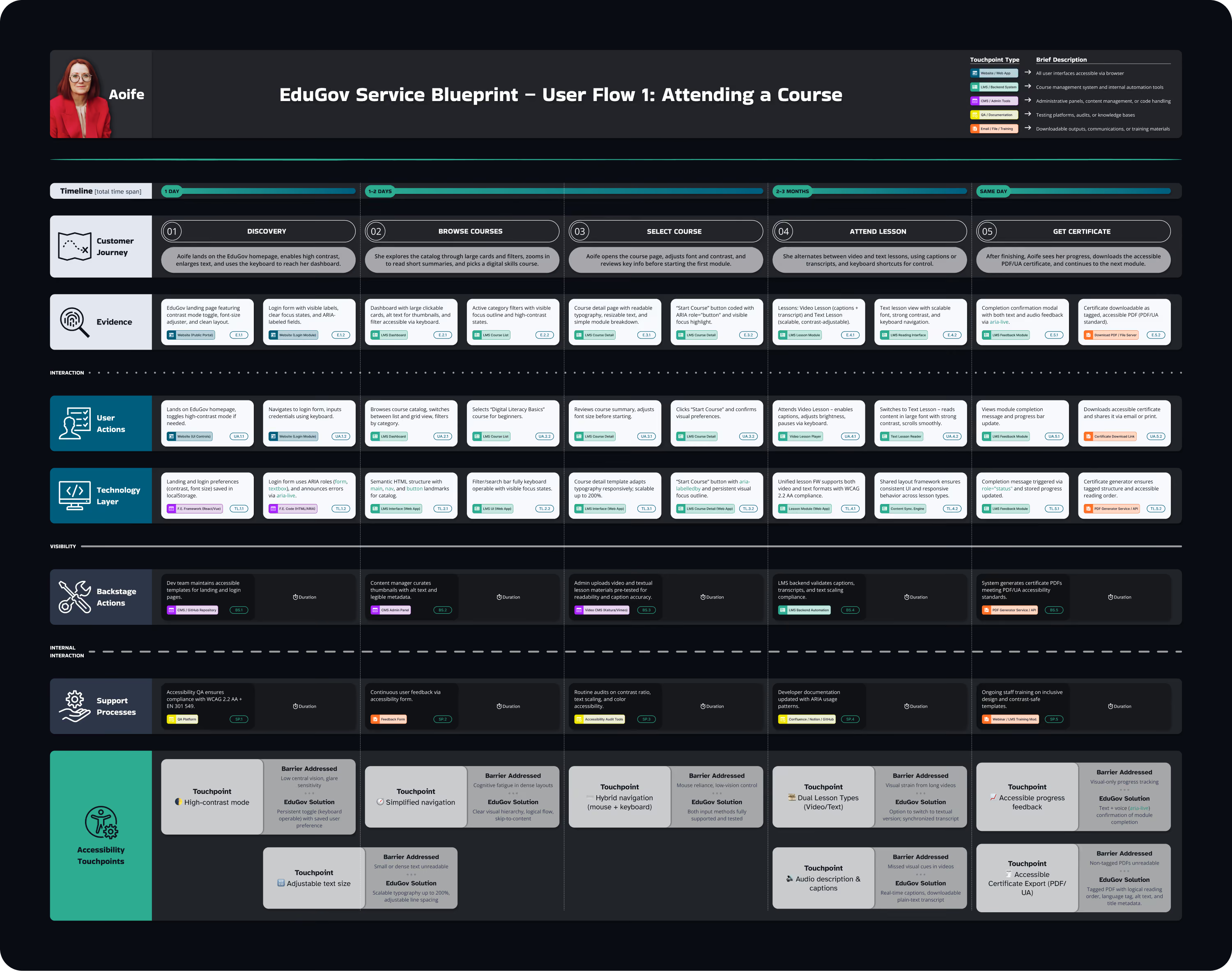
The Service Blueprint's backstage layer showed that video and text lessons each need separate validation before publishing. This informed the decision to build a single, unified lesson framework, so every accessibility check applies consistently regardless of format.
Chunked instructions and text-to-speech ease her into the quiz.
Consistent layout and visual cues keep her focus steady.
Plain-language, inline messages guide her through quick corrections.
Text and audio feedback confirm her results clearly.
A dyslexia-friendly, tagged PDF certificate confirms her achievement.

The Service Blueprint showed that icon consistency and text chunking needed dedicated review, not just automated accessibility checks. This informed the decision to involve icon and content review as a distinct step before publishing, separate from technical WCAG validation.
Wireframes, mockups, tokens, components, states, annotations and design decisions across the whole project.
The sitemap was structured around two primary user types, registered learners and unregistered visitors, with distinct navigation paths and access levels. Key architectural decisions were made early to ensure accessibility was embedded in the structure, not retrofitted.
Full site hierarchy with gated and public pages clearly differentiated. Key decision: course content partially accessible to unregistered users to lower the barrier to entry.
Eight end-to-end flows mapped: registration, login, course browse, enrolment, lesson, assessment, and certification. Each flow annotated with decision points and alternative paths.
Primary navbar, user dropdown menu, breadcrumbs, footer A–Z index and in-page section navigation. Icon placement rules documented for consistency across all contexts.
Research showed low digital confidence users abandon long forms early. Presenting Google/Gov ID first reduces perceived effort at the most critical drop-off point.
Alternative Considered: form-first layout — rejected due to high abandonment rate in comparable gov platforms.
Users need to evaluate a course before committing to registration. Gating all content behind login creates friction that disproportionately affects less confident users.
Alternative Considered: full gate — rejected because it prevents informed decision-making and increases bounce rate
EduGov contains courses, services, news and resources. An A–Z index supports users who know what they want but cannot formulate a search query, a key accessibility pattern for cognitive accessibility.
Alternative Considered: search-only discovery — rejected because it excludes users with low digital literacy who benefit from browse patterns.
Research showed low digital confidence users abandon long forms early. Presenting Google/Gov ID first reduces perceived effort at the most critical drop-off point.
form-first layout — rejected due to high abandonment rate in comparable gov platforms.
Users need to evaluate a course before committing to registration. Gating all content behind login creates friction that disproportionately affects less confident users.
full gate — rejected because it prevents informed decision-making and increases bounce rate
EduGOV contains courses, services, news and resources. An A–Z index supports users who know what they want but cannot formulate a search query — a key accessibility pattern for cognitive accessibility.
search-only discovery — rejected because it excludes users with low digital literacy who benefit from browse patterns.
A selection of four screens where wireframing revealed the most significant structural decisions. Full wireframe set available in the Figma file.

Filter sidebar with checkboxes, active filter chips with individual and clear-all options. Sort controls and list/grid view toggle for result display.
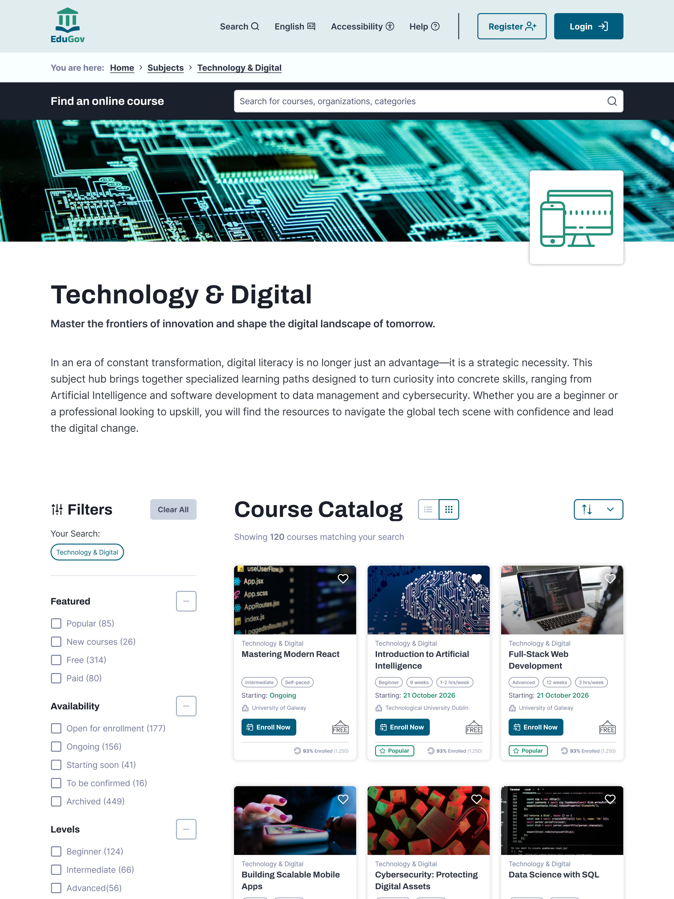
Title and intro paragraph, followed by filtered search results. Subject filter pre-applied by default, consistent with the Search Results pattern.
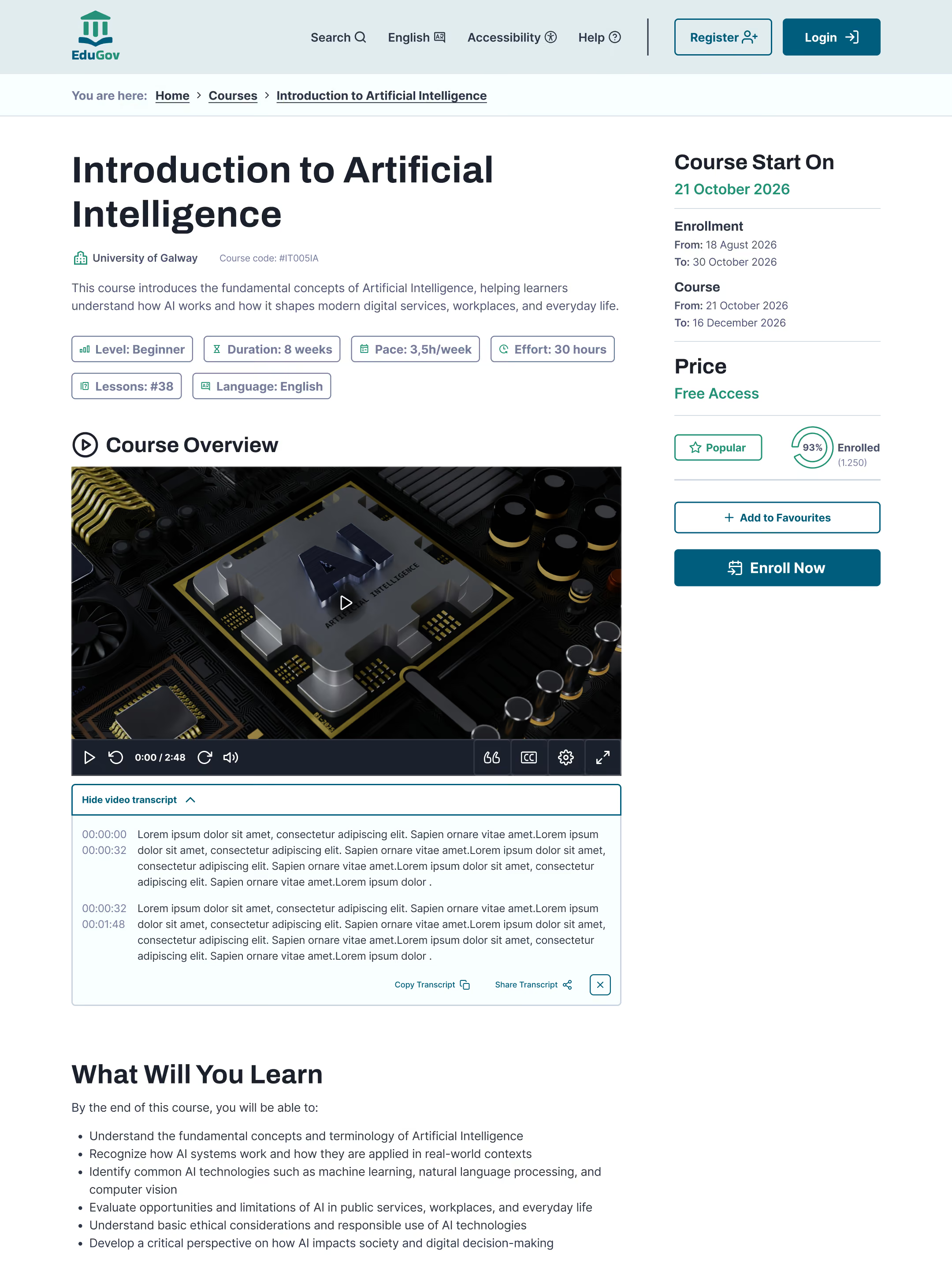
Two-column layout with sticky sidebar showing dates, price and CTAs. Availability before reputation, hierarchy driven by research findings.
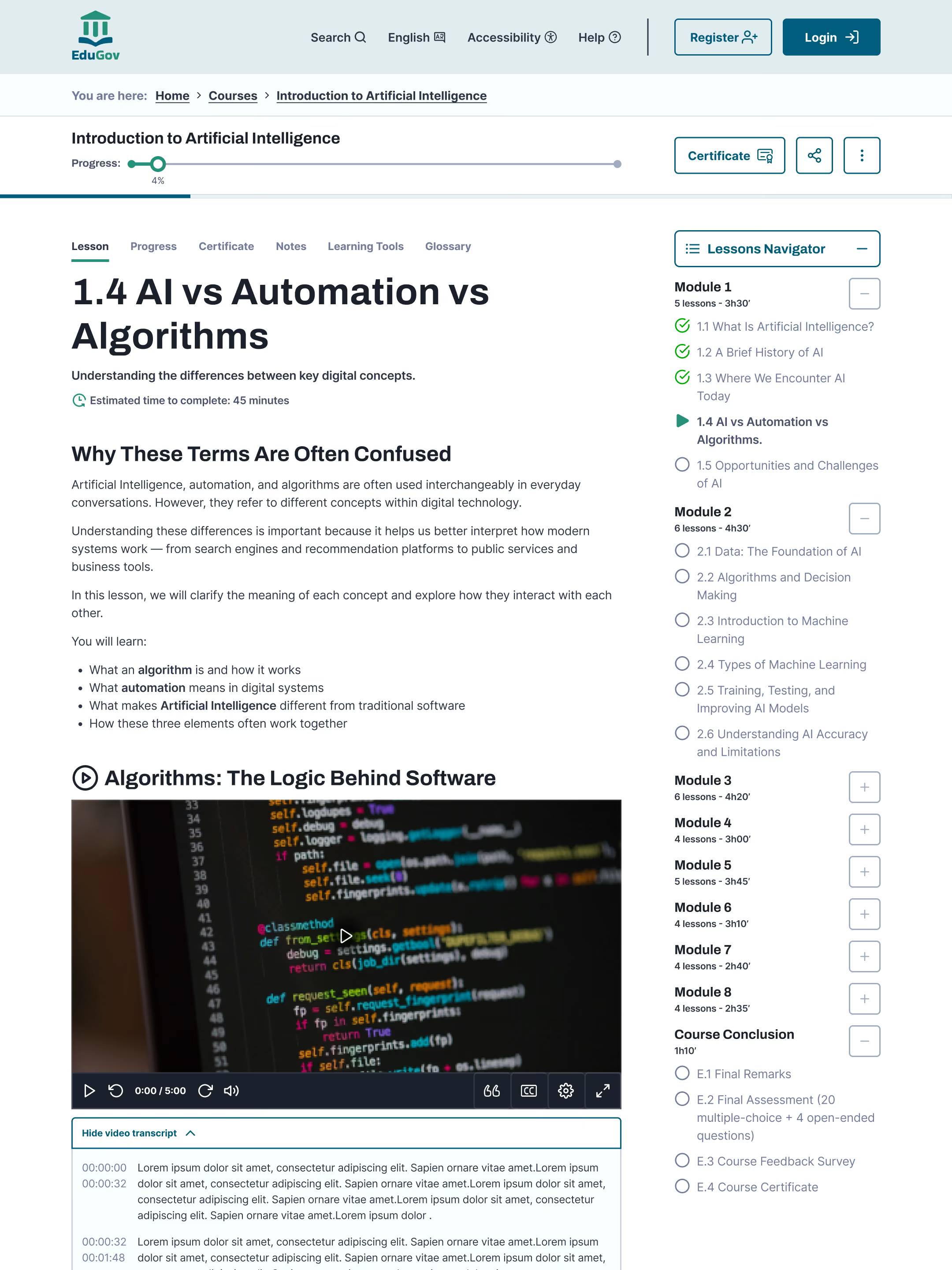
Collapsible sidebar, progress bar and tabbed menu for lesson, notes and glossary. Mixed text and video chapters with transcripts, key takeaways and a short comprehension quiz.
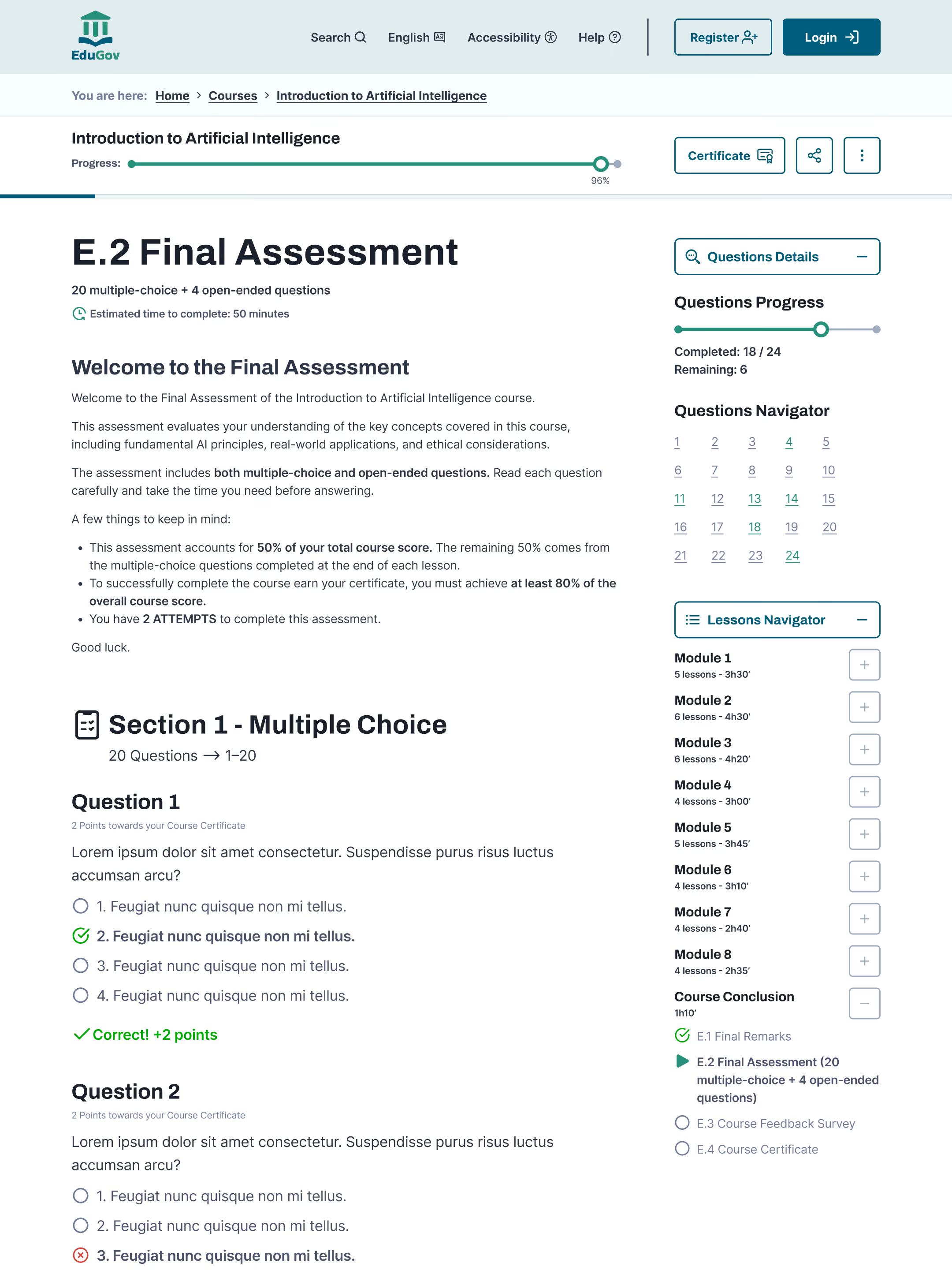
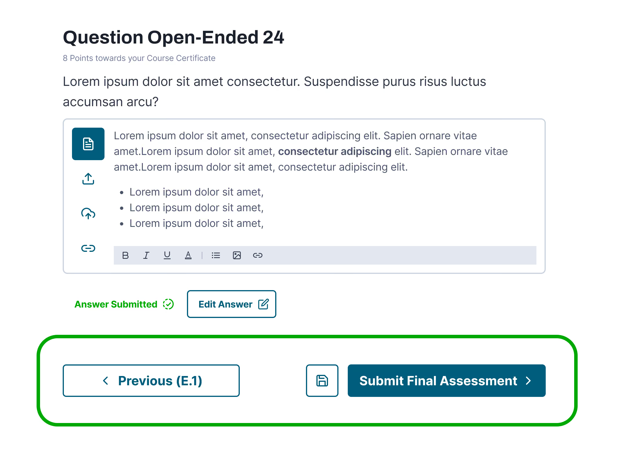
Collapsible sidebar with question progress bar and navigator. Submit always active, error summary with named links to unanswered questions.

Certificate preview with download, share and link actions. Verification, learning outcomes and related courses reinforce credibility and next steps.
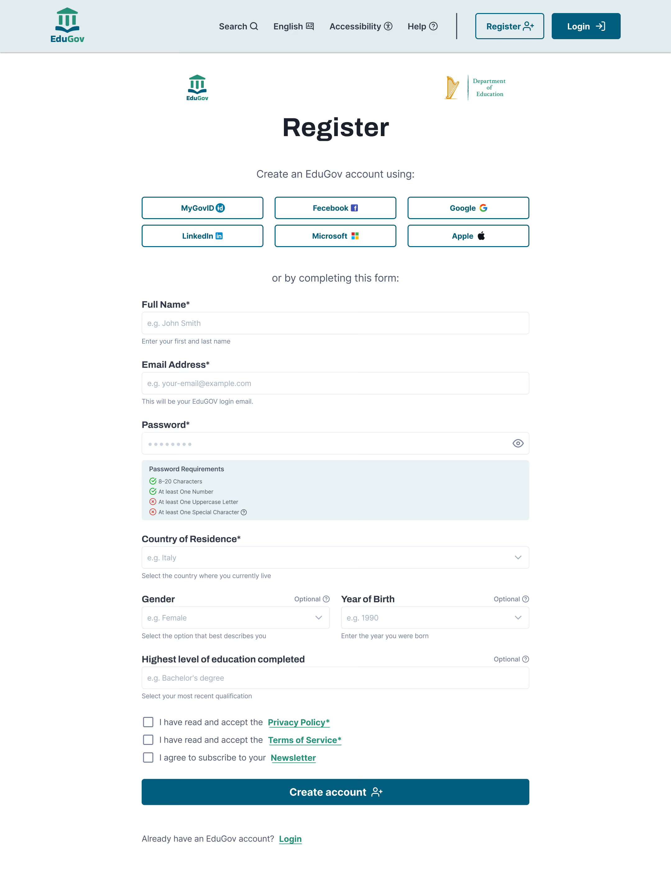
Trust masthead with EduGOV and Ministry of Education logos. Hint text placement, error summary positioning and password field behaviour designed for clarity.
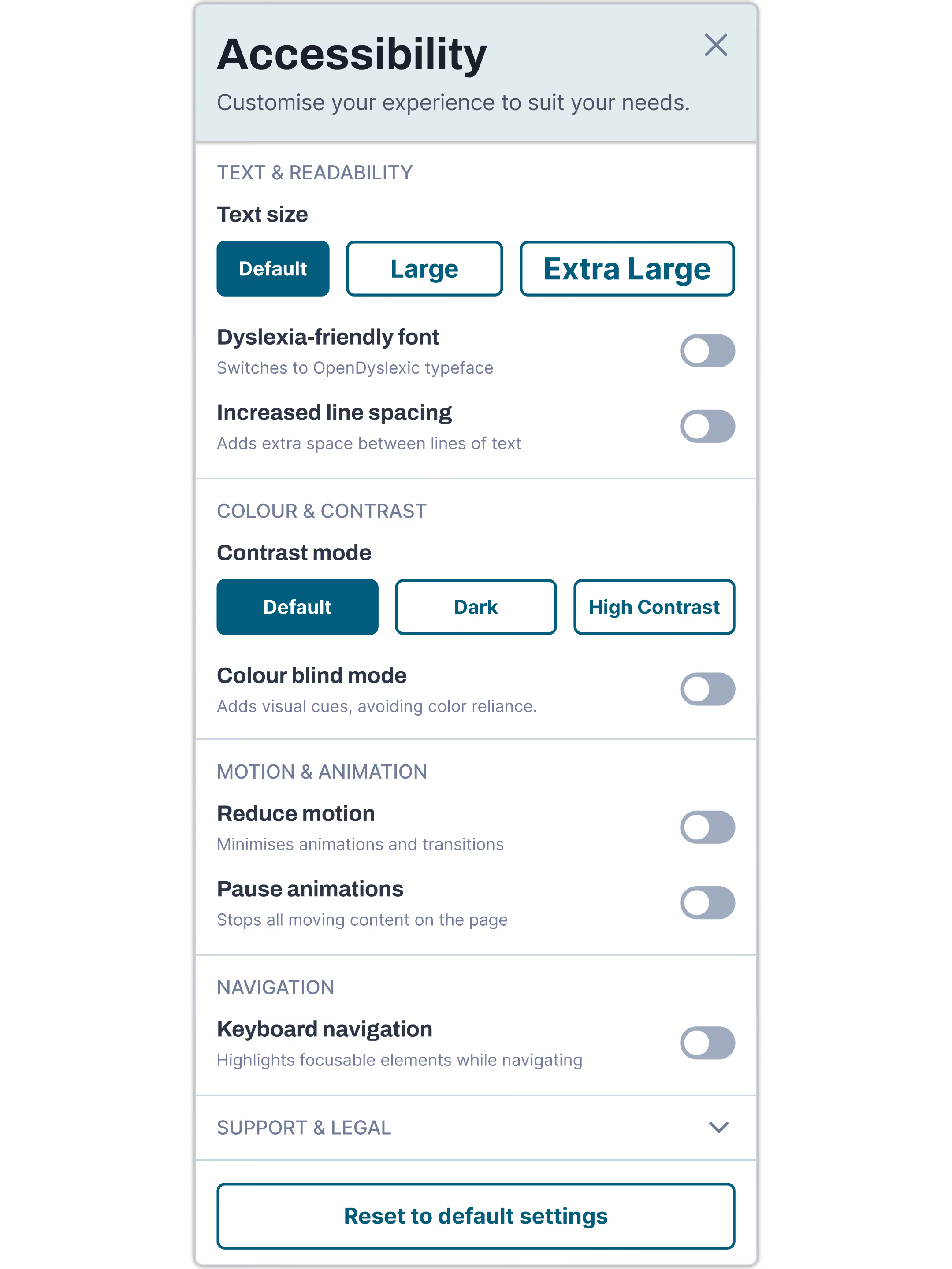
Modal covering text size, dyslexia-friendly fonts, contrast and colour-blind modes, motion reduction and accessibility statement links.
EduGov's design system was built to serve a diverse, non-specialist user base on a government platform. Every decision, from contrast ratios to button hierarchy, was grounded in WCAG 2.1 AA compliance and plain language principles. Below are the core building blocks, fully documented in Figma.
All colour combinations meet WCAG 2.1 AA contrast ratio of 4.5:1 minimum. Error, success and warning states always combine colour with icon and text — never colour alone (criterion 1.4.1).
Archivo · 56 → 64px · 700
Archivo · 24px · 700
Inter · 18px · 400 · 150%
Inter UC · 12 → 18px · 500
Inter · 14 → 20px · 700
OpenDyslexic · A11y menu
Navbar CTAs (Register, Login) carry the icon to the right of the label. Internal page CTAs carry the icon to the left. CTAs contextualised by their surrounding section (e.g. "View all courses" in homepage sections) use no icon.
93% Enrolled (1.250)
Starting:
21 October 2026
280,00
Persistent label above every field — never placeholder-only
Hint text below for format guidance — persists while typing
Inline error with alert circle icon — below the affected field only
Error summary banner at top of form with role="alert" on submit
Password field with show/hide icon — real-time "Password requirements" box
Optional fields labelled "Optional" directly in the label — for immediate clarity and screen reader support.
All icons are sourced from Tabler Icons, chosen for legibility at small sizes without adding visual weight next to body text. Icons are never used as the sole navigational or functional cue: every icon pairs with a visible label or accessible name.
A selection of the most significant decisions — each documented with problem, solution and rationale. Full annotations in the Figma file.
Placeholder text disappears on input, leaving users without context mid-form — critical for low digital literacy users.
Persistent label above + hint text below. Placeholder used only as format example (e.g. "Jane Smith").
WCAG 2.1 criteria 1.3.5 and 3.3.2. GOV.UK Design System standard. Supports screen reader users.
Using both alert triangle and alert circle would require users to decode a semantic distinction not universally understood.
Alert circle used consistently across all error states — inline errors, dynamic banners, and assessment error summaries.
Consistent iconography reduces cognitive load for a diverse, non-specialist user base. Triangle was considered and deliberately set aside.
Distinct errors for "email not found" vs "wrong password" reveal account existence — a security vulnerability known as user enumeration.
Single generic banner: "Your login details are incorrect. Please check your email address and password and try again."
Standard security practice for government platforms. Both fields highlighted without exposing which is incorrect.
Unanswered quiz questions need a reminder, but must not block progress or create anxiety in a learning context.
On clicking Next with unanswered questions, navigation buttons transform inline: Previous stays, Next becomes "Continue anyway".
No new element appears — the nudge lives where the user's attention already is. Less interruption than a toast, no decision paralysis from a third CTA.
Star ratings carry commercial associations and create political risk — a low-rated government course implies poor public service.
Completion rate (%) with people icon and "Highly recommended" badge above a threshold. State-specific indicators for inactive courses.
Normalised metric — does not penalise new or niche courses. Avoids marketplace associations inappropriate for a gov platform.
Participants - 3 persona profiles
Key task flows tested
Issues identified
Design iterations post-testing
Participant 1 · Maria profile · Enrollment task
A selection of the most significant decisions, each documented with problem, solution and rationale. Full annotations in the Figma file.
Password requirements not understood on first attempt
Critical
1
2
3
4
5
Fixed
Course availability states (enrol vs waitlist) unclear on card
Critical
1
2
3
4
5
Fixed
Submit button on assessment perceived as inactive/disabled
Critical
1
2
3
4
5
Fixed
Accessibility menu not found during unguided exploration
Major
1
2
3
4
5
Fixed
Survey mandatory questions not visually differentiated from optional
Major
1
2
3
4
5
Fixed
Course code position too prominent, caused confusion with course title
Minor
1
2
3
4
5
Fixed
Critical — blocks task completion
Major — significant friction
Minor — cosmetic or edge case
Before
After
Before redesign
Ok
After redesign
Good
A selection of four screens where wireframing revealed the most significant structural decisions. Full wireframe set available in the Figma file.
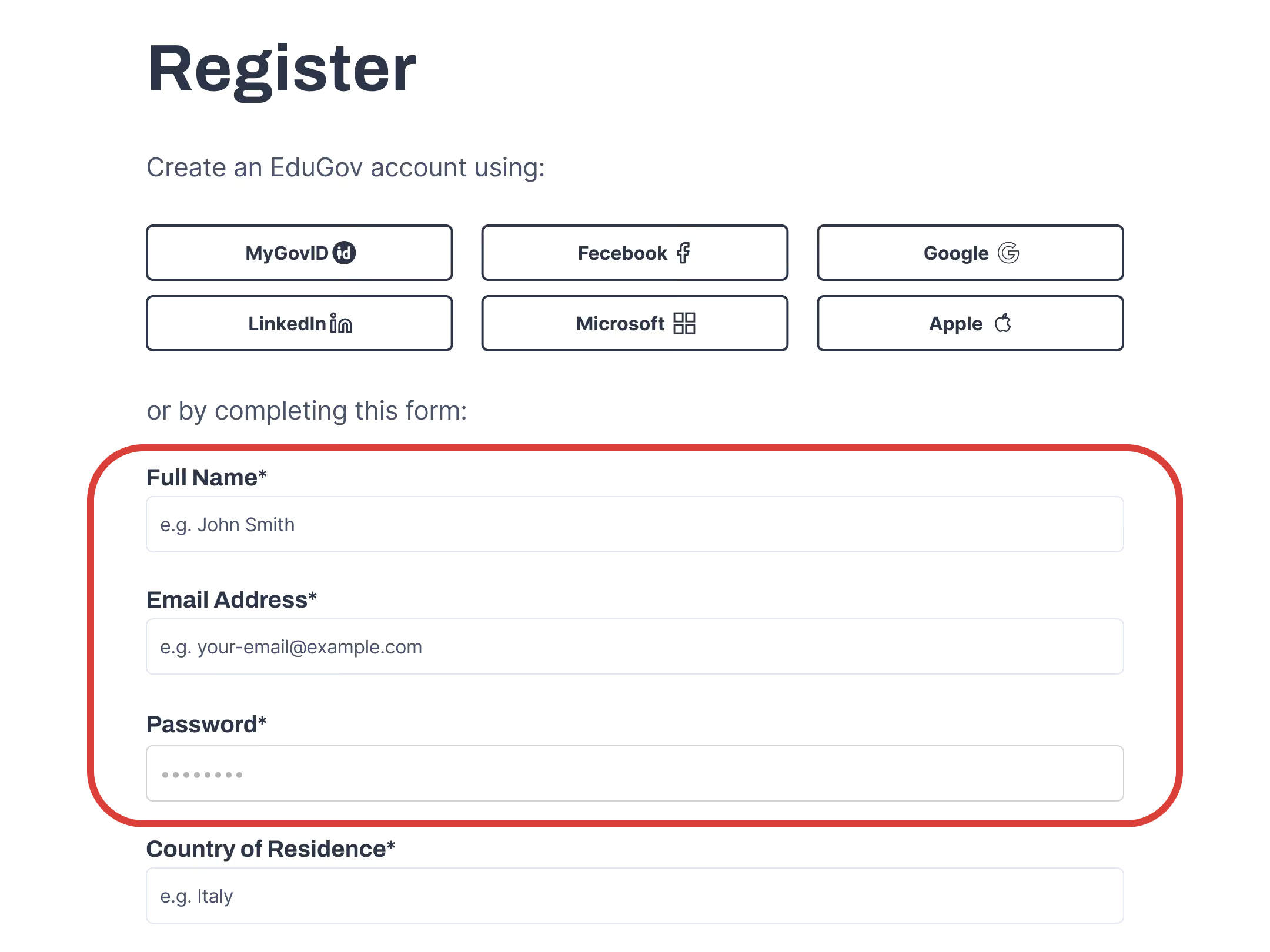
"I didn't know what the password needed. There was no hint to guide me."


"I couldn't tell if the course was open or if I had to wait. The buttons looked the same."

"The Submit button looks greyed out. I wasn't sure if it was even clickable."
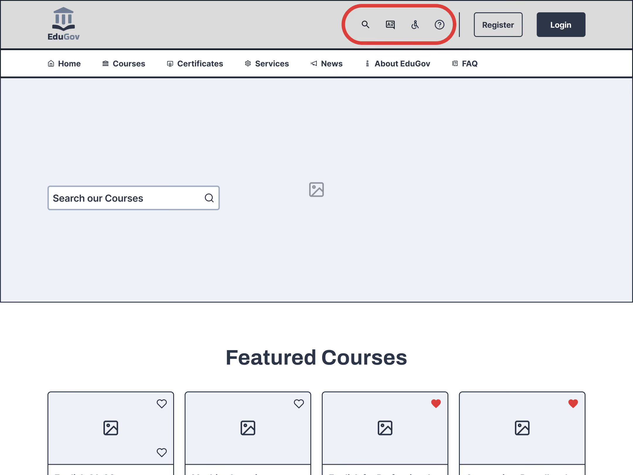
"I was looking for the word 'Accessibility', I just scrolled right past those little icons."
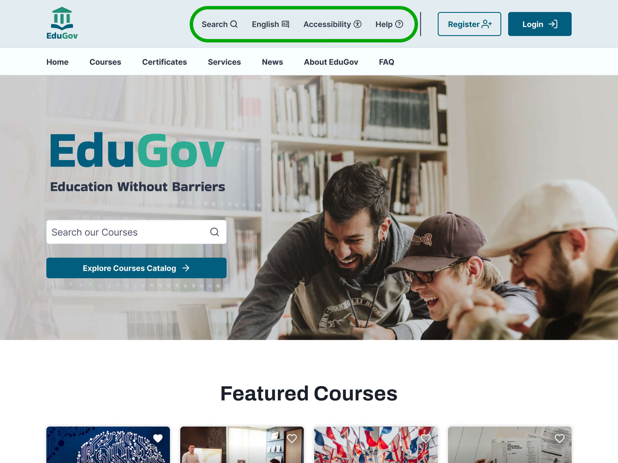
These fixes moved the System Usability Scale score from 62 (ok) to 93 (good), with task success rates for registration, enrolment and assessment all reaching 90% or above. For a government platform where accessibility and inclusion are mandated, removing these barriers is not just a UX improvement, it is a compliance requirement.
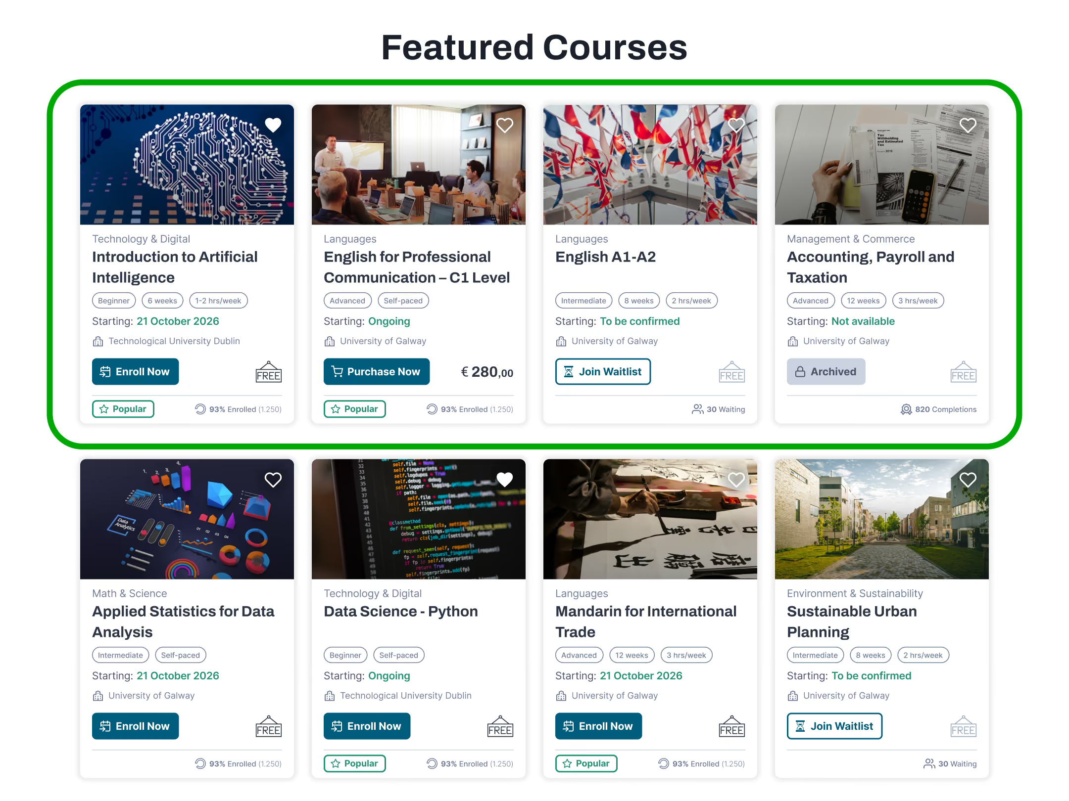
Each state maps to a specific CTA, price badge, and reputation indicator. The card communicates everything needed to make an enrollment decision without opening the course detail page.

Technology & Digital
Starting:
21 October 2026
University of Dublin
93% Enrolled (1.250)

Languages
Starting:
Ongoing
University of Galway
280,00
93% Enrolled (1.250)

Management & Commerce
Starting:
To be confirmed
University of Galway
30 Waiting

Technology & Digital
Starting:
Not available
University of Dublin
820 Completions
Star ratings were rejected in favour of a completion rate indicator, a normalised metric that does not penalise new or niche courses and avoids the commercial marketplace associations inappropriate for a government platform.
Three distinct error levels, each with a defined semantic role, colour and icon. No state relies on colour alone.
The Register and Login pages open with a trust masthead, EduGov and Ministry of Education branding, before any form field. Both forms follow the same structural pattern: persistent label above, hint text below, SSO options (Google, Gov ID) placed before manual registration, since research showed low digital confidence users abandon long forms early. The password field uses a show/hide toggle instead of a re-type field.
Two collapsible sidebars, both reducing in width to keep focus on the central content. The lesson navigator maps every step of the course through to certification; the question sidebar combines a progress bar with a calendar-style grid of answered and unanswered questions, each linked directly.
The question navigator updates in real time: multiple-choice answers turn green or red as soon as they are graded, open-ended answers turn amber once submitted for review, and grey marks anything still unanswered. This gives a spatial overview of progress without scrolling, and direct links to unanswered questions reduce friction at the most critical moment of the assessment.
Fully clickable flows: registration, login, course browsing, lessons, assessment, survey and certification.
Four short screen recordings cover the platform end to end: browsing and enrolling, registration and login, final assessment and survey, and the accessibility menu across key pages. A quick way to see EduGov in action before exploring the prototype independently.
Home to certificate: browsing, enrolling, lessons, assessment, survey, completion.
Full registration and login flows, including error and success states.
Final assessment and survey flows, from errors to confirmation screens.
Accessibility menu in action across browsing, registration and course pages.
Registration · Course · Assessment · Certificate
Eight end-to-end flows cover the main journey, registration, login, assessment, survey and certification. Four additional entries link directly to key screens already shown within the Main Flow, for quick access without duplicating steps.
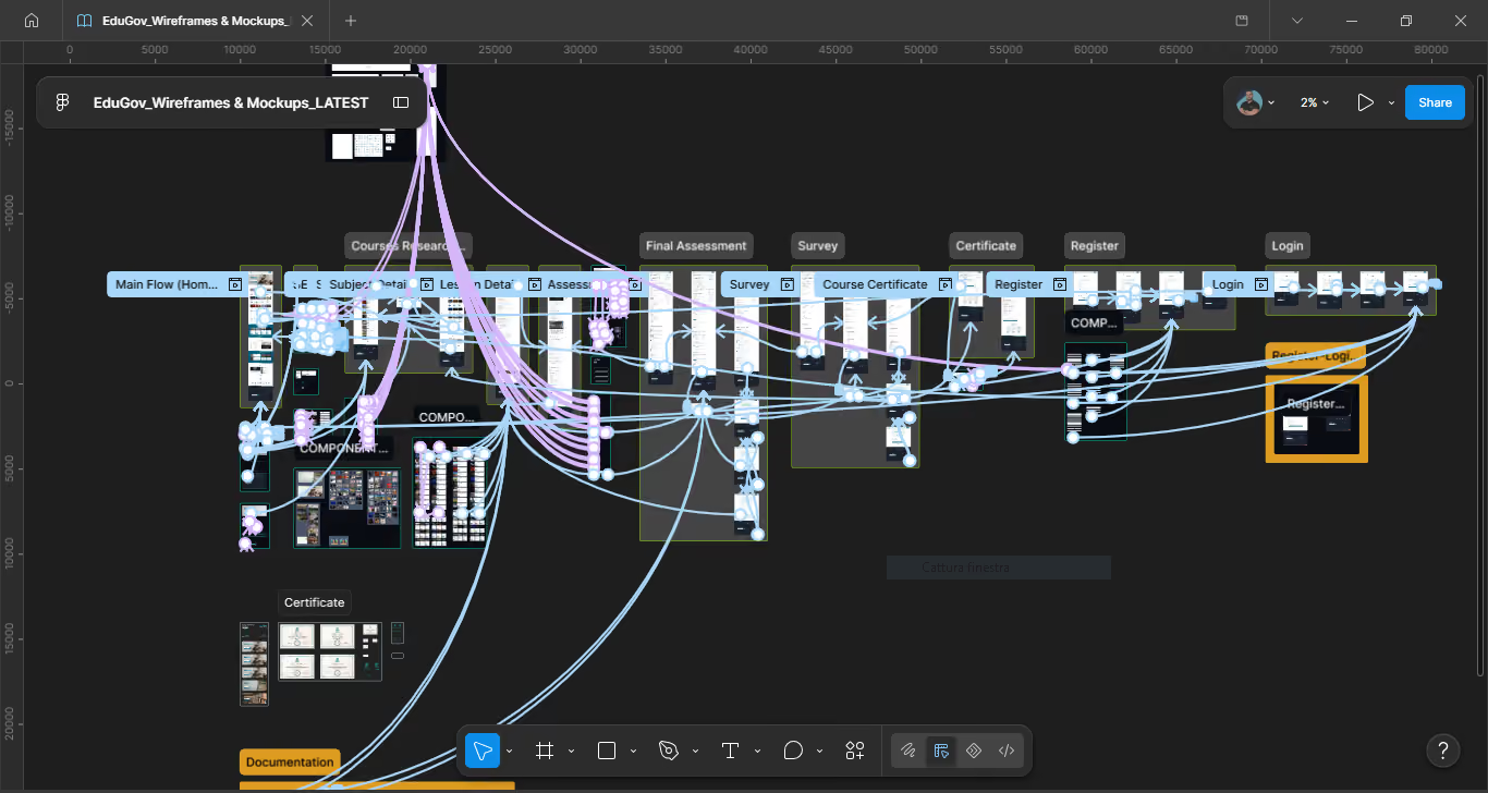
The complete end-to-end product experience, linking every other flow.
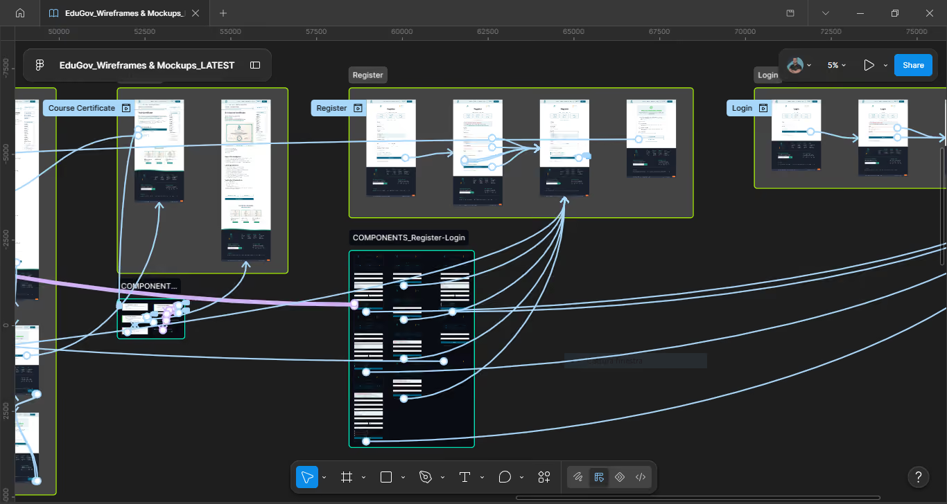
Full registration flow, including the clear and error validation states.
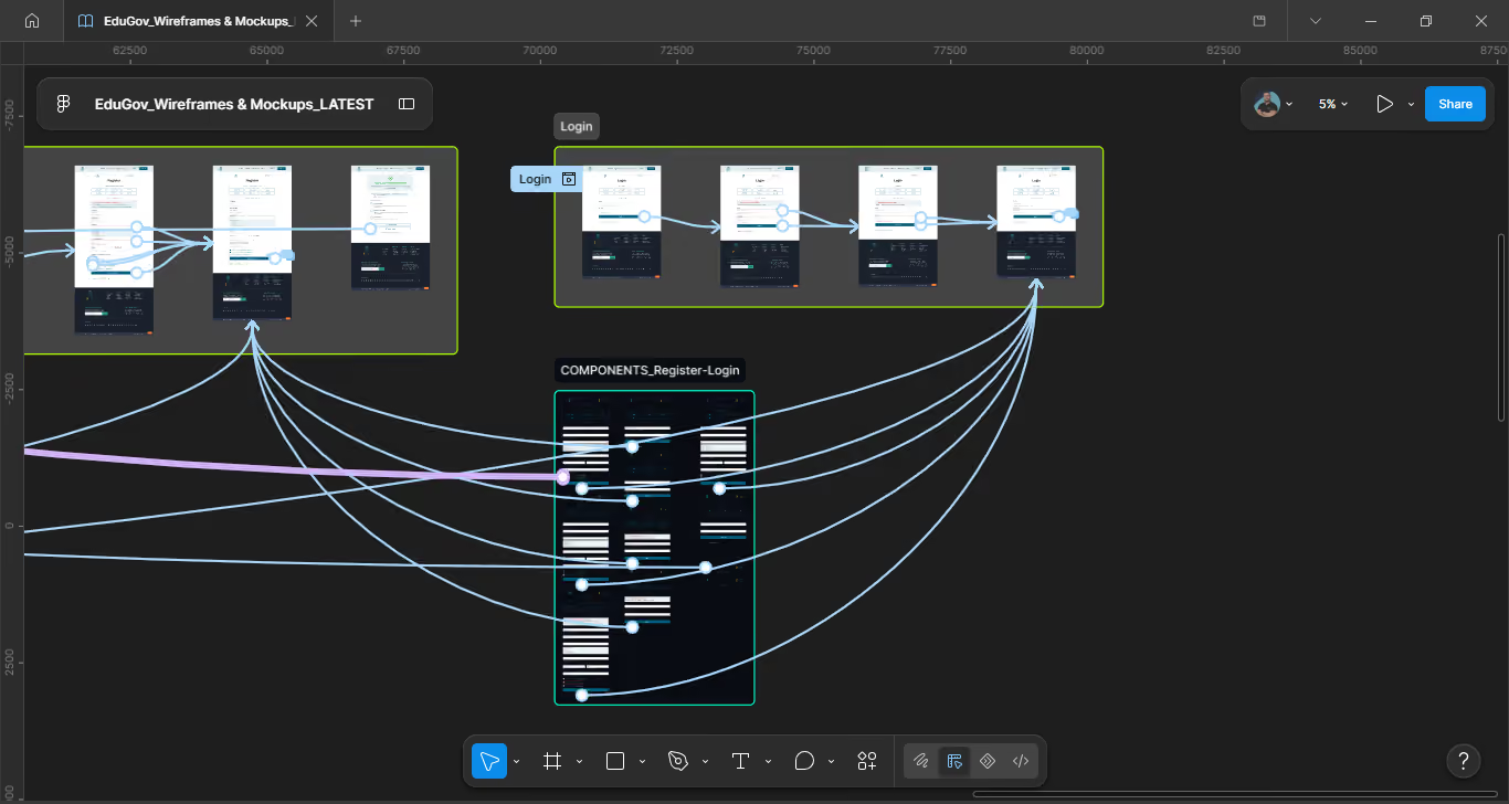
Full login flow, including the clear and error validation states.
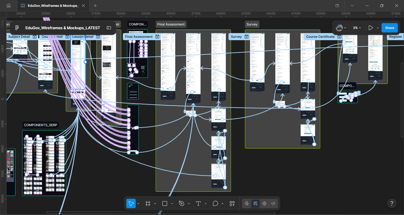
Full assessment flow across all three states, to the outcome screens.
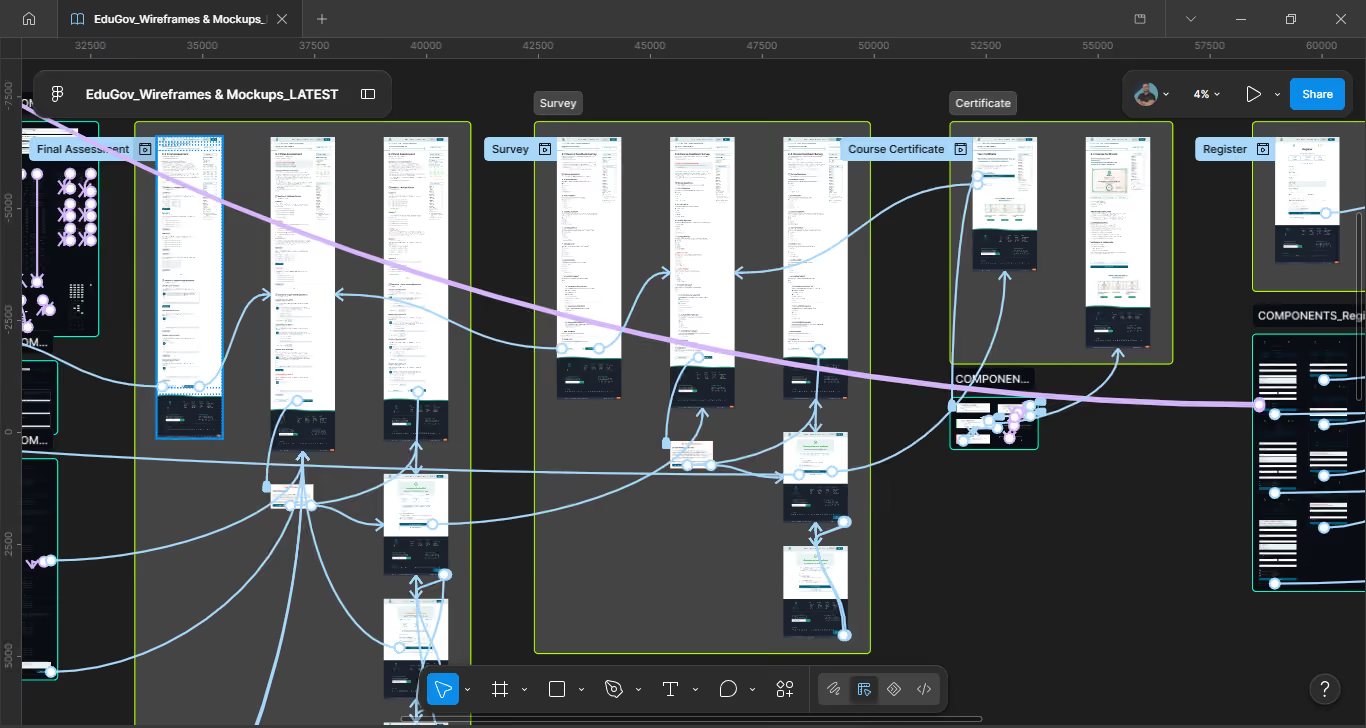
Full survey flow across both validation states, to confirmation.
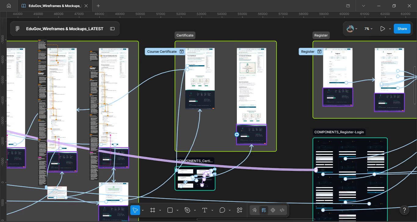
Certificate screen with download, share and verification actions.
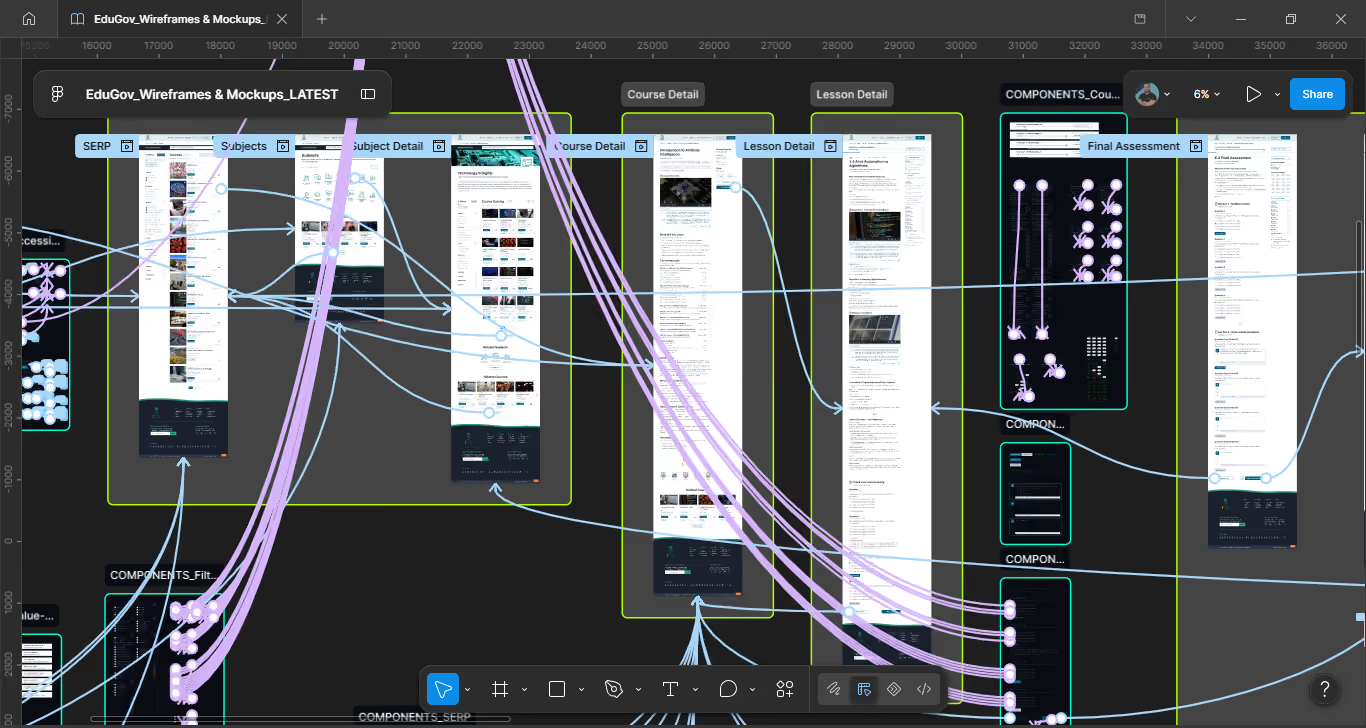
Direct link to the course detail step within the Main Flow.
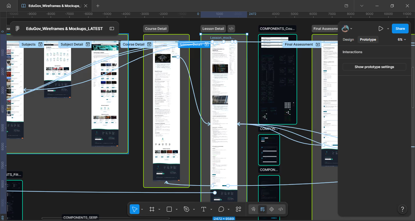
Direct link to the lesson detail step within the Main Flow.
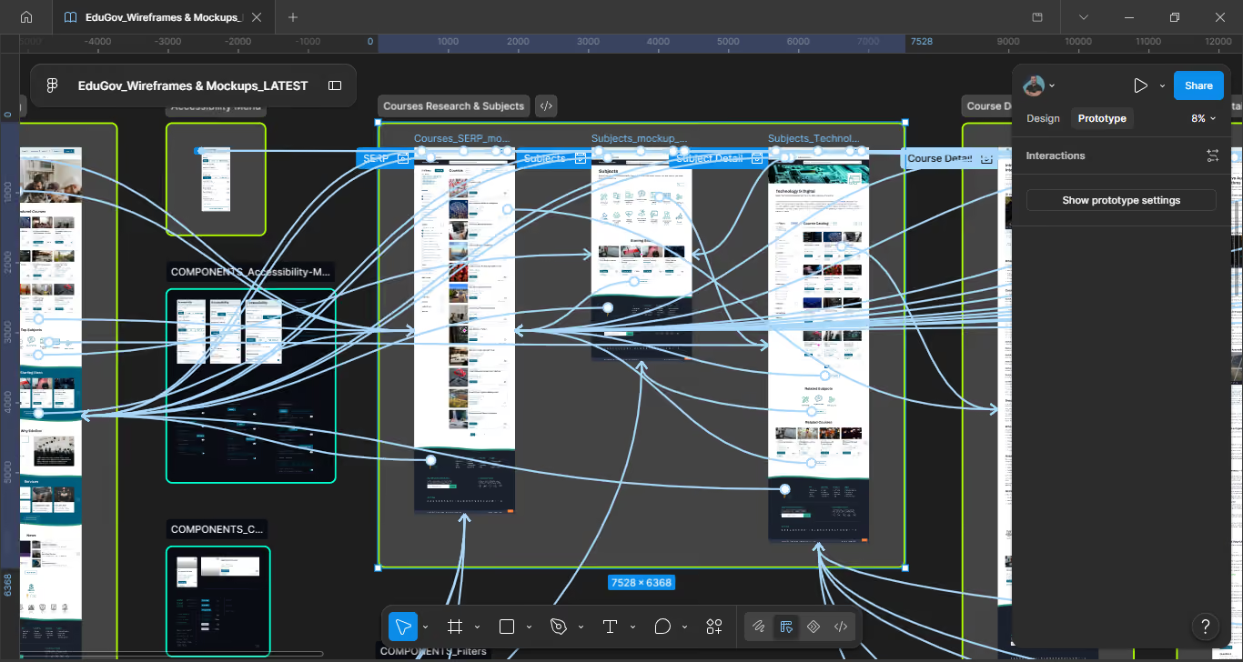
Direct link to the search results step within the Main Flow.
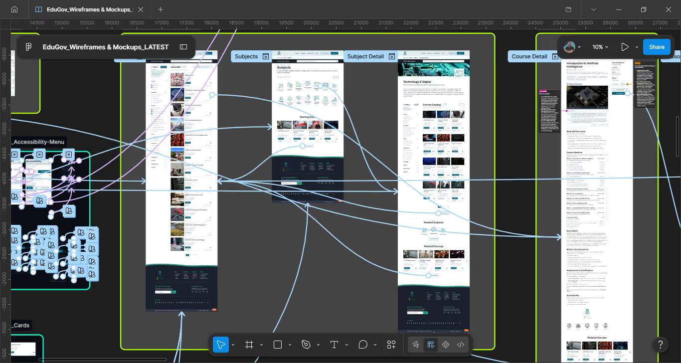
Direct link to the subjects overview step within the Main Flow.
Course Detail, Lesson Detail, SERP, and Subjects are not duplicated as standalone flows. Since they already exist within the Main Flow, each links directly to that step instead, keeping the prototype file lean and avoiding redundant paths.
Flows covered end-to-end
Screens designed and annotated
Video walkthroughs recorded
Compliance across all screens
Accessibility on EduGov was treated as a primary constraint from day one, not a checklist applied at the end of the design process. Every component decision, from error messages to icon systems to copy, was evaluated against WCAG 2.1 AA criteria and GOV.UK Design System guidelines.
Contrast, colour independence, text alternatives
Keyboard nav, focus management, no time limits
Plain language, consistent patterns, error guidance
Semantic HTML, ARIA roles, screen reader support
Contrast, colour independence, text alternatives
Keyboard nav, focus management, no time limits
Plain language, consistent patterns, error guidance
Semantic HTML, ARIA roles, screen reader support
A dedicated accessibility menu in the navbar, not a settings page, allows users to customise their experience (text, contrast, colour and motion) without leaving the current page. Changes apply immediately, with no save step required.
The accessibility menu opens as a modal, not a dropdown or a separate page, so users can see its effect on the page behind while adjusting settings. It implements a focus trap and ESC-to-close behaviour, with preferences persisting across sessions via local storage.
Error states must not rely on colour alone to convey meaning.
Implementation: Every error state uses icon + text + colour together. The alert circle icon and the error text are present regardless of colour — a user who cannot perceive red still receives the full error signal.
Text must have a contrast ratio of at least 4.5:1 against its background.
Implementation: All text colours verified against backgrounds including error red, success green, and warning amber. Placeholder text uses a sufficiently dark shade — a common failure point in form design.
Form fields must identify their purpose so browsers and assistive tech can autofill correctly.
Implementation: All registration fields use persistent labels above the field — never placeholder-only labels, which disappear on input and break autofill identification.
Errors must be identified in text and described to the user.
Implementation: Dynamic error banners use role="alert" so screen readers announce them immediately on submit. Inline errors are associated with their fields via aria-describedby. Login uses a generic error to prevent user enumeration without compromising WCAG compliance.
Status messages must be announced by screen readers without receiving focus.
Implementation: Certificate generation toast uses role="status". Error banners use role="alert". Non-blocking nudges on the lesson page use a subtler pattern to avoid interrupting screen reader flow unnecessarily.
Focus must move in a logical sequence that preserves meaning.
Implementation: On submit with errors, focus moves programmatically to the error summary at the top of the form. Modal dialogs (accessibility menu) implement a focus trap — keyboard navigation cannot escape the modal while it is open.
Colour blind mode adjusts the EduGov palette to remain distinguishable across the four most common types of colour vision deficiency. All adjusted combinations maintain WCAG 2.1 AA contrast ratios.
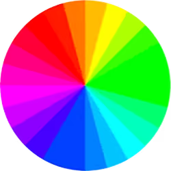
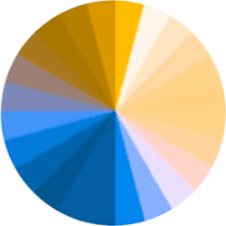



Deuteranopia and protanopia, the two most common deficiencies, are addressed by shifting the four key semantic colours: blue and amber tones replace red and green wherever they carry meaning.
In achromatopsia, colour alone cannot carry meaning regardless of palette adjustments. EduGov addresses this through redundant coding: every state combines icon, label and colour, satisfying WCAG 2.1 criterion 1.4.1 for all vision types, including complete colour blindness
For users with severely reduced vision, EduGov offers a dedicated high contrast mode that replaces the standard palette entirely.
Key colours shift to maximum contrast combinations: yellow on black for headings, green and orange for success and accent, cyan for interactive elements and pure white for body text. Every combination exceeds WCAG AA contrast ratios.
High contrast mode is independent of colour blind mode and can be activated simultaneously.
Four distinct display modes address different visual needs. The structure of the controls reflects a deliberate semantic decision.
Standard platform palette. White backgrounds, blue and teal accents, dark body text.
Dark backgrounds with light text. Reduces eye strain in low-light environments.
Maximum contrast ratio. Removes decorative elements. For users with low vision.
Adjusts palette for colour vision differences. A toggle, combinable with any of the three modes above.
Default, Dark and High contrast are mutually exclusive (button group). Colour blind mode is a toggle because it is orthogonal: a user can legitimately combine Dark mode with Colour blind mode. Four equal buttons would imply mutual exclusivity, which would be semantically incorrect and prevent valid combinations.
A deliberate, documented icon hierarchy ensures consistency and reduces cognitive load across all feedback states.
Alert triangle was considered for banner-level errors and rejected in favour of alert circle. On a platform with a diverse, non-specialist user base, two error icons would require users to decode a semantic distinction that is not universally understood. Consistency was prioritised over semantic granularity.
Standard applied throughout
Conformance level achieved
Gov accessibility directive referenced